With the recent launch of Adobe’s Creative Cloud came an assortment of new tools and features, most of which I’ll likely try to learn in an attempt to keep as current as possible. After hours of tutorial videos, I should be able to recognize which ones I’ll put into practice and which aren’t relevant to what I do. It’s sort of a labor of love for me, really, much like back when I was a more traditional artist and I’d spend an hour wandering through Utrecht’s, picking up new medium to try, trying it out, and either putting it into play, or abandoning it.

Take my money..!
Since the digital design capabilities are already getting their press this week, I’d like to take this opportunity to recognize the analog tools in my workflow, like pencils, paper, etc., and how I use them to start a digital project. If the finished project isn’t proprietary, I’ll have that original piece of work to sell, which wouldn’t be possible if the entire project were done, start to finish, in Photoshop or Sketchbook Pro.
Pencils!
No doubt, a #2 pencil with a full eraser on the end is a thing of joy. Because I learned how to draw while not paying attention in grade school, flipping a pencil around is more natural than using a separate eraser; therefore, the #2 is the favorite for sketching. I never was able to find a proper use for those pencil-packs with the range of lead-hardness but that rarely stops me from buying them every Fall.
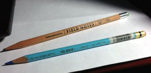
Old Reliable and Blue
Once an idea and composition is nailed down, a Col-Erase non-photo blue is used on a fresh surface to fine-tune the details. This blue color is helpful because it’s dark enough to work with but appears faded compared to the final inking, hiding any un-erasable marks. Additionally, the blue can be easily filtered out after scanning when moving the work to a digital platform.
Color pencils have all but completely phased out of my process, mostly because I don’t finish the original illustration in color very much anymore. When I do, it’s Prismacolor and it always has been.
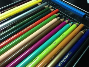
My childhood was pretty much fueled on these and Watermelon Nerds.
Pens!
For years, I’ve used a fine-line Sharpie to make regular, everyday notes. It’s for legibility reasons, actually: nothing I write in ball-point can be read. When inking a drawing, I switch between Pitt artist pens (sizes F-XS) and, for the most delicate work, a Pilot Hi-Tec-C, which is engineered for precision with smudge-free ink. It’s probably my favorite pen ever but don’t tell Sharpie I said that.
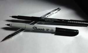
Sharpie Ultra-Fine, Pitt artist pen, and the legendary Hi-Tec-C
Markers!
Markers are a newer addition to my analog arsenal. After trying out Prismacolors for a while and not liking the results, I bought a few made by Copic, based on user feedback.
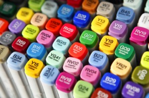
This is, like, $100 in markers.
These markers are expensive and their hype borders on cultism, but I’ve never used anything as satisfying as Copics to complete an illustration. That’s saying a lot, since all 24 of my markers are shades of warm and cool grays.
Paper!
I have three types of paper: dirty, clean, and notebook. The dirty paper is a sketchbook that comes from the dollar store, with 80 pages of cheap, grey, pulp. It’s not only inexpensive, alleviating worry about using it up too quickly, but it’s also not suitable for a finished piece, granting a sort of freedom to experiment and make mistakes.
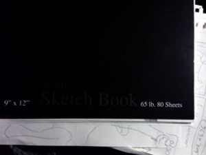
Cheap, dollar-store sketchbook = priceless.
Well… it’s a dollar, actually.
This sketchbook is filled in every available space, worn spots or tears appearing if too much erasing is done, creating a healthy sort of forced revision of ideas rather than attempting perfectionism on a particular sketch. Perfectionism isn’t what a sketchbook is for.
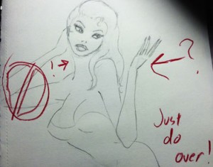
Clearly.
The clean sketchbook is always the same for me: Strathmore Bristol Smooth. This is where the best parts of many dollar store pages goes, sewn together like Frankenstein’s monster, copied over in non-photo blue via grid, lightbox, or projector depending on the size.
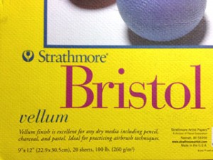
So bright. So very, very bright…
This copy, once inked, is captured digitally either with a scanner or, if it’s over 8.5×11, a camera for Photoshop. Then the original can be completed with markers or colored pencils.
My everyday notebook of choice is Field Notes because it fits into a back pocket and their design aesthetic is enviable. Released seasonally, they come in themed packs of three and usually sell out fast.
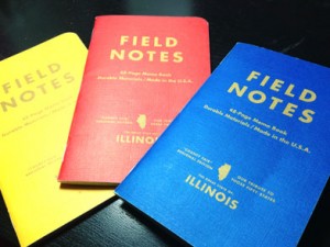
The County Fair edition is in prize-winning ribbon colors. Sweet.
So, during all of the digital design news this week, consider revisiting those analog tools of the trade or even discovering them for the first time. Stop in your local art supply store, browse the sketchpads, check out some pen options, and maybe find something that you can share with us here at AIGA Baltimore. We might be able to make an event out of it.
Hmm: Analog Design Day. That has a nice ring to it.
Greg Jericho spends an awful lot of time designing for clients that do not exist at his equally fake company, Myopic! Studio.