Crafting Publications and Cultivating Community

A recap of the AIGA Baltimore and BmoreArt panel at MICA

On November 28, 2024, the auditorium at the Maryland Institute College of Art (MICA) was filled with the energy of Baltimore’s and the DMV’s graphic design community. They gathered for the panel “Crafting the Page,” an event hosted by MICA, BmoreArt, and AIGA Baltimore as part of AIGA Baltimore Design Month.

The event featured presentations by Ellen Lupton, Raquel Castedo, and Tony Venne. Each shared their expertise, insights, and experiences, offering valuable advice to aspiring designers, artists, and writers. The presentations were followed by a lively Q&A session with the audience, fostering a vibrant exchange of ideas.

Moderated by BmoreArt’s editor-in-chief Cara Ober, this event provided valuable insights into design, partnership, and storytelling in publishing as part of the Design Month celebrations. For those who missed it, a recording of the panel is available to watch on YouTube.

Designing While Writing: four tips for creating engaging books

Ellen Lupton, a renowned author, designer, and educator, opened the evening by emphasizing the power of design and the magic of books. Lupton, who serves as the Betty Cooke and William O. Steinmetz Design Chair at MICA, has authored and co-authored over 30 books on graphic design, including Design Is Storytelling, Graphic Design Thinking, Health Design Thinking, and Extra Bold: A Feminist, Inclusive, Anti-Racist, Nonbinary Field Guide for Graphic Designers.

Lupton shared her four essential tips for creating compelling books, gleaned from her extensive experience as both author and designer:

  • Start with a Table of Contents: The table of contents acts as a roadmap for the book, outlining its structure and guiding readers through the content. A well-crafted table of contents provides a clear overview of the book’s thesis and theory, like a map leading readers to treasures within.
  • Design in Spreads: Recognizing that readers often jump around a book, Lupton advocates for designing in spreads, ensuring each two-page spread is visually appealing and makes sense on its own. This approach caters to diverse reading habits and ensures a satisfying experience for those who may not read the entire book linearly.
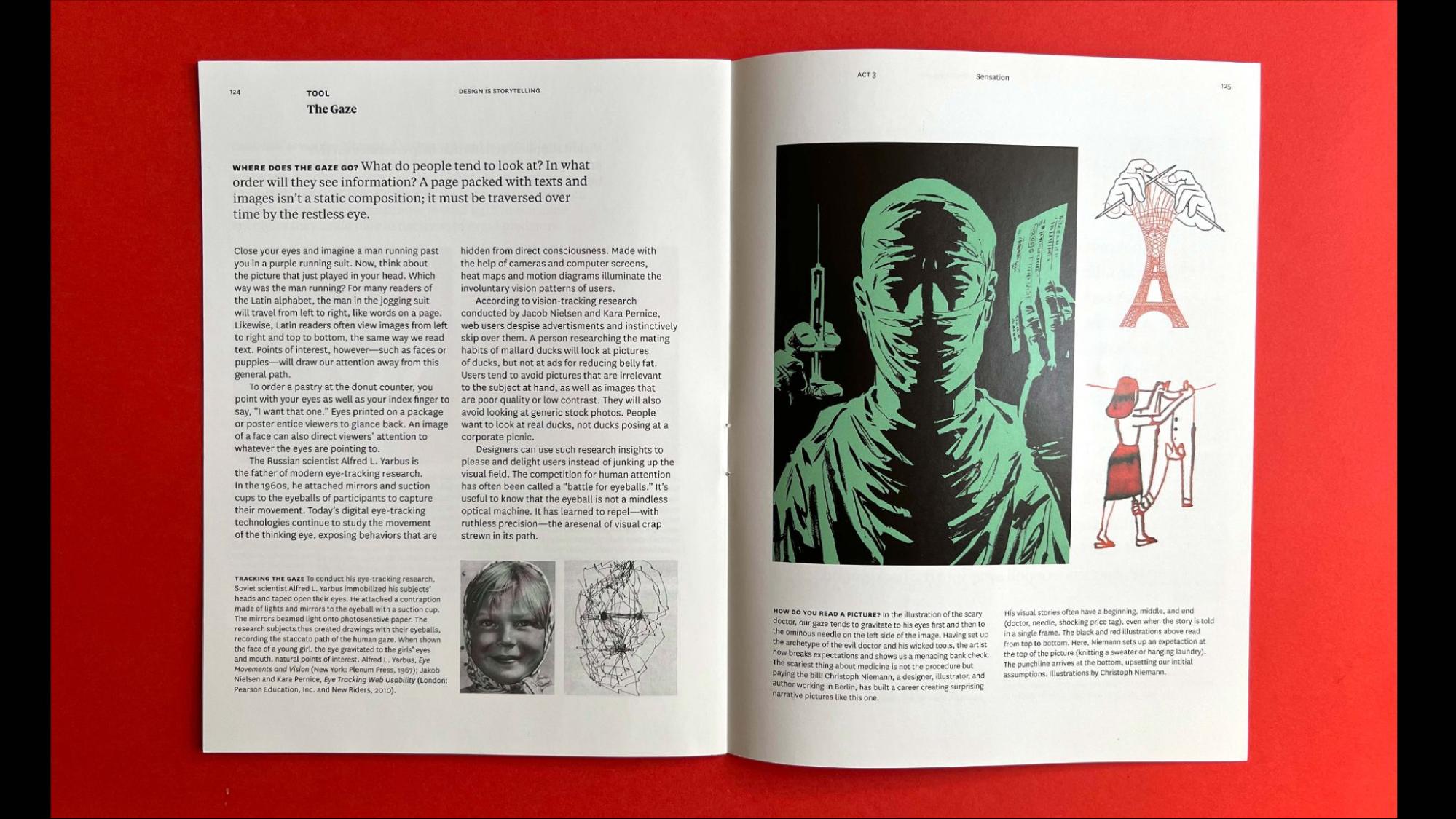
Page spread from the book Design Is Storytelling. Page spread from the book Design Is Storytelling

  • Picture Your Reader: Lupton stresses the importance of considering the reader’s perspective and knowledge base. Authors and designers should strive for inclusive, simple, and direct language that respects the reader and avoids assuming a shared vocabulary. Visual elements can play a crucial role in making complex ideas more accessible to a broader audience.
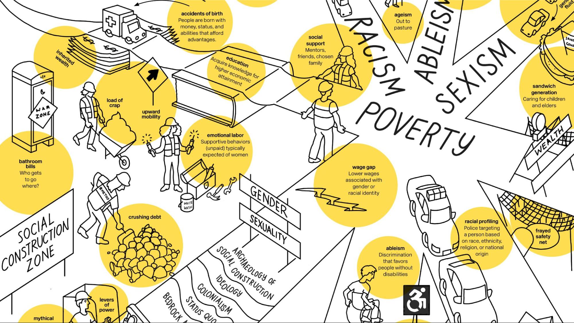
Page spread from the book Extra Bold.Page spread from the book Extra Bold.

  • Design the Cover Last: While envisioning the cover early on might be tempting, Lupton recommends waiting until the content is finalized to design the cover. This ensures the cover accurately reflects the book’s essence and appeals to the target audience.
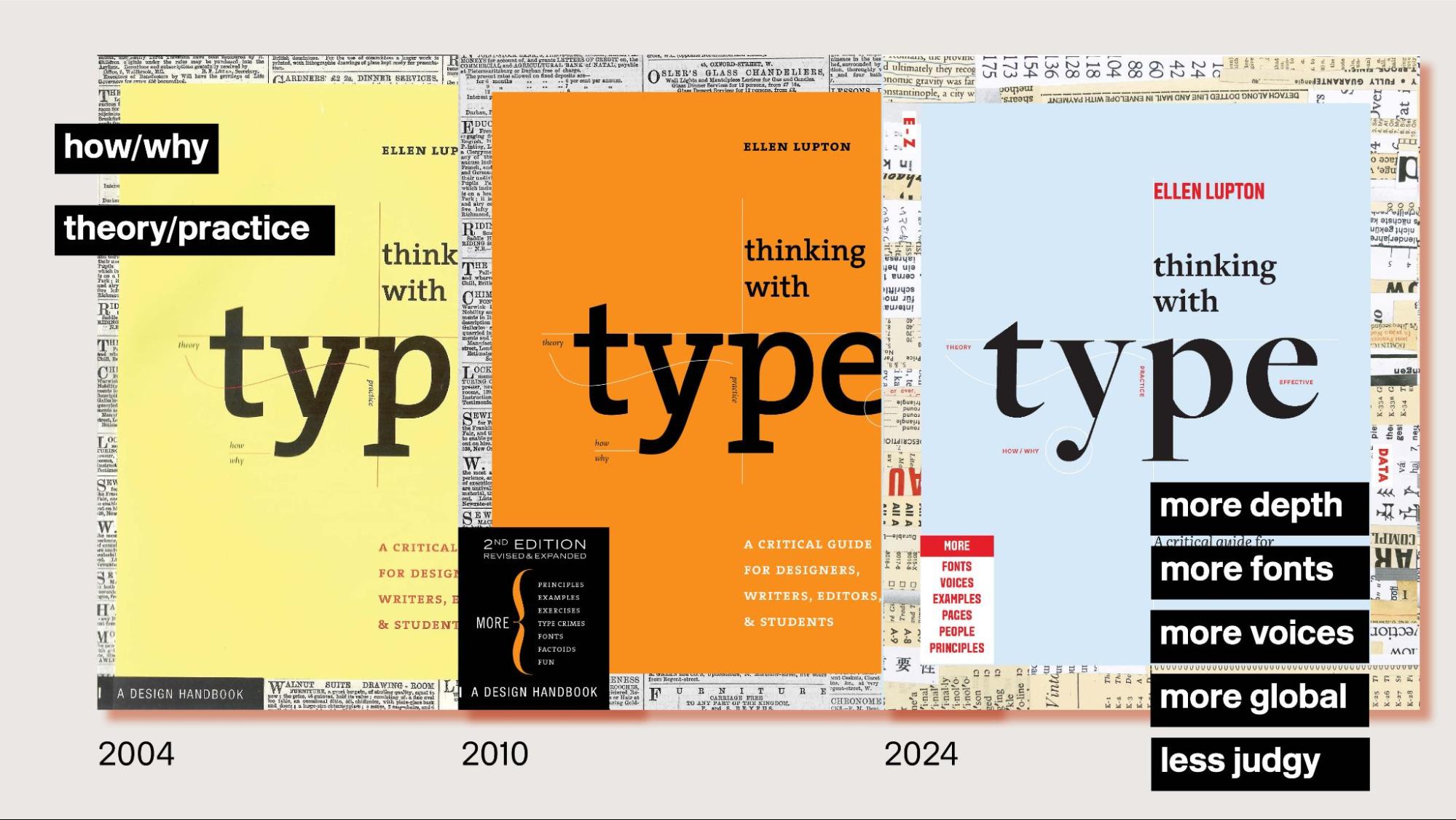
Books covers from different editions of Thinking with Type.Book covers from different editions of Thinking with Type.

Lupton illustrated these principles with examples from her own work, including Design Is Storytelling and Extra Bold, showcasing how a thoughtful approach to structure, layout, and language can enhance the reader’s experience and create engaging and impactful publications. Her third edition of Thinking with Type serves as a compelling example of how a book’s design can evolve to reflect changing perspectives and a more inclusive philosophy.

Towards A Collaborative Publication

Tony Venne, Head of Design at the Walters Art Museum and publication designer for BmoreArt Magazine, shifted the focus to the collaborative process behind BmoreArt’s print journal. He highlighted how BmoreArt has consistently embraced collaboration, fostering a unique creative process involving photographers, artists, and writers.

Venne’s presentation traced the evolution of BmoreArt’s collaborative approach, sharing anecdotes and behind-the-scenes glimpses of the magazine’s development.

Early in the process, Venne realized the importance of shared knowledge and mutual learning, as he brought his print experience to the team while Cara Ober, BmoreArt’s publisher, provided extensive knowledge of Baltimore’s art community. This dynamic exchange, evident in their first team meeting and Cara’s first press check, laid the foundation for a fruitful collaboration.
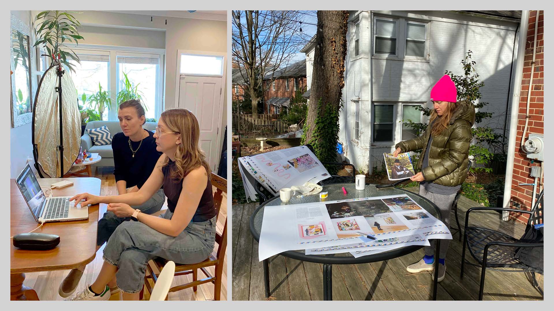
BmoreArt Magazine’s editor Cara Ober with photographer Brady Robinson.BmoreArt Magazine’s editor Cara Ober with photographer Brady Robinson.

Venne emphasized that BmoreArt’s collaborative process extended beyond the core team. They actively engaged photographers, like Brady Robinson, in the creative process, moving away from traditional models where photographers worked in isolation. This collaborative approach gave the team more control over the visual storytelling and facilitated a deeper understanding of the artists and their work.

This spirit of collaboration even led to unexpected ventures, like a “takeout photoshoot” during the pandemic, highlighting Baltimore’s comfort food scene and supporting local restaurants struggling amidst lockdowns. These spontaneous collaborations, driven by shared interests and a desire to support the community, became a defining characteristic of BmoreArt’s approach.

Venne also described how BmoreArt’s design adapted to the evolving content, demonstrating how publications can “learn” and evolve over time. The need to credit artists featured in photoshoots led to significant changes in the publication’s grid, including repositioning folio numbers for longer captions. This evolution showcased how collaboration can necessitate flexibility and creative problem-solving in publication design.
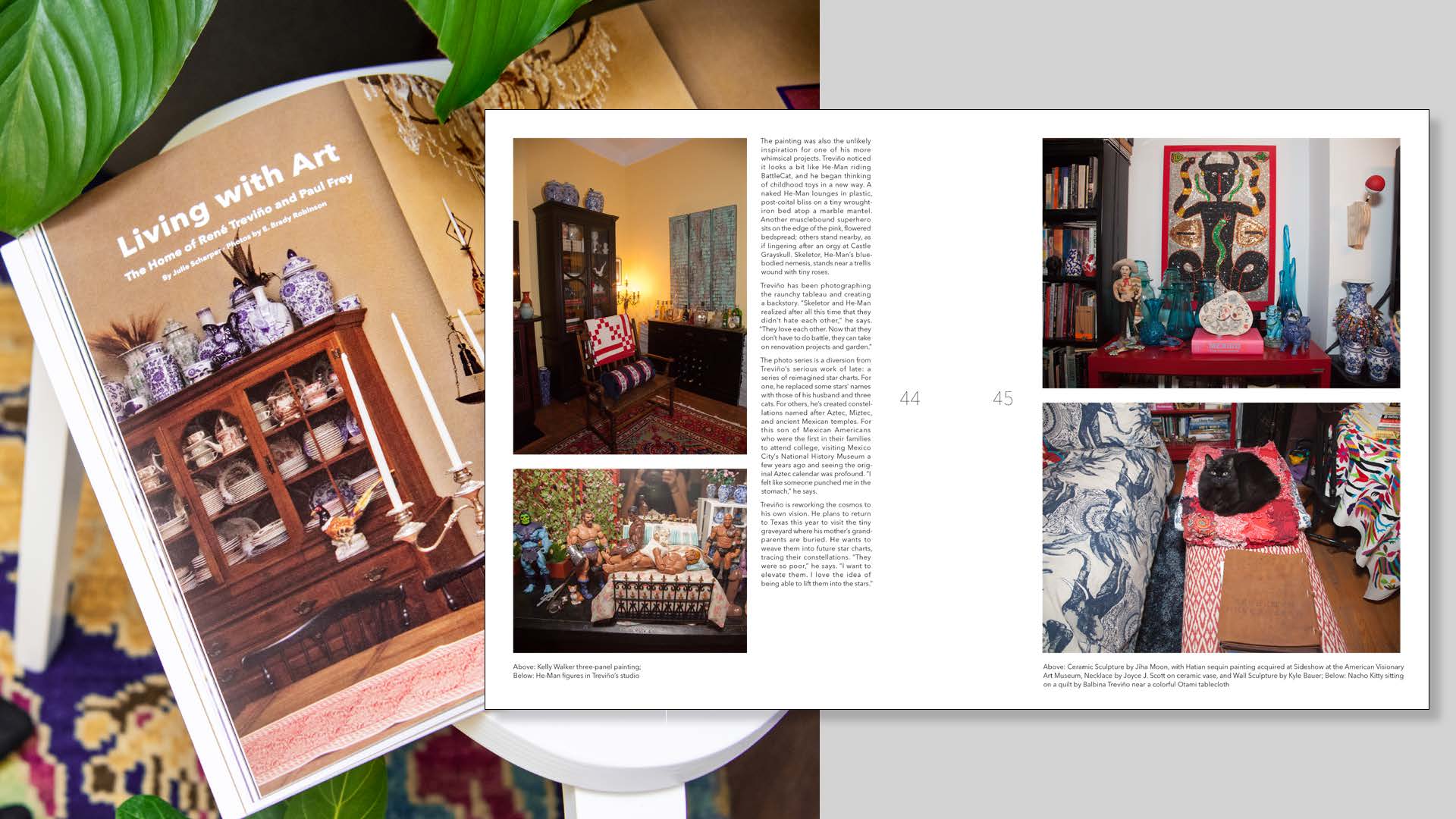
Repositioning folio numbers on BmoreArt Magazine pages to accommodate longer captions.Repositioning folio numbers on BmoreArt Magazine pages to accommodate longer captions.

Furthermore, Venne emphasized the significance of cover design, revealing how Amy Sherald’s cover photoshoot marked a turning point for BmoreArt. The team’s dedication to this shoot, recognizing Sherald’s rising national prominence, led to a more sophisticated and elevated aesthetic, solidifying BmoreArt’s position as a platform for showcasing Baltimore’s vibrant art scene.
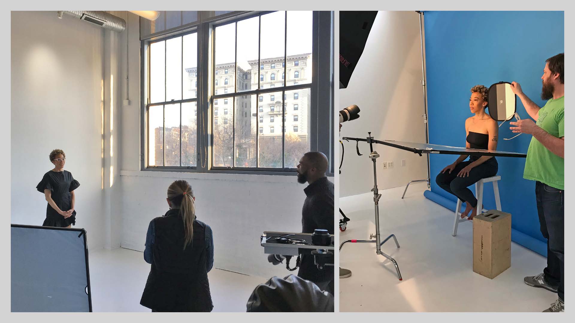
Amy Sherald’s BmoreArt Magazine cover photoshoot by Kelvin Bulluck.Amy Sherald’s BmoreArt Magazine cover photoshoot by Kelvin Bulluck.

Throughout his presentation, Venne underscored the importance of being open to new ideas and perspectives, embracing the unexpected turns that collaboration can bring. He concluded by reflecting on the enriching experience of collaborating with a diverse group of creatives, which has broadened his understanding of design and fostered a more inclusive approach to his work.

Crafting Artist Books as Collaborative Art

Raquel Castedo, a Brazilian graphic designer, educator, and researcher based in Baltimore, brought her expertise on artist books to the forefront. Castedo, who teaches book design at MICA and serves as BmoreArt’s Creative Director, focused on the collaborative aspects of crafting artist books, highlighting the unique challenges and rewards of such projects.

Castedo framed her presentation by emphasizing the significance of artist books, not only for designers and artists seeking to showcase their work but also for art enthusiasts, collectors, writers, and anyone interested in understanding the collaborative efforts behind these unique publications.

She then detailed the creation of Post-Consumption Benediction, a limited-edition artist book published as a companion to a two-person exhibit featuring Adam Stab and Jordan Tierney. The exhibition ran at BmoreArt’s Connect + Collect Gallery from December 2022 to March 2023. This project served as a case study, demonstrating the collaborative process and the importance of honoring the artists’ vision and materiality.
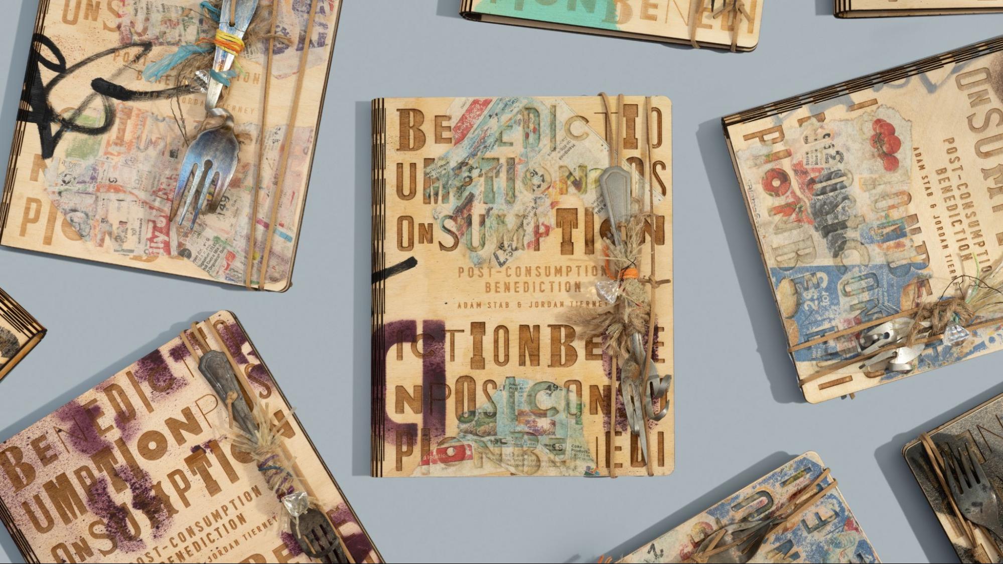
Limited-edition artist book Post-Consumption Benediction, featuring the work of Baltimore artists Adam Stab and Jordan Tierney, published by BmoreArt.Limited-edition artist book Post-Consumption Benediction, featuring the work of Baltimore artists Adam Stab and Jordan Tierney, published by BmoreArt.

Castedo’s journey began with studio visits, where she immersed herself in Stab and Tierney’s creative process, learning about their materials, techniques, and inspirations. These visits were crucial in fostering a connection with the artists and understanding their work’s essence.

Drawing inspiration from the artists’ use of found objects and their commentary on consumer culture and environmental crisis, Castedo sought to create a book that felt like a “found treasure.” The unique typography discovered in their artwork informed the book’s visual identity, including a custom-designed texture incorporating the exhibition’s title.

Castedo’s presentation also delved into the production process, highlighting the collaborative efforts required to bring the book to life. The decision to use wood for the cover led to a partnership with Open Works, a Baltimore-based makerspace. The team at Open Works, led by Zack Adams, experimented with laser engraving techniques, testing various wood thicknesses and refining the design to achieve the desired aesthetic and durability.
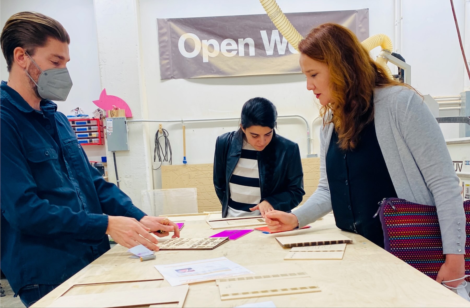
Zack Adams, project coordinator Inés Sanches de Lozada, and Raquel Castedo at Open Works.Zack Adams, BmoreArt project coordinator Inés Sanches de Lozada, and Raquel Castedo at Open Works.

The production process involved a multi-stage approach, with each layer adding a new dimension to the book’s physicality. After laser engraving, the covers were spray painted by Adam Stab, followed by a second round of laser cutting. Jordan Tierney then added collaged elements to each cover, creating a unique textural interplay. Stab then added handwritten details with permanent markers, further enhancing the book’s handcrafted feel.

Finally, the BmoreArt team gathered at Tierney’s studio to attach the interiors to the covers and add a final touch: unique forks sourced by Tierney from Baltimore rivers, adding a symbolic and evocative element to the book.

Castedo highlighted that the success of Post-Consumption Benediction—recently awarded Gold in the 10th Bornancini Award for Editorial Design, a prestigious honor presented by ApDesign in Brazil—was rooted in the strength of the collaborative network behind its creation. She emphasized the importance of fostering connections with artists, designers, production teams, and vendors, including Open Works and Indigo Ink, which handled the printing of the book’s interior.
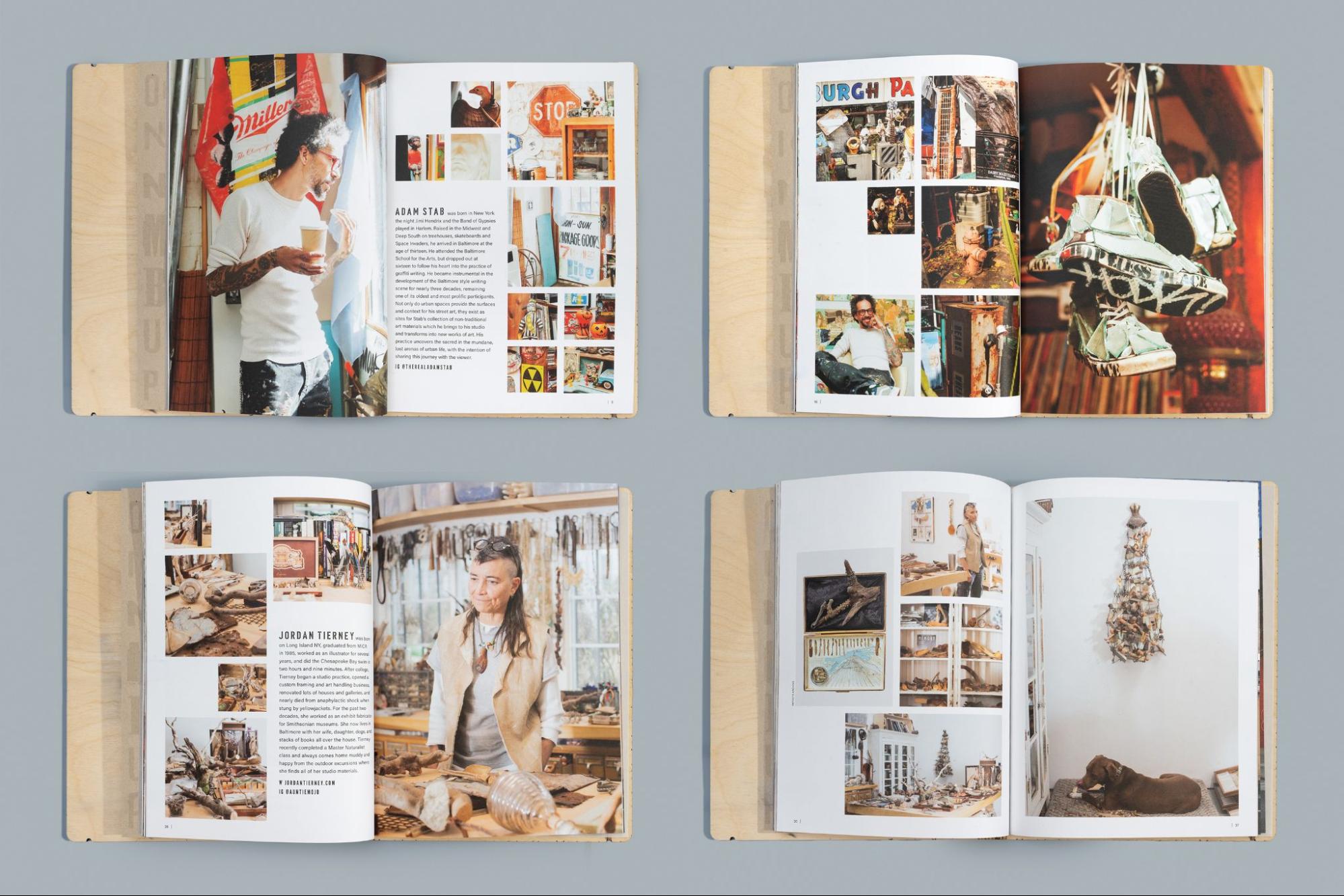
Post-Consumption Benediction book interior pages.Post-Consumption Benediction book interior pages.

Furthermore, Castedo highlighted the often-overlooked aspects of book production, such as shipping and distribution. She advised designers to consider the practicalities of shipping and the costs involved early in the process. She also emphasized the importance of finding the right community for the book, ensuring its accessibility and preservation for future readers.

Post-Consumption Benediction, now part of the special collections at several Baltimore institutions, stands as a testament to the power of collaboration. It transcends mere documentation, becoming an extension of Stab and Tierney’s artistic practice, embodying their creative spirit and the unique materiality of their work.

Discussion and Audience Q&A

Following the presentations, a lively Q&A session offered the audience a chance to engage directly with the panelists, raising insightful questions about the future of design, the intersection of art and capitalism, and the challenges of navigating the digital landscape. The discussion underscored the importance of inclusivity, audience awareness, and the enduring value of physical objects in an increasingly digital world.

The panelists highlighted the lasting significance of books and publications, recognizing them as time capsules that preserve cultural moments and artistic expressions for future generations. They encouraged attendees to be thoughtful in their creative practices, considering not only their message and audience but also the long-term impact of their work.

Ethical considerations in design were also addressed, particularly regarding the tension between artistic expression and commercial pressures. The panelists advocated for a balanced approach that supports creative freedom while critically engaging with the systems that influence artistic production.

The role of social media and online platforms in contemporary design was another key topic. While acknowledging their value for communication and promotion, the panelists stressed the importance of maintaining a discerning perspective—prioritizing authentic connections over superficial online engagement.

The “Crafting the Page” panel at MICA provided an invaluable opportunity to explore the multifaceted world of publication design. Through engaging presentations, thoughtful discussions, and a dynamic Q&A session, the event fostered a sense of community among designers, artists, and writers, inspiring creatives to embrace collaboration, challenge conventions, and craft publications with meaning and purpose.

Resume Writing: Guidance for Designers

Writing a resume can be a daunting task for many. What template should you use? Remembering and articulating your tasks PLUS results? Do you need to customize every resume?

But do designers have different rules than other professions? When I have partnered with Creative and Design directors to identify design talent, they have all requested that the designers have a portfolio or samples of work to supplement the resume. In fact, many have prioritized the portfolio over a resume.

This article offers two distinct perspectives on crafting powerful resumes for design roles. First, I’ll share my comprehensive resume guidance applicable to all professionals.

Next, to go beyond assumptions, I interviewed 11 design leaders in the DC and Baltimore area. They offer their unique insights on what truly catches their eye when evaluating design talent.

Clarity before Writing

Before you decide upon the formatting of your resume, spend time to self-assess and reflect on your career journey up until this point. What projects have you enjoyed contributing to? What type of work environment do you work best in? What are your strengths and weaknesses? What are your longer-term career goals, and what stepping stones do you need to take to get there?

By identifying where you have been and the experiences you have had, you can create a unique value proposition to market to employers. What factors could make you different?

  • The projects you have worked on
  • The industries you have helped
  • Hard skills, training, and methodologies
  • Aesthetic/style (shown in the portfolio)

Have you analyzed the job descriptions you are applying for to make sure your resume speaks to the job requirements? If the job supports government clients, a requirement may include knowledge of Section 508 compliance or the need for an active security clearance. Other requirements could include design software exposure, industry experience, or project type.

Will the ATS kick me out?

The short answer is no. First, an Applicant Tracking System (ATS) is the centralized software system that businesses deploy to manage the recruitment process. Typically, if you are applying to a job online there is a software system where you upload your resume and fill out open fields with your personal information. I wrote an article about the Myths of the ATS system with insights from a dozen recruiters who are the end users.

Many people believe that if your resume isn’t formatted correctly or has the right keywords, the system will boot you out and reject you for the job. Some recruiters and companies may set a job opening to screen with a knockout question, such as “are you authorized to work in the US” or “do you have X years of experience.” If the answer doesn’t align to the requirements, an automated rejection may trigger.

Otherwise, up until today, I do not know any recruiters who are fully relying on keyword match or ranking tools to move applicants on to interviews.

The one thing to be mindful of is how the content of your resume parses into the fields of the ATS system. Text boxes, columns, and images can alter the data extraction of the parsing. With the systems I have worked with, I can view PDF and Word docs as they were submitted.

General Resume Advice

Formatting:

  • Choose a chronological format, prioritizing your most recent experience.
  • Enhance readability by incorporating a fair balance of white space rather than cramming content into the document.
  • Use readable fonts and adopt a font size larger than 10. I shouldn’t have to zoom in to read your resume.
  • Avoid unnecessary visual elements, like a headshot or subjective skill graphics. While I’ve seen a huge uptick in including a headshot over the last five years, you may want to take precautions due to concerns about discrimination based on appearance.
  • Consider offering both PDF and Word document formats, although PDF documents will maintain formatting consistency.

Content:

  • Contact Information: Include relevant details like email, phone, city/state, and LinkedIn/portfolio URLs. A street address is not necessary and maintains your privacy.
  • Summary: Ditch “Objective” and use a targeted statement showcasing your value proposition. This field is a simple space where you can customize your resume to the target job.
    • Consider removing generic sentences inflated with soft skills. For example: Passionate and results-driven web designer with X years of experience crafting user-friendly and visually stunning websites
    • For more impact, you could transform it into a unique statement aligned to the job: Web designer with 5 years of experience creating high-performing websites for SaaS companies. Passionate about leveraging design to empower users and streamline financial processes in the fintech space.
  • Experience: The majority of your content should be dedicated to this field. For readability, format the sentences in a bullet-point list. Include the tasks + results, and quantify your results when you can. Examples:
    • Example: Increased website conversion rate by 15% by redesigning checkout flow using user-centered design principles and A/B testing.
    • Designed a captivating logo for tech startup, resulting in 42% increase in brand recognition within first 6 months.
  • Skills: List relevant software, technical, and language skills, possibly categorized for clarity.
  • Achievements: Consider a separate section for awards, scholarships, certifications, or honors (limit to 2-5).
  • Education: List recent degree, institution, and relevant awards/honors. Include coursework details only if you have no work experience.
  • References: Remove any mention of Reference, as this information can be provided once you convert to an interview. Plus, do you want anyone reaching out to your references without your knowledge?

Additional Tips:

  • Proofread meticulously to avoid grammatical errors or typos. If you aren’t using software tools like Grammarly, hand it off to a trusted colleague or friend to proofread.
  • Have a few copies of your resume if you are targeting different job titles. For example, if the job is for a “Content Designer” then include any project details around content design principles or methodologies. In the summary, swap out the copy “Summary” for “Content Designer.” Do you have an achievement you can highlight here that matches a job requirement?
  • Adding interests or hobbies is your personal choice.
  • Don’t keyword stuff. Instead of creating a laundry list of skills, weave the keywords into your experience section to demonstrate context.

Insights from Design Leaders

Resume advice can be subjective, as everyone has their preferences (and biases). I also wanted to seek out advice from people who are influencing and making the hiring decisions. Here are the recommendations of eleven design leaders from the DC metro area:

Jay Selway, Creative Director at Accenture Federal, prioritizes the portfolio over the resume. “If the resume isn’t nicely designed, that’s a red flag.” However, Jay admits he has seen not-so-impressive resumes from people with amazing portfolios. He said, “the work gets you in the door, and your personality and passion close the deal. The qualifications are the cherry on top.”

A Chief Creative and Founder of a DC-based boutique firm reviews both the resume and portfolio to assess design talent. For the portfolio, he looks for a consistency and sense of style across pieces, along with a sense of proportions and typography. For the resume, design is as important as the content. Seen as a self-marketing opportunity, he looks for creativity and personable branding. Specifically, “how they handle their names? Do they give themselves a logomark? Are there widows and orphans in the type?” Even the decision to use a Word document doesn’t demonstrate the full potential of a creative.

A VP of Design from a real estate tech firm says that a resume that is easy to read and is well-organized, paired with relevant experience is the ideal recipe for an effective resume. What else catches their eye? If the applicant showcases skills needed for the job requirements, like flows, wires, research, and design systems. If you are entry-level, the coursework outweighs the academic performance (like GPA). If the resume is poorly designed with excessive fancy formatting, it negatively impacts the readability.

A VP of Creative & Design, with experience in both a corporate and global agency setting, says that the “portfolio will always be king.”, but be sure to demonstrate your process. Include your sketches, inspiration, and round builds to demonstrate your thinking and unique contribution to the project. For the resume, keep it simple, well-organized, and thoughtfully crafted. Choose a clean typeface that allows the content to be the hero.

Billy Candela, SVP Creative Director at Vox Global, believes that the resume design matters. A well-designed resume (preferably in PDF) showcases a designer’s attention to detail and reflects their overall design skills. The portfolio is a confirmation of the capabilities on the resume. Both the resume and portfolio are a first impression and an extension of your self-marketing, so make them easy to navigate and highlight your relevant experience.

A resume is the sneak peak of your design style before getting into the cool stuff in your portfolio, an AVP, Creative of an agency stated. A clean, readable layout with a bit of creative spark will stand, but it’s about how the design and information work together.

A marketing executive at a SaaS technology company believes less is more with resume writing, but keep it relevant. Crafting an impressive resume is all about telling a concise and captivating story that sets you apart. Focus on clear, tailored writing for your target job level, skip the fancy designs, and cut out the excess. Utilize solid facts and stats to prove your expertise, ditch the flowery language. Research keywords for those resume-scanning bots. Keep it to one page-ish, sync it with your LinkedIn, and add a professional pic and background. Personalize those opening letters, 100% avoid any typos(triple check), and keep it snappy. If you share a portfolio, make it straightforward and showcase your value with meaningful metrics. Your resume should tell a compelling tale of your intentions and your desired company fit. Stay flexible and realistic, avoiding both self-doubt and overconfidence.

“The creativity should not overshadow or overpower the message,” says a Creative and Marketing leader, about the criteria of a strong resume. A one-page resume is preferred, without a personal photo, and it must have clean visual design language and a hierarchy of information. They also seek a business-minded creative, so showing metrics and KPIs shows they understand the value ifor delivering results. As a leader of people, they do give weight to skills and behaviors–not just what they can do but how they do it. A portfolio is also a must-have!

The owner of a Baltimore creative agency prioritizes a strong portfolio and a compelling narrative of the thought process and context behind the work. Real-world experience trumps formal education. As for a resume? It’s not a necessity, especially if the designer has a robust LinkedIn presence.

A Sr. Creative Director from a global PR agency prioritizes 3 main sources when evaluating a design candidate: LinkedIn, a portfolio, and a resume. A LinkedIn profile provides a history of experience and education, and the portfolio showcases the designer’s skills and style. A resume is still important, as it hones in on the designer’s attention to detail. This includes typography, choices of visual hierarchy, and formatting like sentence breaks. Designers who make resumes too “designy” or branded like infographics risk being offputting and overselling their authenticity.

The design leader of a digital solution firm emphasizes the importance of targeted, clear, and visually appealing application materials to demonstrate an understanding of the job and how you can add value. With a resume, focus on clarity and relevance–help the hiring manager understand how you could apply those skills and learnings to the new role. For formatting, make it succinct and scannable. The portfolio connects the dots of the skills and experience stated in the resume. Content design matters! Treat your portfolio design with the same care you’d give client work. And if you consider a cover letter? First, ditch the generic template. Secondly, don’t focus just on your experience. Bridge the gap by showing how that experience will meet the business challenge at hand.

Wrapping up

While I’ve shared my approach to resume writing paired with the valuable insights from design leaders who are calling the shots on hiring, remember that hiring is nuanced. If anything, the perspective from the 11 is a clear example of this.

Ultimately, each interviewer brings their own unique perspective and priorities. Don’t be afraid to tailor your resume and highlight experiences that resonate with specific companies and roles. Experiment, seek feedback, and trust your instincts to craft a resume that authentically reflects your talent and aligns with your target job.

About the writer

Kelli Hrivnak

LinkedIn | Website

Kelli Hrivnak is a leader with over 15 years of experience in staffing and recruitment services. Recognizing the limitations of quantity-driven staffing models, Kelli embarked on a mission to create a forward-thinking alternative. She is founder of Knak Digital, a recruiting agency prioritizing strategy and quality over high-volume recruitment. Throughout her career, Kelli has partnered with various companies, from Fortune 500 corporations to start-ups. Her extensive background in the technology and marketing industry has provided her with valuable insights and a deep understanding of client needs.