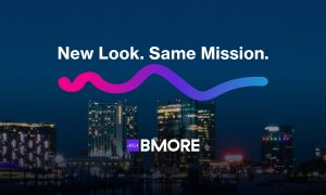
We introduced AIGA Baltimore’s pink-oriented branding in 2016 (reference). The Baltimore chapter has served the design community for 36 years, but the impact of design has shifted drastically over the past decade.
Why We Refreshed the Brand
The design industry has changed significantly, including the segmentation of design as a discipline. The COVID-19 pandemic also heightened the importance of health, wellness, and job satisfaction. At the same time, diversity, inclusion, and belonging have become central conversations in the creative industry.
AIGA Baltimore is a safe space for creatives to express themselves and connect meaningfully, beyond being a nonprofit organization. With this shift in purpose and perspective, the previous brand no longer reflected who we are.
Community Feedback
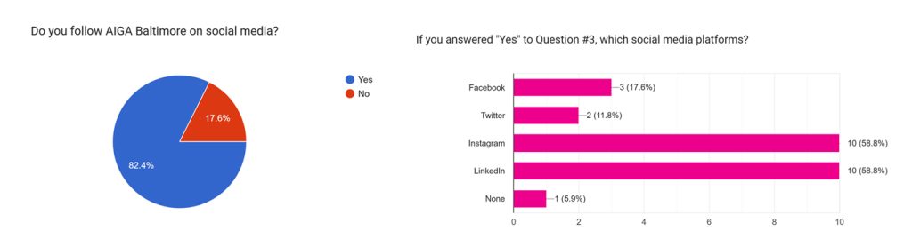
To lay the groundwork, we gathered feedback from both members and non-members. A public survey offered invaluable insights, and the overwhelming response became the foundation of the brand refresh.
“AIGA hasn’t been able to establish a relationship with creatives of color. Whether intentional or not, I think it speaks volumes.”
We asked hard questions during internal discussions:
- What do members gain from joining?
- Are the benefits clear and useful?
- Does our organization appeal to both beginning and seasoned designers?
Highlighting the Community
Baltimore is known for its restaurants, museums, and tourist attractions, earning its nickname “Charm City.” It’s also a place that embraces both its grit and its cultured environment, combining a small-town feel with strong urban roots.
As Maryland’s sole AIGA chapter, we wanted to capture this character in our brand. Our rebrand committee settled on the phrase “Unapologetically Urban” to reflect Baltimore’s bold and authentic spirit. This theme became the guiding principle for the new branding direction.
Creative Exploration
We began by drafting a mood board inspired by street culture, experimental typography, and bold colors. These elements capture the essence of Baltimore’s creative community.
After using the same color palette for eight years, we expanded beyond AIGA’s signature pink. Purple was added for its neutrality and sophistication.

Our refreshed look reflects Baltimore’s pride while preparing us for the future. Our chapter continues to be a resource for designers at all levels, offering workshops, networking events, competitions, and portfolio reviews.
The new identity embodies Baltimore’s creativity, pride, and resilience while setting the stage for future growth.
Conclusion
AIGA Baltimore cherishes our chapter’s dedication to inclusivity. This rebrand isn’t only about aesthetics. We aim to create a space where designers feel both empowered and supported.
We’re excited to continue our legacy of fostering a thriving creative community in Charm City!
