Top 7 Takeaways from Baltimore Design Week 2015
This past October, AIGA Baltimore celebrated design by kicking off its 4th annual design week. With over a half dozen events between Oct 16th-23rd, it was one of our best registered and attended design weeks to date. For those who missed it or just want a recap of the week’s events to tide you over until Baltimore Design Week 2016, here is a list of our top seven takeaways from 2015.
- Failure isn’t the end of the world
Alyson Beaton told us about her experiences with failure while developing her company, Lille Huset. Failure, as she says, teaches you when to let go, and when something needs to change.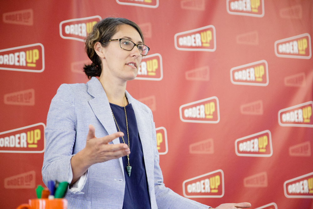
- Personal projects—projects just for you—are important
Not only do personal projects give you the opportunity to explore ideas or concepts outside of your day-to-day, but it can also be therapeutic. Daniel Danger spoke on how creating personal work helped him cope with complex emotions at the opening art talk for the National Poster Retrospecticus.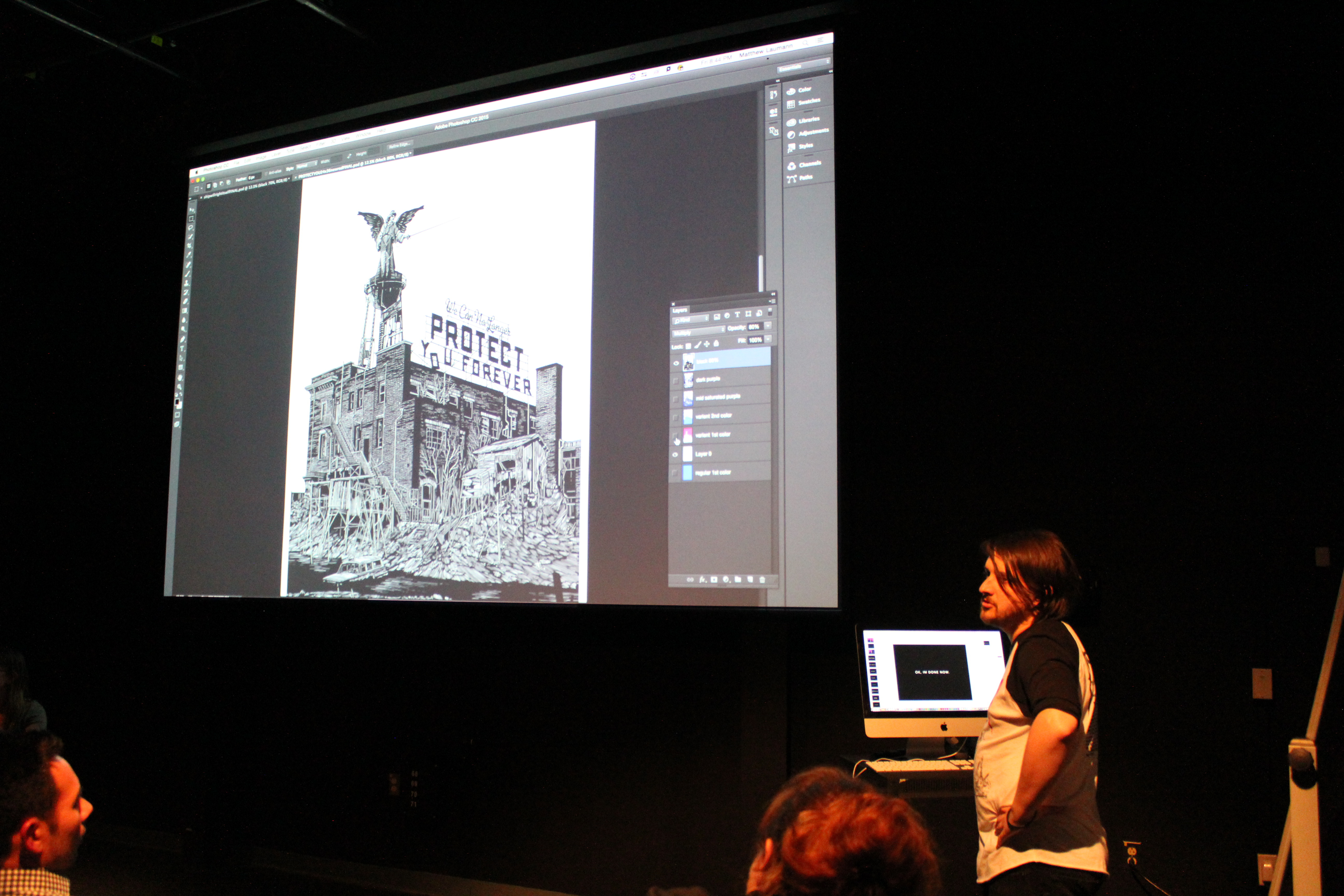
- Inspiration can be anywhere. Even graveyards.
While touring graveyards in Southwest England, Paul Barnes of Commercial Type was inspired by the worn, eroded tombstone lettering. This prompted him to create Dala Floda, an elegant stencil typeface that looks anything but military.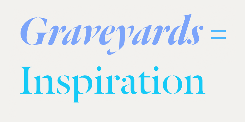
- A-N-A-C-I-N
Considered one of the oldest pain relief brands in the United States, Anacin made waves with their advertising strategy. Anacin television and radio ads were “designed to irritate” with their continually repeated unique selling proposition. One of the original television spots cost only $800 to create and generated $86 million in media buy revenue.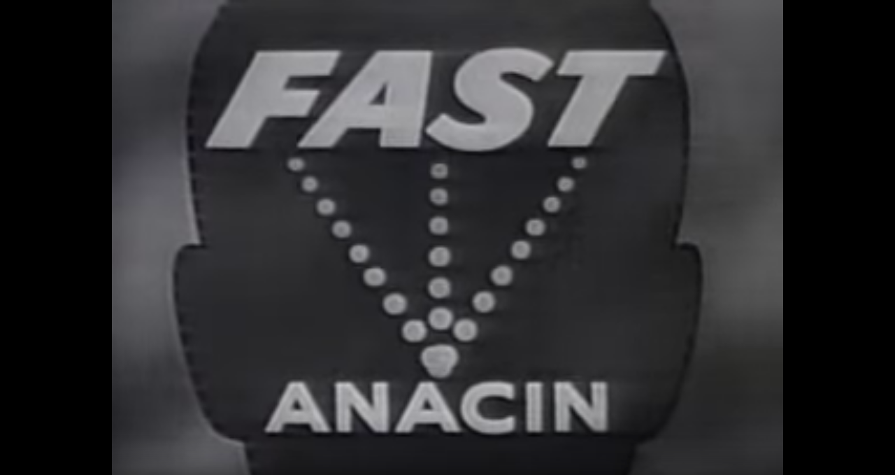
- Don Norman and the Norman Door
In its simplest terms, a Norman Door is a door that at first glance does not quickly convey how it should be opened—pushed or pulled. Named after Donald Norman, it represents one of the key principles of user experience design: To empathize with the user.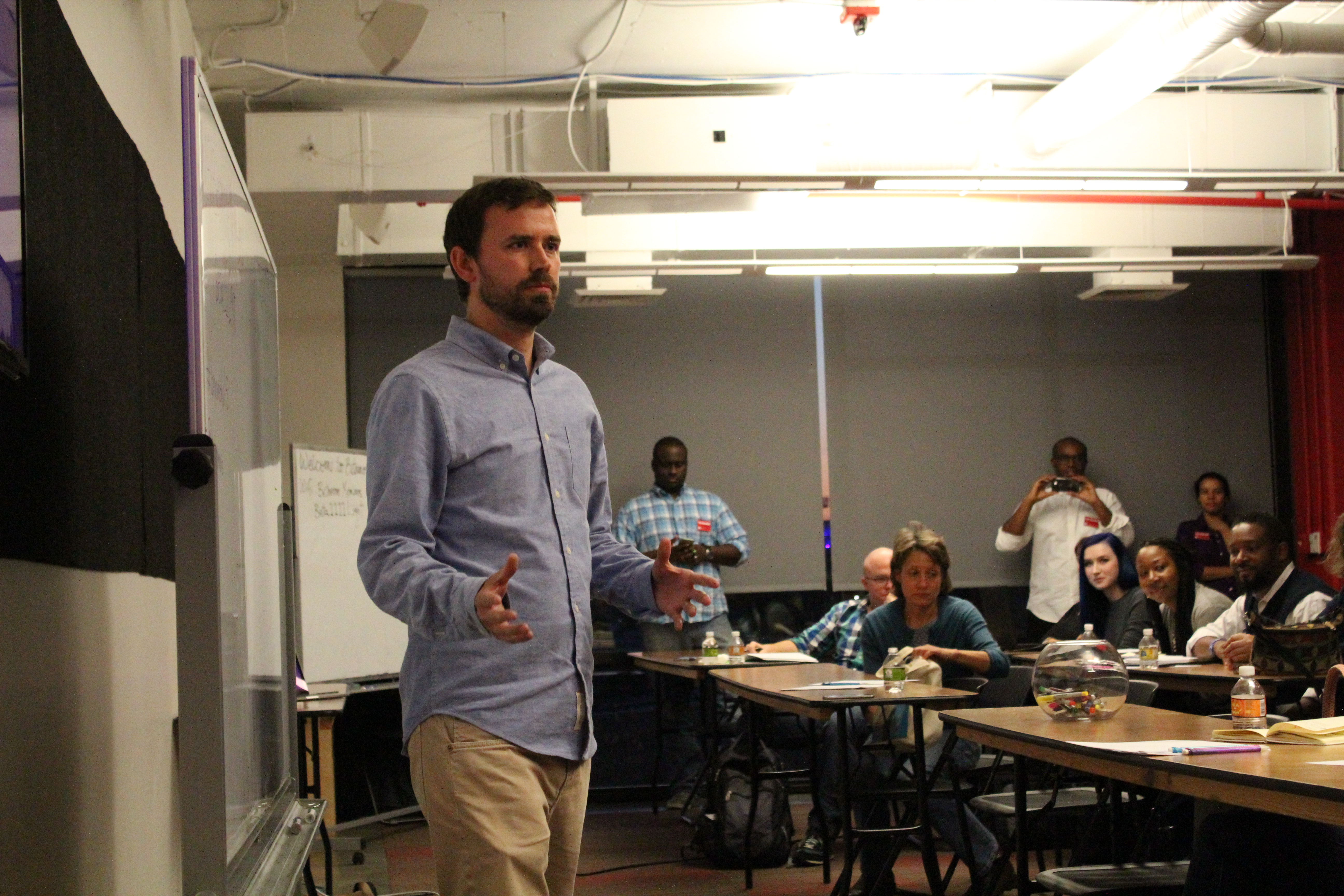
- Mad Men was 90% accurate
Thin ties aside, the 1960s marked the “age of the creative team”. Copywriters and art directors started working on advertising concepts together to share with the account executives, the true “Mad Men” of the era.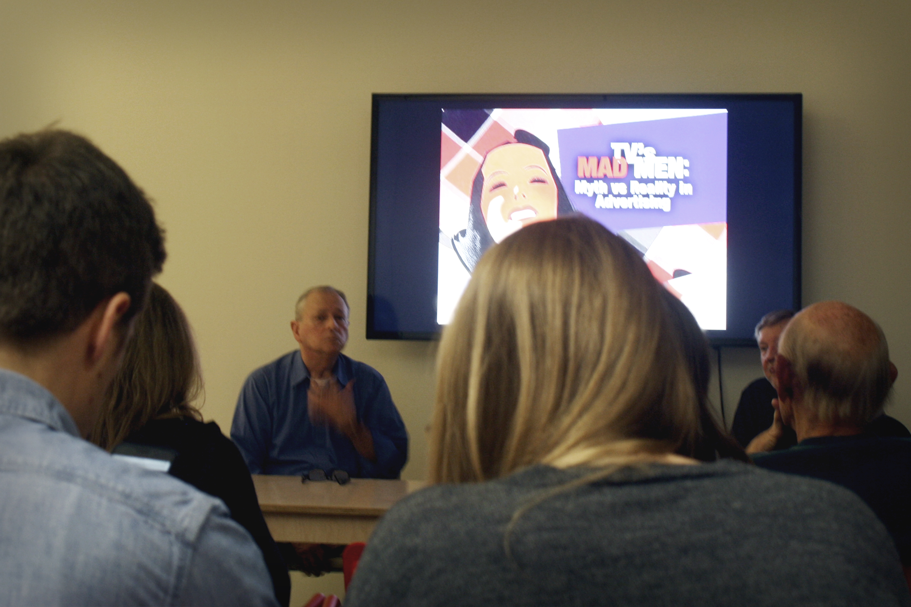
- What do you do when your client hates the one concept you had to show them?
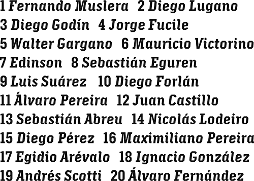
Get back to the drawing board. Fast. Commercial Type experienced this exact moment of panic while showing lettering concepts to Puma for their sponsored teams in the Africa Cup of Nations. They scrambled to come up with a new concept, Crepello, which ended up being a winner for them and the client.
Check back soon for more design week recaps. Who’s ready for Baltimore Design Week 2016?
Illustration by Niko Kwiatkowski
Shannon Crabill is a HTML Email Developer at T. Rowe Price. Outside of the Internet you can find her riding her motorcycle and binge-watching home improvement shows on HGTV. Tweet her at @shannon_crabill.

