Baltimore Magazine was first printed in 1907 by the Baltimore Chamber of Commerce. It is to this day, the oldest city magazine in the U.S. In 1994, Steve Geppi, owner of Rosebud Entertainment acquired the magazine with the goal of reviving the publication by rethinking its content as a channel to celebrate the great things that Charm City has to offer. With over 50,000 magazines in circulation, its in-house creative team collaborates diligently to keep the look and feel of the publication fresh and dynamic. Amanda White-Iseli has been Art Director for the publication for the last 16 years and shares insight on her in-house team.
How far in advance do you start working on your next issue?
Baltimore is a monthly publication designed on a 4- to 5-week production cycle. My team and I work closely with each other and with the editorial team throughout the cycle. Work begins even before the previous issue hits newsstands as art directors and designers meet with editors and writers to discuss the stories for the next issue. As a department, we all rely on each other for collaboration and critique at every step of the process. We’ve developed a strong, harmonious relationship with the editorial staff as well as with our digital and social media divisions, whom we also work closely with.
Special Editions and Marketing Art Director, Staci Lanham designs our quarterly Home section, our annual Baltimore Bride magazine, and all in-house promotional materials. Our Design and Print Division—headed up by Art Director Vicki Dodson and Senior Designer Michael Tranquillo—is creating fresh, new looks for businesses all over the region including print advertisements, stationary, media kits, newsletters, brochures, and more. Jon Timian is our Production Manager and is responsible for the top-notch production of the magazine—color correcting, along with the image, print, and paper quality. Production Artist, Marina Feeser designs ads and manages ad production for the monthly magazine as well as Baltimore Bride. Craig Forbes is our digital designer handling our web design and many of our online videos.
Understanding the broad strokes of the story and the writer’s tone influences the direction of the design and helps with the initial concept stage. Stephanie Shafer, the editorial design assistant, is responsible for part of the front of the book and all of the departments. Sophia Belitsos, the assistant AD, designs the rest of the front of the book, some features, and our Local Flavor section. I design the cover as well as features, provide direction to the assistant AD and design assistant, and manage the art department as a whole.
The three of us meet weekly to review progress, discussing design direction and potential illustrators and photographers that would be a good fit for the stories. Each person is responsible for creating art assignments for the stories they are working on.

Photography and Illustration have become a huge part of your publication, is all of this done in-house?
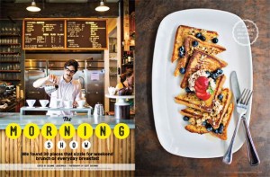
David Colwell, our Director of Photography, shoots a large part of the photography for any given issue. Front of the book sections such as “Charmed Life” are typically shot in our studio during the second week of the production cycle. The studio—which is a block away from our Lancaster Street offices in Harbor East—is a large, open space that provides an area where we can paint walls, build sets, and do whatever is necessary to shoot everything from fashion to portraits to product and detailed documentary photography for the monthly magazine as well as our annual Bride publication. (It was even used for a short scene in Season 2 of “House of Cards.”)
We also assign work to photographers in our extensive network of talented freelancers. We try to choose photographers whose style and aesthetic is a good fit for that particular project. We then send a detailed art assignment explaining the story and our design ideas, often including sample images that will help describe the look we are after. We try to give them two weeks to complete each assignment, although time is a luxury we don’t always have.

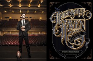
We approach illustration projects in much the same way, providing art assignments and examples of illustrations that will help guide the illustrator’s concept and initial sketches. We have worked with renowned painters and illustrators from all over the world as well as those in our own backyard, including MICA graduates and even some professors. We find most of our illustrators either through artist reps or as a result of their own dogged determination to promote themselves via print mailings and email inquiries (yes, a well-written email or catchy postcard still works).
Can you give an example of a recent concept for a cover that you really enjoyed working on? What was the process?

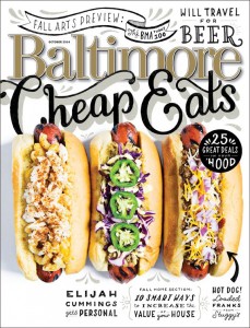
We recently produced our October 2014 Cheap Eats cover which was a lot of work–but really fun to do. The food stylists who I usually work with were unavailable, so I tried my hand at styling the dogs myself. I worked with photographer Scott Suchman who is gifted at shooting food. It was a long process that involved lots of buns, lots of toothpicks, and a soldering iron! I was really happy with the results. I also worked with illustrator Lauren Hom who is amazing! She did the hand lettering for the piece. I provided sketches of what I wanted to include and where—and she worked her magic.
How do you coordinate what goes into your print publication vs. digital?
We meet monthly with digital team to maximize the capabilities of digital media and make the content fresh and dynamic. This can include everything from redesigning charts and incorporating infographics to shooting behind-the-scenes footage from photo shoots as a supplement to the editorial content. We are active on Pinterest and Facebook, posting contests, polls, and generally maintaining an online presence that further nurtures our relationship with existing readers and helps develop new ones. That relationship, and the resulting communication, helps us deliver designs that complement and support the stories and enhance the reader’s experience.
Follow Baltimore Magazine: Facebook | Twitter | Pinterest
Jennifer Marin is co-president of AIGA Baltimore, you can follow her on Twitter: @hungry4design

