Each year for Baltimore Design Month (and previously Design Week), the AIGA Baltimore board selects a local partner to collaborate with in creating a brand that encompasses the theme for the year.
This year, we reached out to longtime community member, portfolio reviewer, designer and illustrator Emilee Beeson and the team at Mindgrub. Their enthusiasm and creativity made the process as smooth as a perfect bezier curve, and we couldn’t be happier with the results! So, to give you a peek behind the scenes, we asked Emilee to share more about the process.

Q: Can you tell us a bit about yourself?
A: I have been a designer and illustrator in Baltimore for about 10 years. I am currently an Art Director at Mindgrub where I design mobile apps, websites, advertising, and everything in between.
I also have a passion for printmaking, art, and illustration. A lot of the work I do on my own time is themed around video games, tv, movies, and other pop culture. I am always inspired by the weird and wonderful things that come out of those mediums.
Q: What made you excited to be a part of Design Month 2022?
A: When I first got involved with AIGA Baltimore it was circa 2012. I was on the reviewee side of the Ink&Pixels table and I won the branding competition for the event. We now know that design competitions are problematic but at the time I was over the moon about seeing my design on a real poster (and the iTunes giftcard!). I’ve grown as a designer through this chapter so it’s special to design the branding for one of their keystone events 10 years later. This time, with the time and resource support from Mindgrub, Creative Director, Meagan Petri and our SVP of Strategy & Design, Ben Slavin!
Q: What was the inspiration and goal of this year’s Design Month branding?
A: There is a good chance other creatives are feeling a lot like I have these past few years. It’s been hard to find the energy to be creative and get back into the communities we had before the pandemic. I wanted this year’s branding to be bright, playful, and optimistic. One of our favorite buzz word phrases here at Mindgrub is “creating moments of delight.” While we usually use this phrase in relation to micro interactions I think looking a bezier pen in the eyes as he taps his little feet is delightful. Hopefully delightful enough to make people smile and remind them to come out to an event!
Q: How did you approach this event branding project and what was your design process?
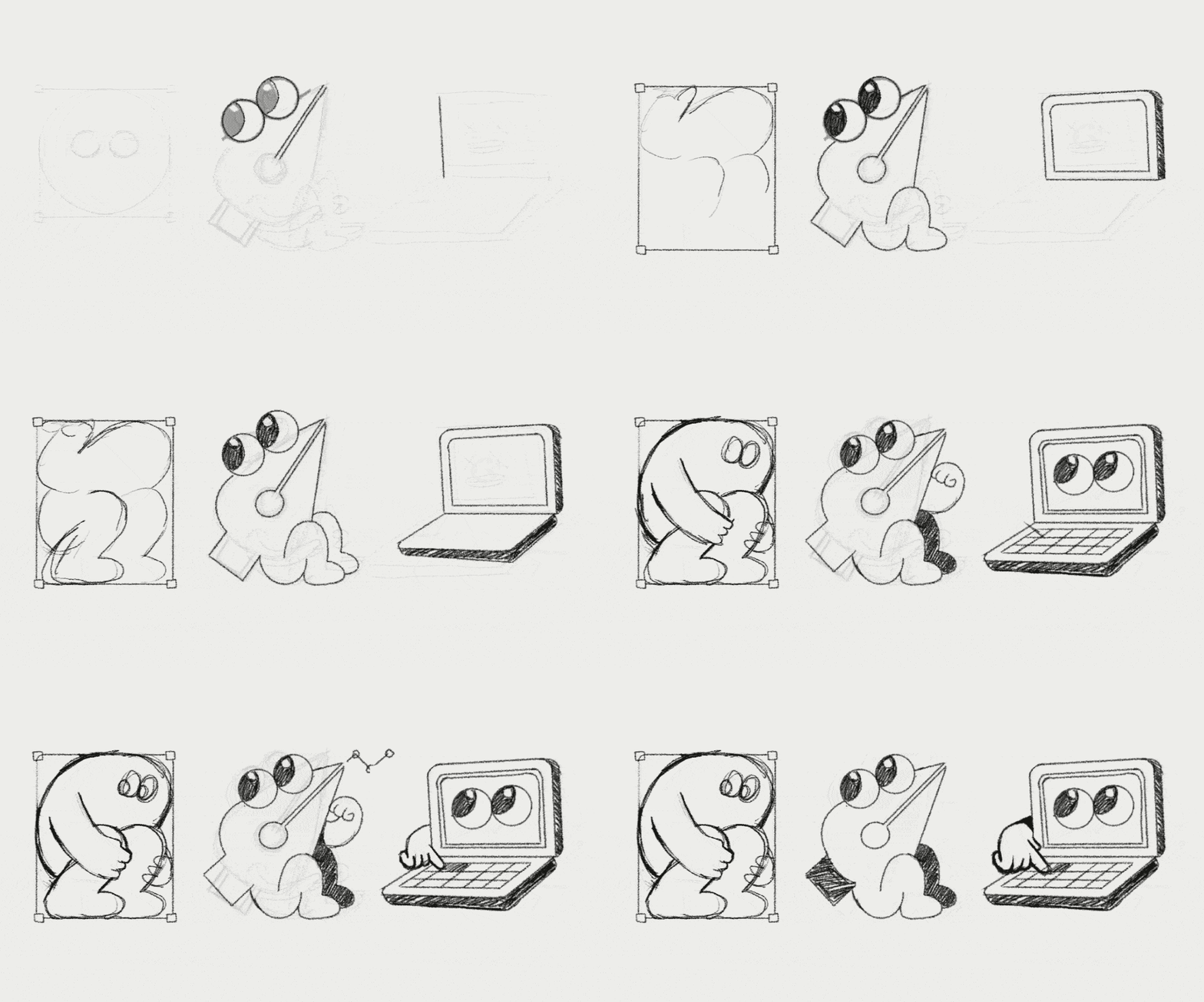
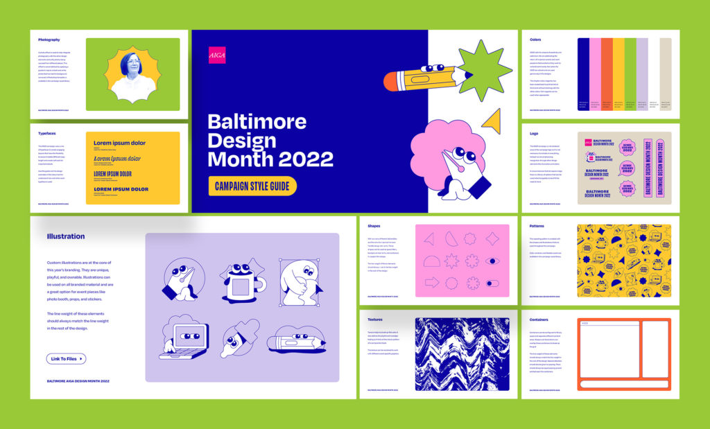
A: I often start with the technical requirements as guardrails. In this case I knew that scalability and flexibility were key as this branding would be applied to many different sizes and spaces over the course of a couple months. I also wanted this year’s theme “designing life” to come through. The character illustrations checked all of those boxes and had great potential for motion design and event swag. Once they were finished everything came together really easily.
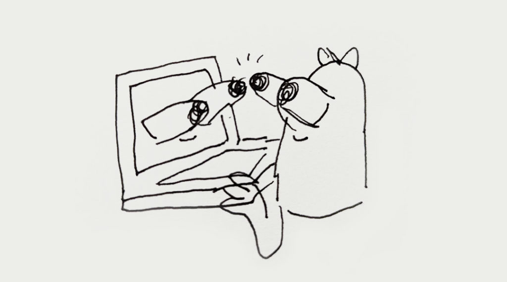
This sketch is what started it all but I decided touching eyeballs was a little too weird. You have to know when to dial it back.

Q: Can you describe your inspiration and any challenges you came across them while designing the branding?
A: I am always inspired by ephemera from the 80s. You can definitely see influence from 80’s puffy stickers in this branding. I am also really inspired by maximalist designs that feel a little ugly and aggressive. There is always that little voice that worries about criticism by committing to something so loud. But to me, being forgettable and underwhelming is a far worse fate.

Q: What are your typical process steps? Do they differ from the work you did for AIGA Baltimore?
A: Designing for other designers is always different than a typical client project. It’s a chance to be a little more out-of-the-box than what a normal client might allow. Presenting a wild idea and having everyone be on board with it doesn’t happen everyday!
Q: Could you explain an exciting Mindgrub project completely unrelated to AIGA?
A: We launched a mobile application for a major utility company called LG&E, KU and ODP. It’s always a good feeling when you start a project and everyone at the (virtual) table is an expert in their own right. Collaborating with designers, directors, scrum masters, product owners, and developers to create a massive tool that is actually useful to people is incredible. The app looks great and more importantly, works flawlessly.
Designing something flashy for a cool design event is easy. But playing a small role on a big team that is working together to make something beautiful and functional is something to really be proud of! Read the Case Study

