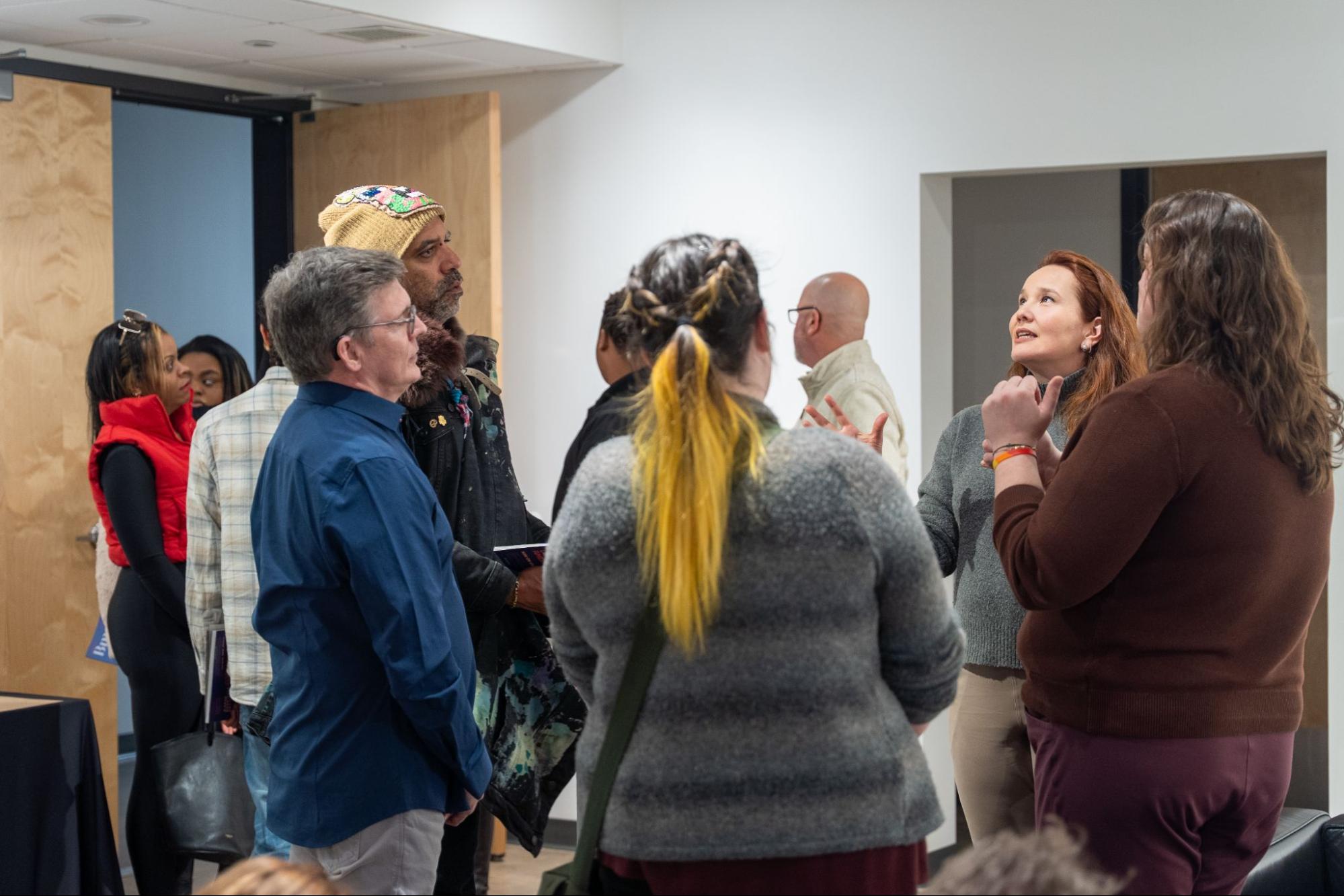
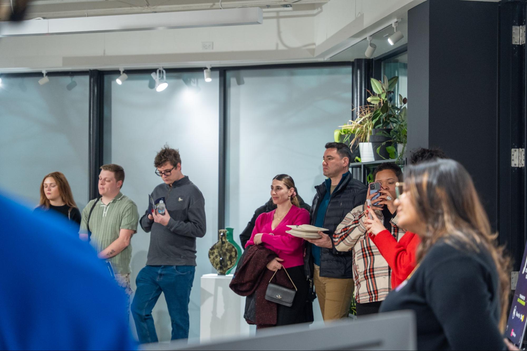
A recap of the AIGA Baltimore and BmoreArt panel at MICA
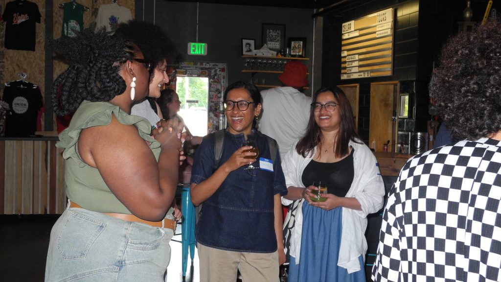
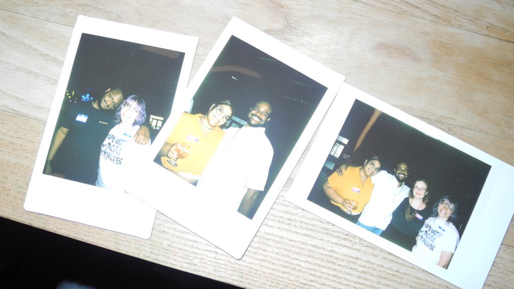
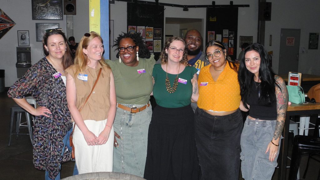
On November 28, 2024, the auditorium at the Maryland Institute College of Art (MICA) was filled with the energy of Baltimore’s and the DMV’s graphic design community. They gathered for the panel “Crafting the Page,” an event hosted by MICA, BmoreArt, and AIGA Baltimore as part of AIGA Baltimore Design Month.
The event featured presentations by Ellen Lupton, Raquel Castedo, and Tony Venne. Each shared their expertise, insights, and experiences, offering valuable advice to aspiring designers, artists, and writers. The presentations were followed by a lively Q&A session with the audience, fostering a vibrant exchange of ideas.
Moderated by BmoreArt’s editor-in-chief Cara Ober, this event provided valuable insights into design, partnership, and storytelling in publishing as part of the Design Month celebrations. For those who missed it, a recording of the panel is available to watch on YouTube.
Designing While Writing: four tips for creating engaging books
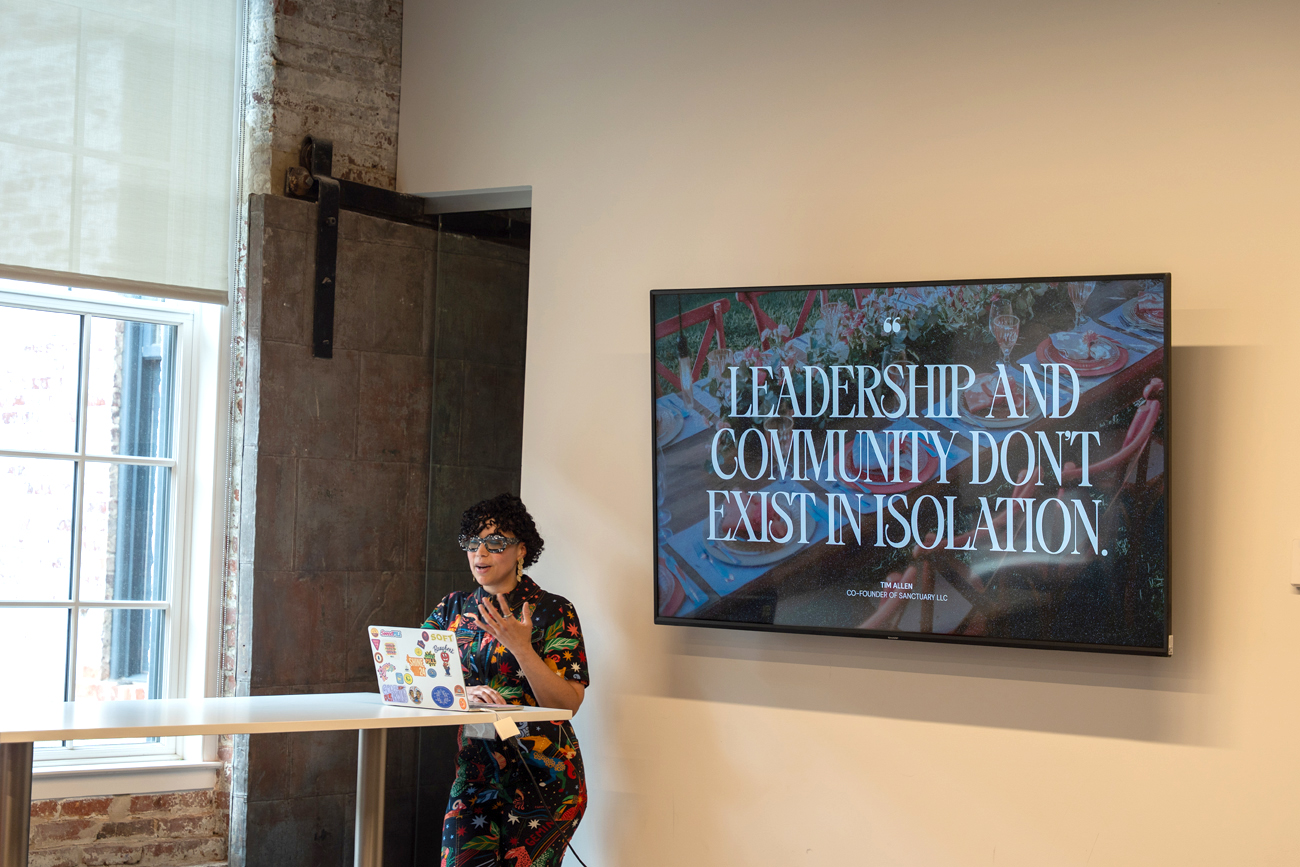
Ellen Lupton, a renowned author, designer, and educator, opened the evening by emphasizing the power of design and the magic of books. Lupton, who serves as the Betty Cooke and William O. Steinmetz Design Chair at MICA, has authored and co-authored over 30 books on graphic design, including Design Is Storytelling, Graphic Design Thinking, Health Design Thinking, and Extra Bold: A Feminist, Inclusive, Anti-Racist, Nonbinary Field Guide for Graphic Designers.
Lupton shared her four essential tips for creating compelling books, gleaned from her extensive experience as both author and designer:
- Start with a Table of Contents: The table of contents acts as a roadmap for the book, outlining its structure and guiding readers through the content. A well-crafted table of contents provides a clear overview of the book’s thesis and theory, like a map leading readers to treasures within.
- Design in Spreads: Recognizing that readers often jump around a book, Lupton advocates for designing in spreads, ensuring each two-page spread is visually appealing and makes sense on its own. This approach caters to diverse reading habits and ensures a satisfying experience for those who may not read the entire book linearly.
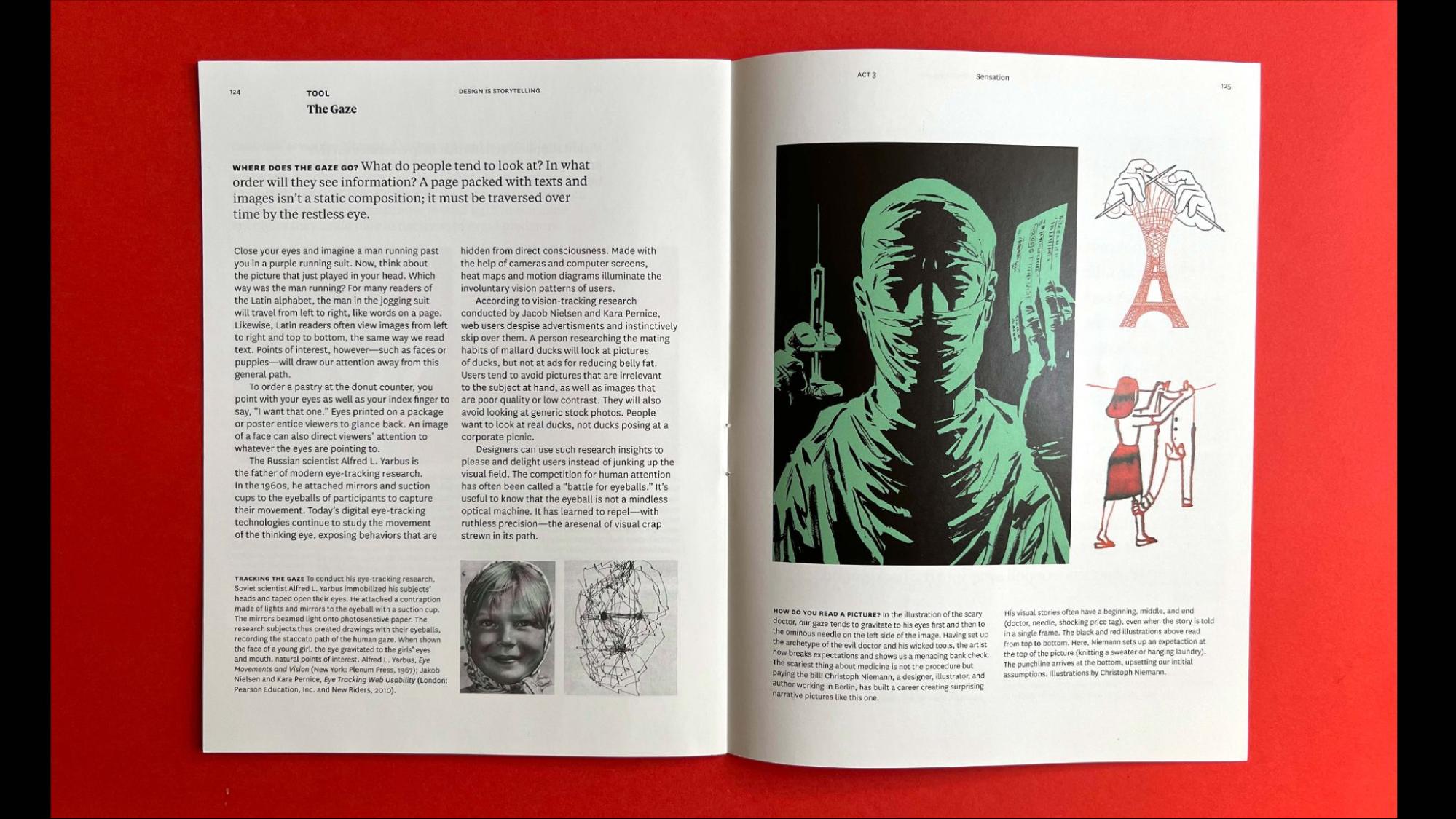 Page spread from the book Design Is Storytelling.
- Picture Your Reader: Lupton stresses the importance of considering the reader’s perspective and knowledge base. Authors and designers should strive for inclusive, simple, and direct language that respects the reader and avoids assuming a shared vocabulary. Visual elements can play a crucial role in making complex ideas more accessible to a broader audience.
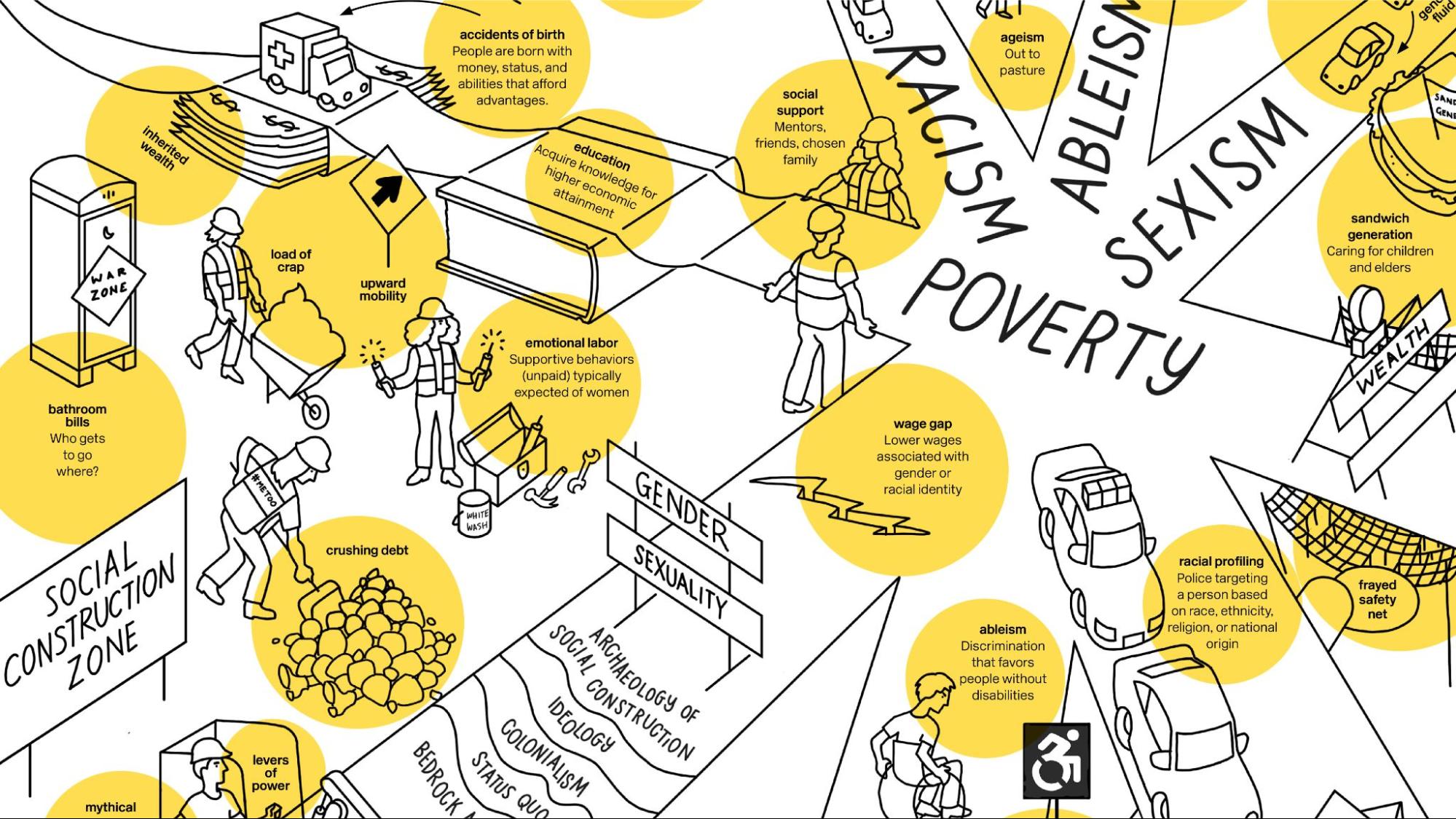 Page spread from the book Extra Bold.
- Design the Cover Last: While envisioning the cover early on might be tempting, Lupton recommends waiting until the content is finalized to design the cover. This ensures the cover accurately reflects the book’s essence and appeals to the target audience.
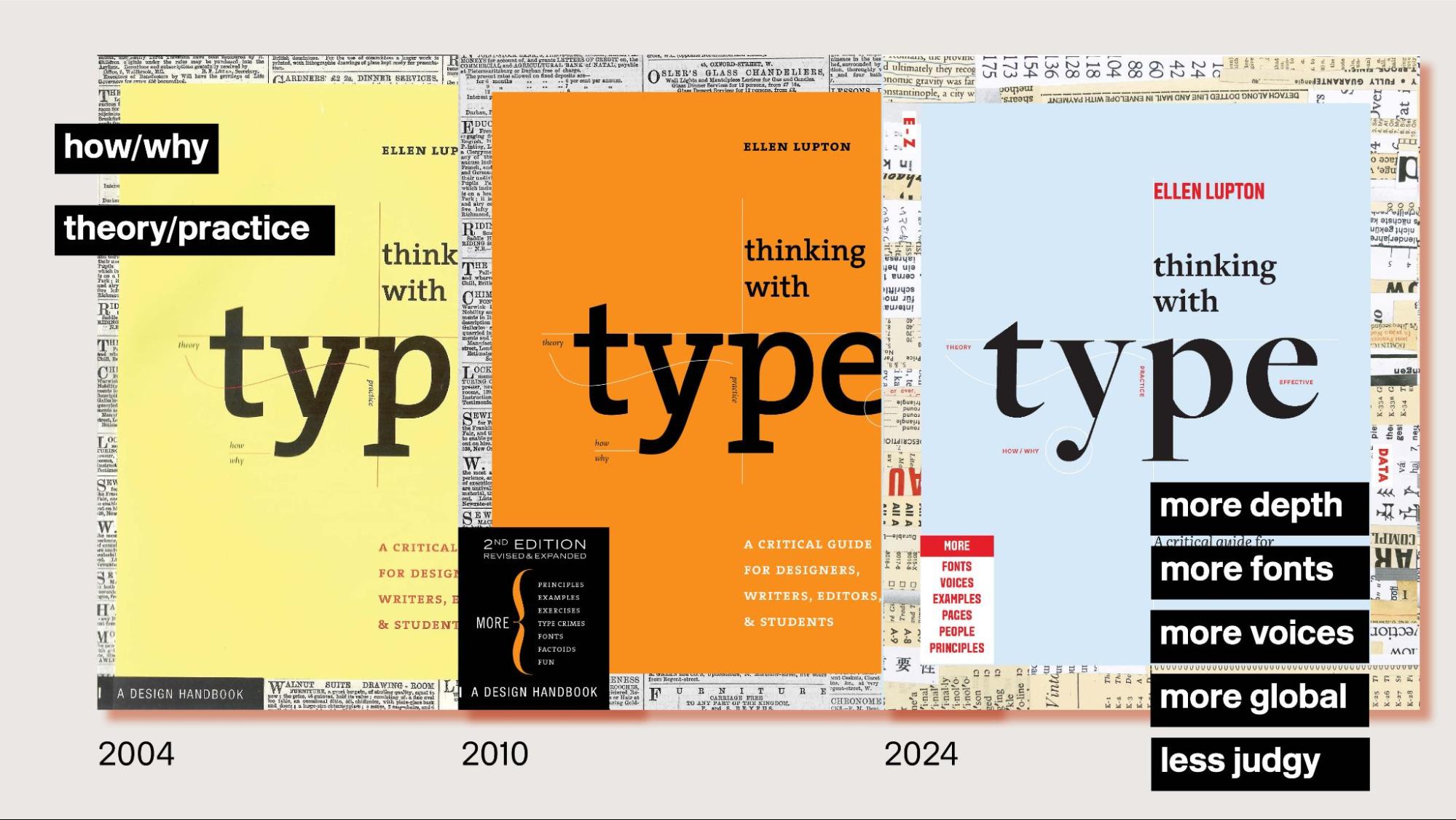 Book covers from different editions of Thinking with Type.
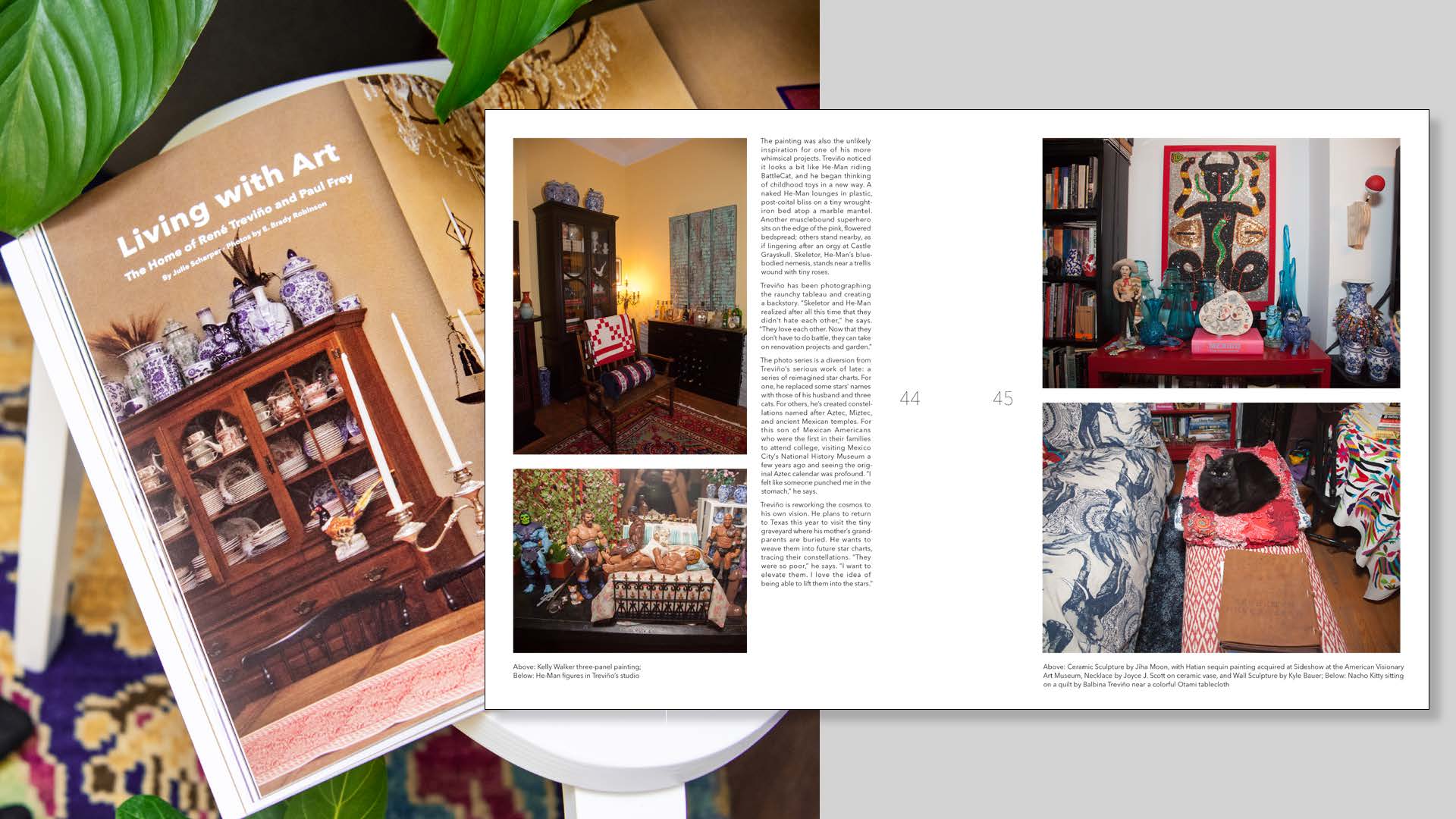
Lupton illustrated these principles with examples from her own work, including Design Is Storytelling and Extra Bold, showcasing how a thoughtful approach to structure, layout, and language can enhance the reader’s experience and create engaging and impactful publications. Her third edition of Thinking with Type serves as a compelling example of how a book’s design can evolve to reflect changing perspectives and a more inclusive philosophy.
Towards A Collaborative Publication
Tony Venne, Head of Design at the Walters Art Museum and publication designer for BmoreArt Magazine, shifted the focus to the collaborative process behind BmoreArt’s print journal. He highlighted how BmoreArt has consistently embraced collaboration, fostering a unique creative process involving photographers, artists, and writers.
Venne’s presentation traced the evolution of BmoreArt’s collaborative approach, sharing anecdotes and behind-the-scenes glimpses of the magazine’s development.
Early in the process, Venne realized the importance of shared knowledge and mutual learning, as he brought his print experience to the team while Cara Ober, BmoreArt’s publisher, provided extensive knowledge of Baltimore’s art community. This dynamic exchange, evident in their first team meeting and Cara’s first press check, laid the foundation for a fruitful collaboration.
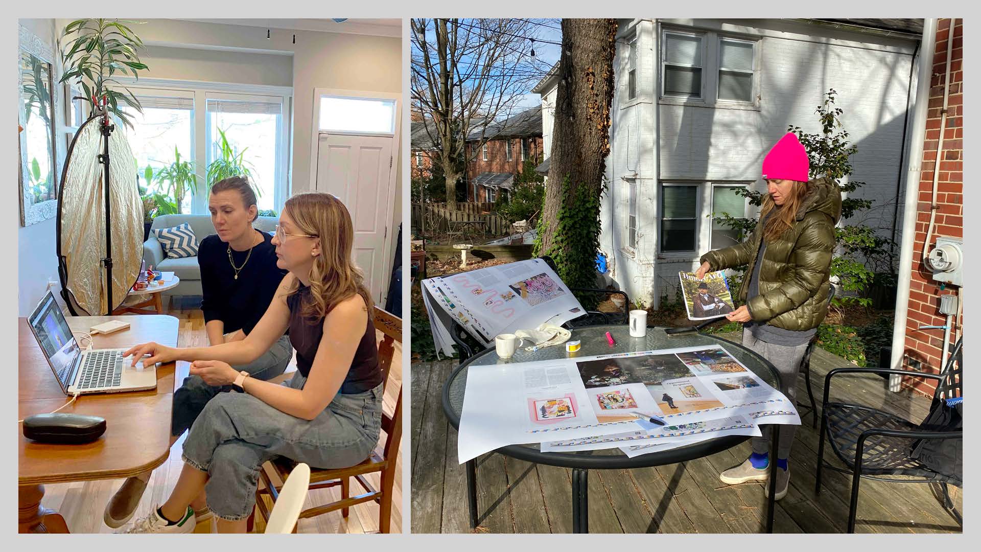 BmoreArt Magazine’s editor Cara Ober with photographer Brady Robinson.
Venne emphasized that BmoreArt’s collaborative process extended beyond the core team. They actively engaged photographers, like Brady Robinson, in the creative process, moving away from traditional models where photographers worked in isolation. This collaborative approach gave the team more control over the visual storytelling and facilitated a deeper understanding of the artists and their work.
This spirit of collaboration even led to unexpected ventures, like a “takeout photoshoot” during the pandemic, highlighting Baltimore’s comfort food scene and supporting local restaurants struggling amidst lockdowns. These spontaneous collaborations, driven by shared interests and a desire to support the community, became a defining characteristic of BmoreArt’s approach.
Venne also described how BmoreArt’s design adapted to the evolving content, demonstrating how publications can “learn” and evolve over time. The need to credit artists featured in photoshoots led to significant changes in the publication’s grid, including repositioning folio numbers for longer captions. This evolution showcased how collaboration can necessitate flexibility and creative problem-solving in publication design.
 Repositioning folio numbers on BmoreArt Magazine pages to accommodate longer captions.
Furthermore, Venne emphasized the significance of cover design, revealing how Amy Sherald’s cover photoshoot marked a turning point for BmoreArt. The team’s dedication to this shoot, recognizing Sherald’s rising national prominence, led to a more sophisticated and elevated aesthetic, solidifying BmoreArt’s position as a platform for showcasing Baltimore’s vibrant art scene.
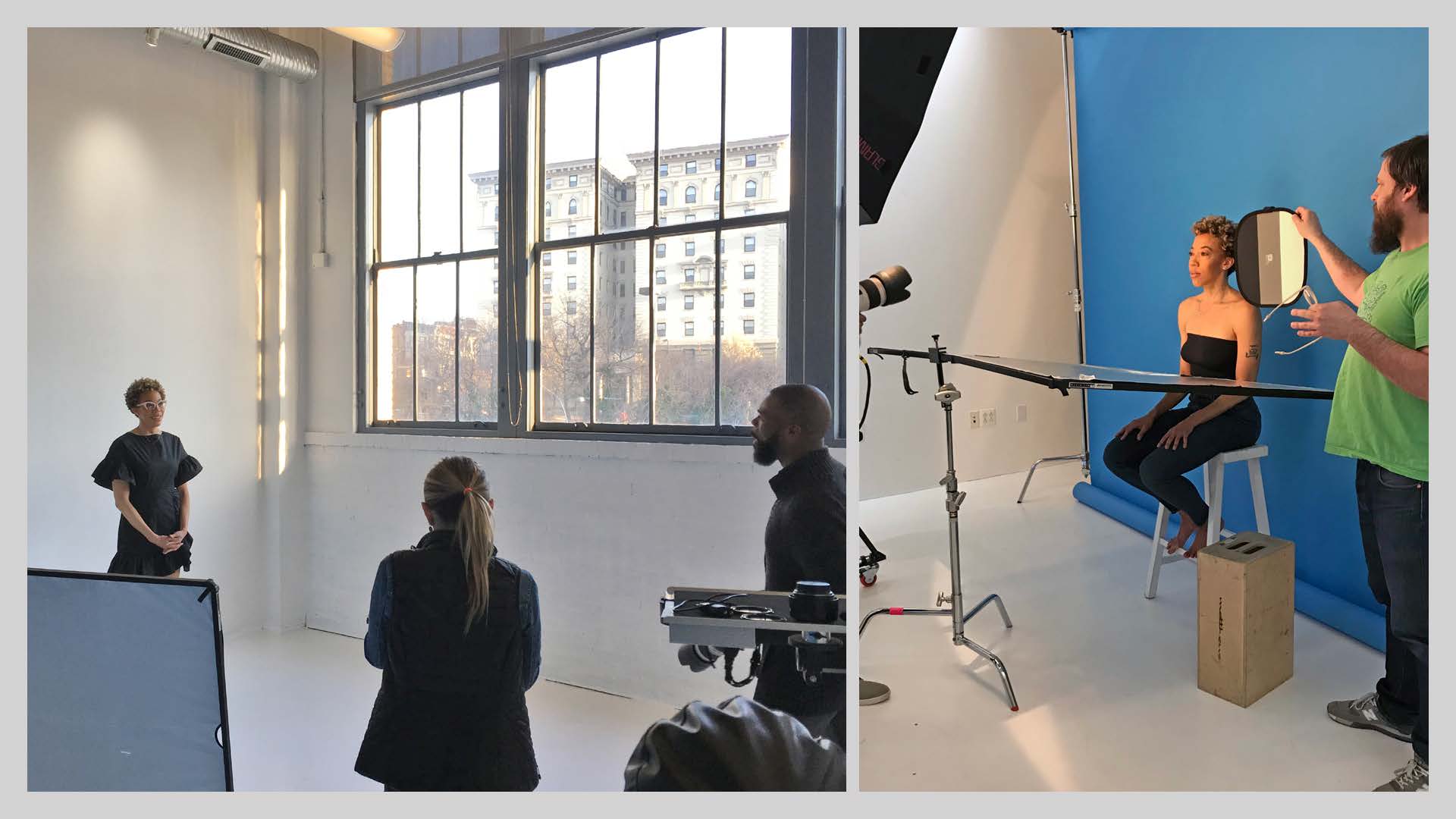 Amy Sherald’s BmoreArt Magazine cover photoshoot by Kelvin Bulluck.
Throughout his presentation, Venne underscored the importance of being open to new ideas and perspectives, embracing the unexpected turns that collaboration can bring. He concluded by reflecting on the enriching experience of collaborating with a diverse group of creatives, which has broadened his understanding of design and fostered a more inclusive approach to his work.
Crafting Artist Books as Collaborative Art
Raquel Castedo, a Brazilian graphic designer, educator, and researcher based in Baltimore, brought her expertise on artist books to the forefront. Castedo, who teaches book design at MICA and serves as BmoreArt’s Creative Director, focused on the collaborative aspects of crafting artist books, highlighting the unique challenges and rewards of such projects.
Castedo framed her presentation by emphasizing the significance of artist books, not only for designers and artists seeking to showcase their work but also for art enthusiasts, collectors, writers, and anyone interested in understanding the collaborative efforts behind these unique publications.
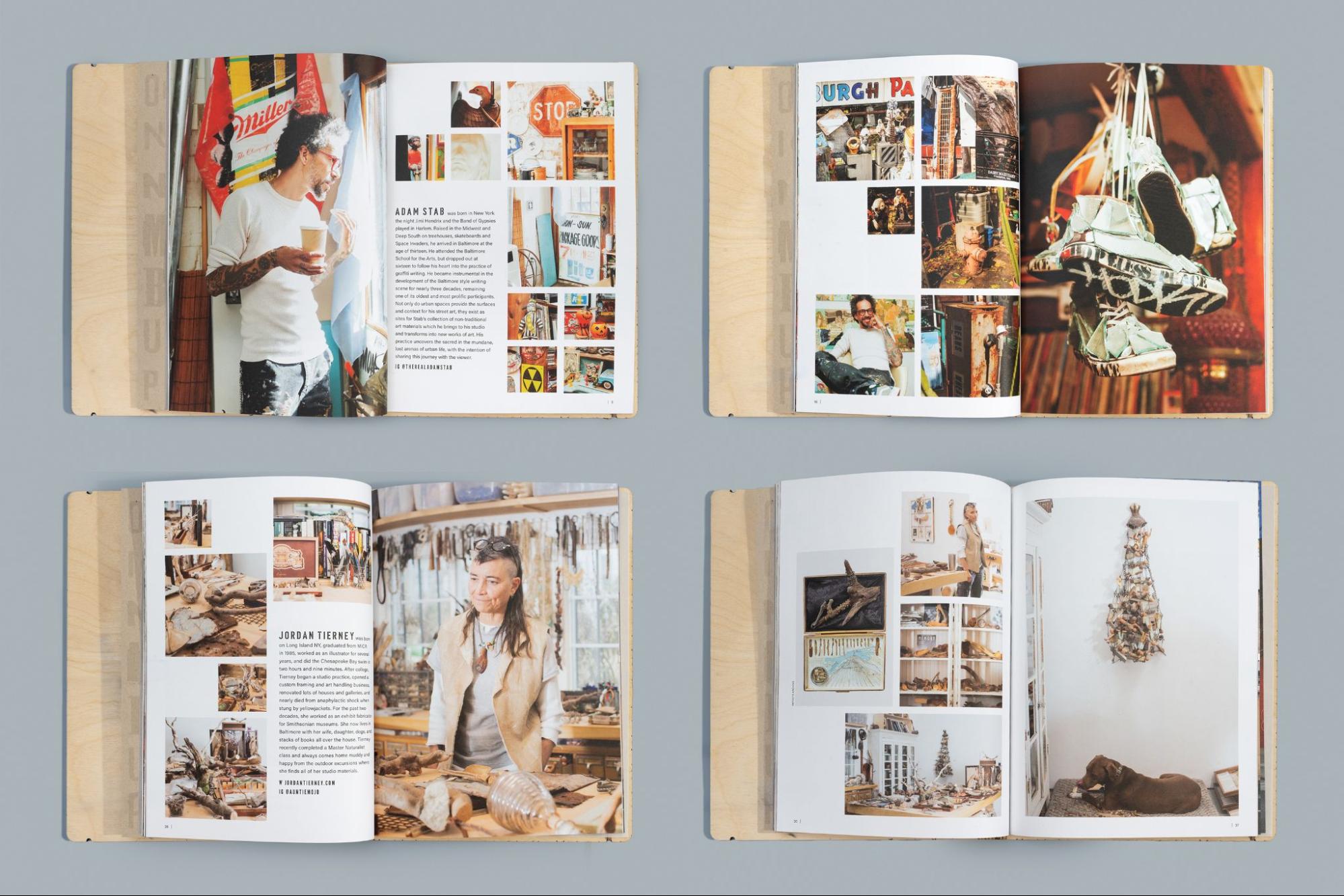
She then detailed the creation of Post-Consumption Benediction, a limited-edition artist book published as a companion to a two-person exhibit featuring Adam Stab and Jordan Tierney. The exhibition ran at BmoreArt’s Connect + Collect Gallery from December 2022 to March 2023. This project served as a case study, demonstrating the collaborative process and the importance of honoring the artists’ vision and materiality.
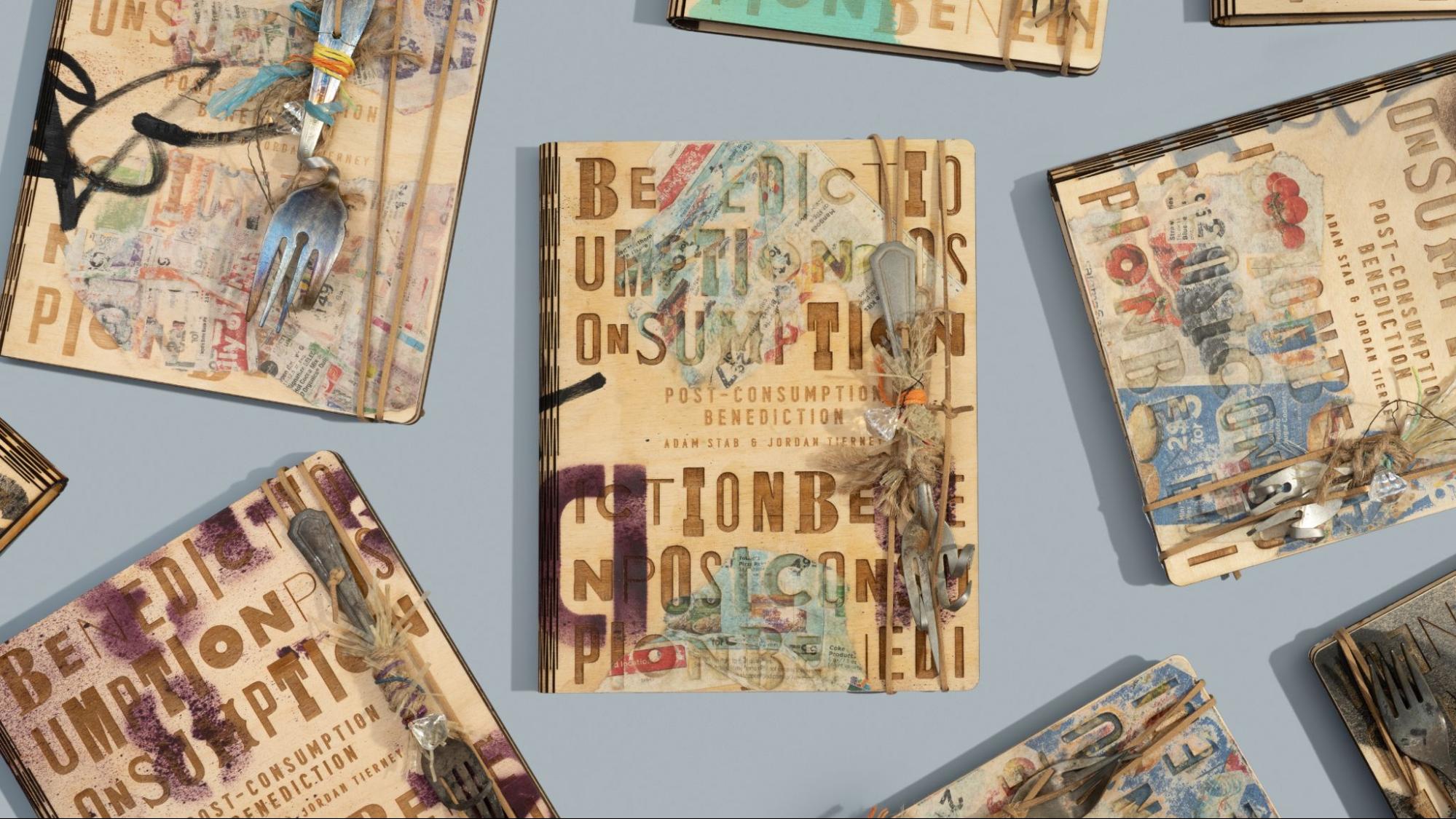 Limited-edition artist book Post-Consumption Benediction, featuring the work of Baltimore artists Adam Stab and Jordan Tierney, published by BmoreArt.
Castedo’s journey began with studio visits, where she immersed herself in Stab and Tierney’s creative process, learning about their materials, techniques, and inspirations. These visits were crucial in fostering a connection with the artists and understanding their work’s essence.
Drawing inspiration from the artists’ use of found objects and their commentary on consumer culture and environmental crisis, Castedo sought to create a book that felt like a “found treasure.” The unique typography discovered in their artwork informed the book’s visual identity, including a custom-designed texture incorporating the exhibition’s title.
Castedo’s presentation also delved into the production process, highlighting the collaborative efforts required to bring the book to life. The decision to use wood for the cover led to a partnership with Open Works, a Baltimore-based makerspace. The team at Open Works, led by Zack Adams, experimented with laser engraving techniques, testing various wood thicknesses and refining the design to achieve the desired aesthetic and durability.
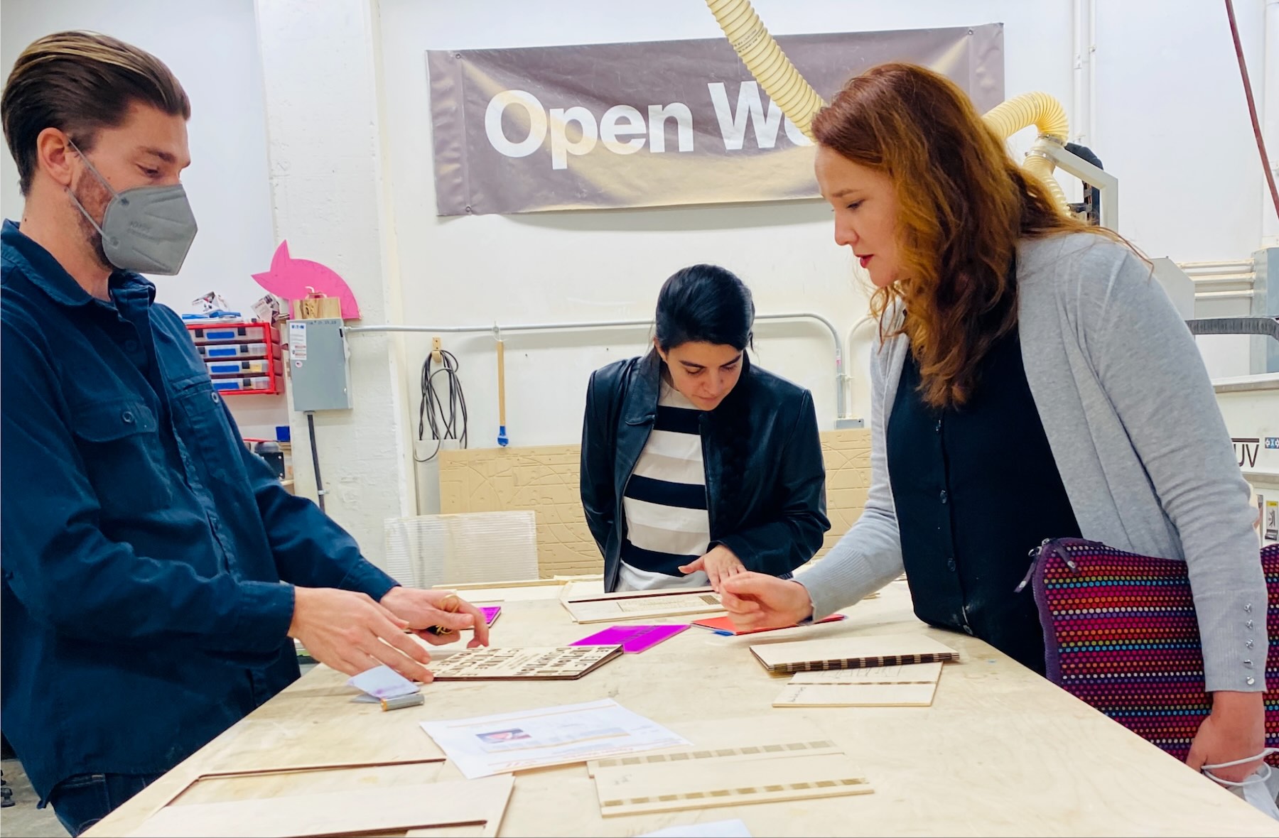 Zack Adams, BmoreArt project coordinator Inés Sanches de Lozada, and Raquel Castedo at Open Works.
The production process involved a multi-stage approach, with each layer adding a new dimension to the book’s physicality. After laser engraving, the covers were spray painted by Adam Stab, followed by a second round of laser cutting. Jordan Tierney then added collaged elements to each cover, creating a unique textural interplay. Stab then added handwritten details with permanent markers, further enhancing the book’s handcrafted feel.
Finally, the BmoreArt team gathered at Tierney’s studio to attach the interiors to the covers and add a final touch: unique forks sourced by Tierney from Baltimore rivers, adding a symbolic and evocative element to the book.
Castedo highlighted that the success of Post-Consumption Benediction—recently awarded Gold in the 10th Bornancini Award for Editorial Design, a prestigious honor presented by ApDesign in Brazil—was rooted in the strength of the collaborative network behind its creation. She emphasized the importance of fostering connections with artists, designers, production teams, and vendors, including Open Works and Indigo Ink, which handled the printing of the book’s interior.
 Post-Consumption Benediction book interior pages.
Furthermore, Castedo highlighted the often-overlooked aspects of book production, such as shipping and distribution. She advised designers to consider the practicalities of shipping and the costs involved early in the process. She also emphasized the importance of finding the right community for the book, ensuring its accessibility and preservation for future readers.
Post-Consumption Benediction, now part of the special collections at several Baltimore institutions, stands as a testament to the power of collaboration. It transcends mere documentation, becoming an extension of Stab and Tierney’s artistic practice, embodying their creative spirit and the unique materiality of their work.
Discussion and Audience Q&A
Following the presentations, a lively Q&A session offered the audience a chance to engage directly with the panelists, raising insightful questions about the future of design, the intersection of art and capitalism, and the challenges of navigating the digital landscape. The discussion underscored the importance of inclusivity, audience awareness, and the enduring value of physical objects in an increasingly digital world.
The panelists highlighted the lasting significance of books and publications, recognizing them as time capsules that preserve cultural moments and artistic expressions for future generations. They encouraged attendees to be thoughtful in their creative practices, considering not only their message and audience but also the long-term impact of their work.
Ethical considerations in design were also addressed, particularly regarding the tension between artistic expression and commercial pressures. The panelists advocated for a balanced approach that supports creative freedom while critically engaging with the systems that influence artistic production.
The role of social media and online platforms in contemporary design was another key topic. While acknowledging their value for communication and promotion, the panelists stressed the importance of maintaining a discerning perspective—prioritizing authentic connections over superficial online engagement.
The “Crafting the Page” panel at MICA provided an invaluable opportunity to explore the multifaceted world of publication design. Through engaging presentations, thoughtful discussions, and a dynamic Q&A session, the event fostered a sense of community among designers, artists, and writers, inspiring creatives to embrace collaboration, challenge conventions, and craft publications with meaning and purpose.