Spotlight: Kit Hinrichs

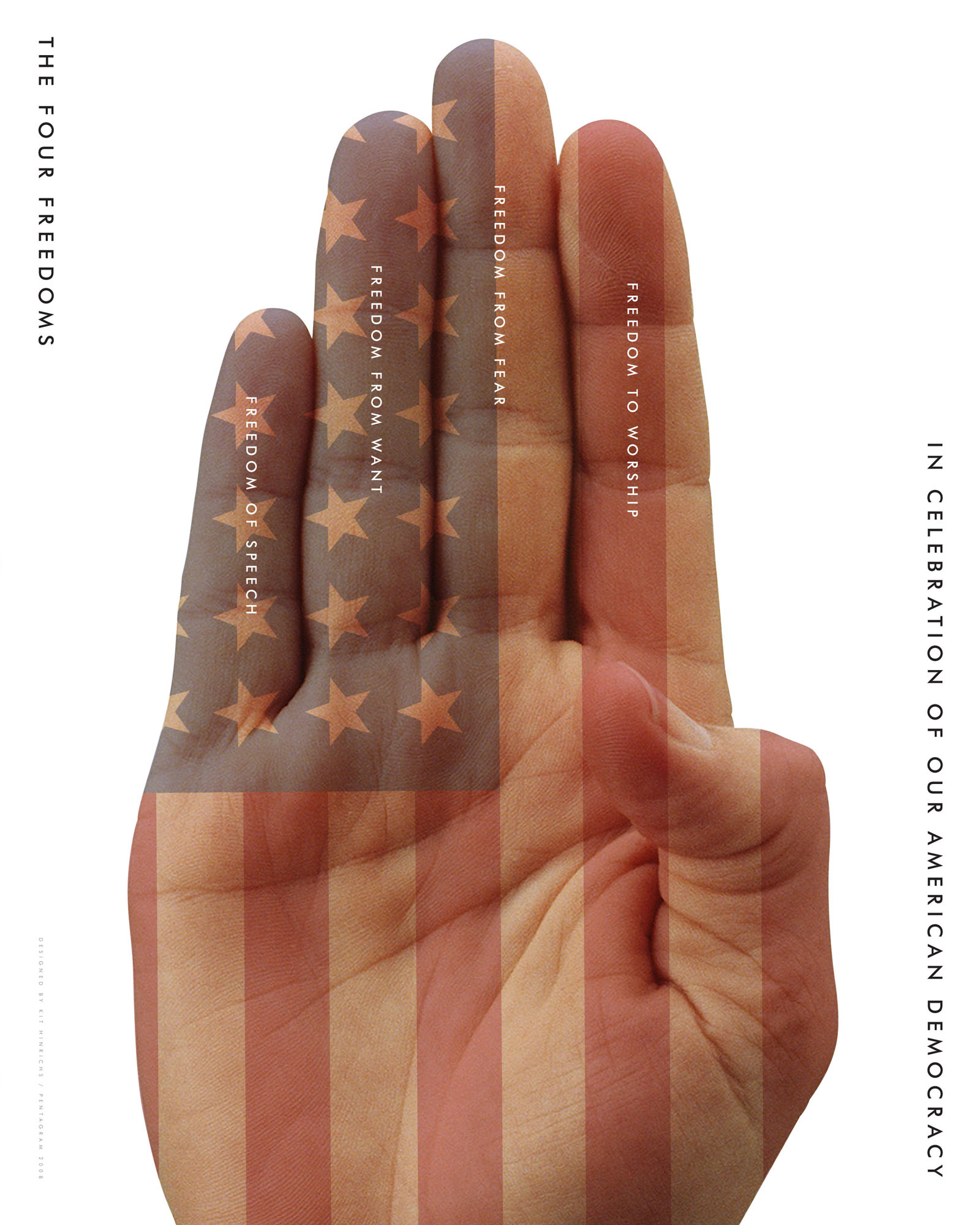
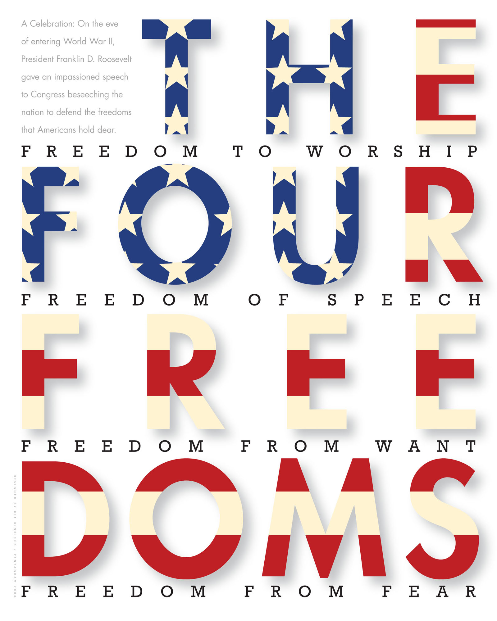
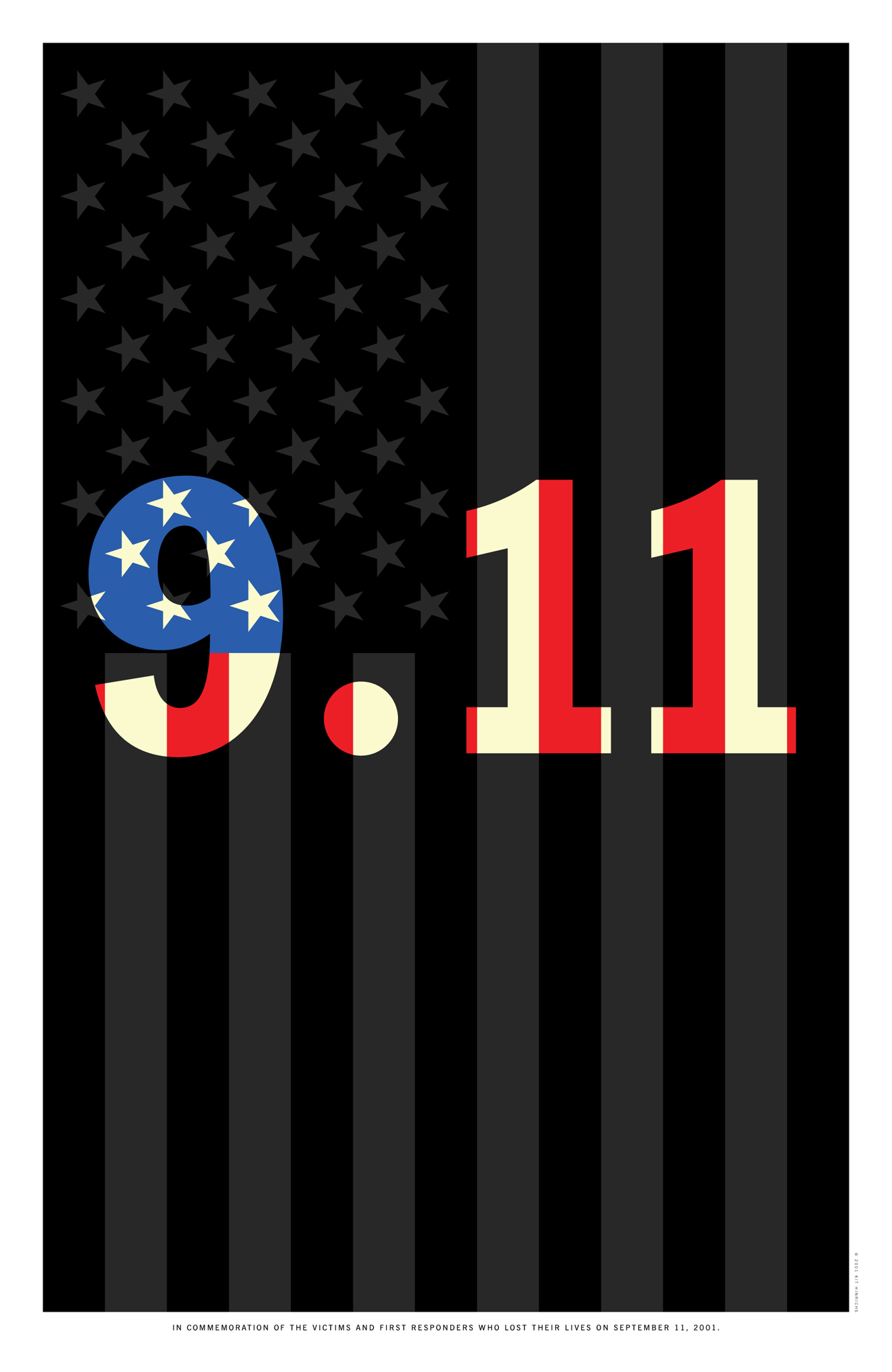
We are proud to introduce Kit Hinrichs, the keynote speaker for the upcoming opening of the O! Say Can You Design a Poster Exhibition. A noted graphic designer and former partner at Pentagram, he will be presenting a series of unusual case studies about his eclectic assortment of American flag memorabilia and how he has integrated his passion for flags into his design practice.

Kit Hinrichs is a graduate of Art Center College of Design in Los Angeles, California. He served as principal in several design offices in New York and San Francisco and spent 23 years (1986–2009) as a partner of Pentagram, an international design consultancy, before opening Studio Hinrichs in San Francisco in 2009. His design experience incorporates a wide range of projects, including corporate communications, brand development, promotion, packaging, catalogs, environmental graphics, and editorial and exhibition design.

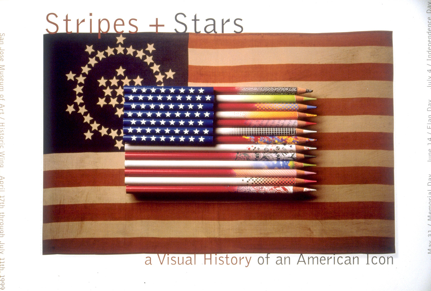
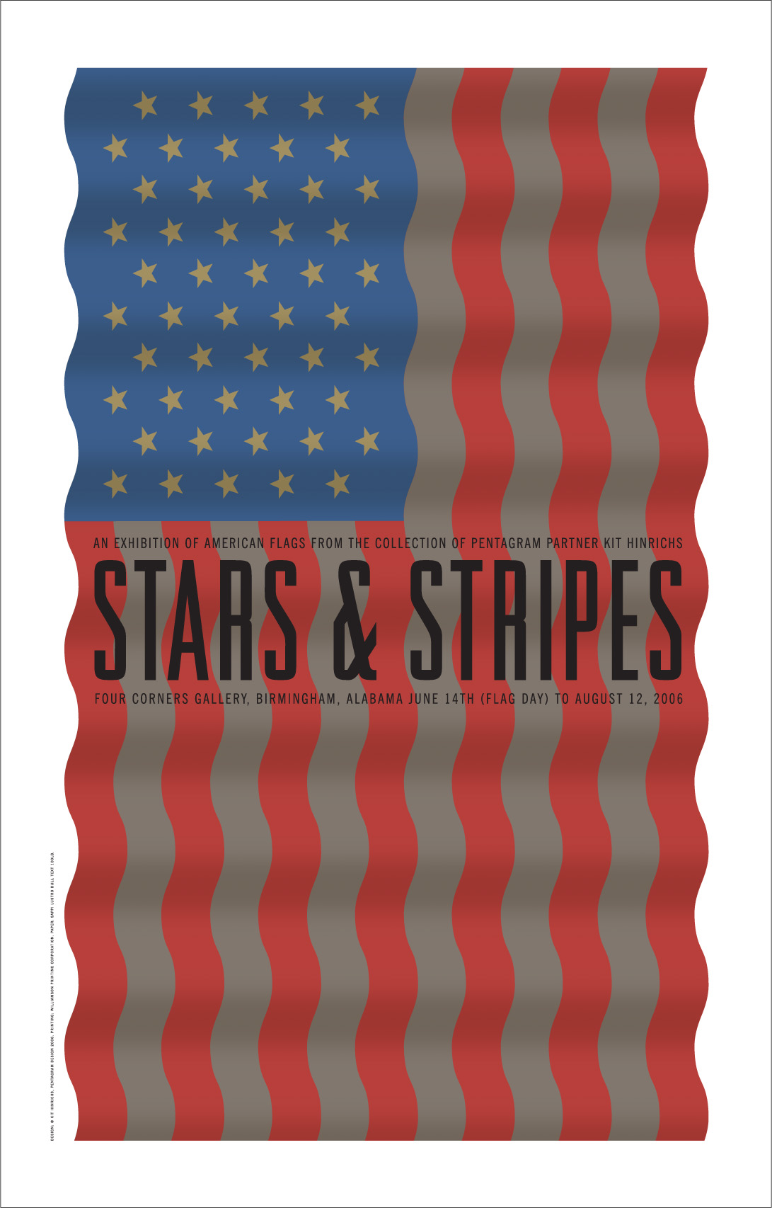
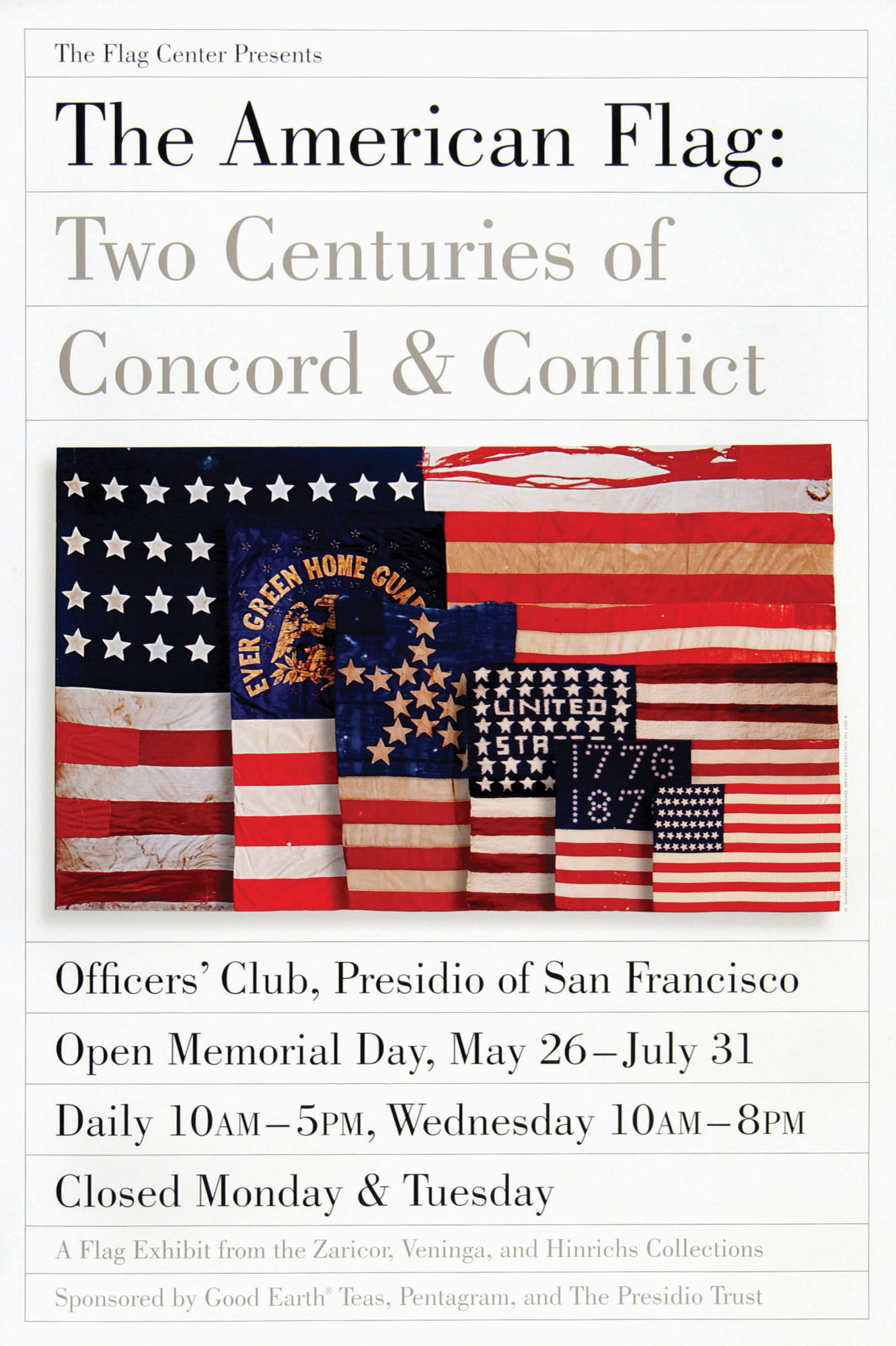
In addition to teaching at the School of Visual Arts in New York, the California College of Arts in San Francisco, and the Academy of Art in San Francisco, Kit has been a guest lecturer at the Stanford Design Conference, AIGA National Conferences, the HOW Conference, and numerous other design associations and universities worldwide. His work is included in the permanent collections of the Museum of Modern Art, New York, the San Francisco Museum of Modern Art, and the Library of Congress. He is co-author of five books, including Typewise, Long May She Wave, and The Pentagram Papers.

Kit’s list of distinguished clients includes United Airlines, Sappi Fine Paper, Design Within Reach, Muzak, Gymboree, University of Southern California, Safeco, Museum of Glass, Symantec, KQED, the San Francisco Zoo, Restoration Hardware, and many more.

During his career, he co-founded @issue: The Journal of Business and Design, was chair of the AIGA California Show (the first regional show in AIGA’s 85-year history), co-chaired the Alliance Graphique Internationale San Francisco Congress, chaired the AIGA Business Conference and San Francisco Design Lecture Series, and launched the @issue Design Conference. Kit is a recipient of the prestigious AIGA medal, in recognition of his exceptional achievements in the field of graphic design and visual communication. He is also a past executive board member of the American Institute of Graphic Arts; a member of the Alliance Graphique Internationale, and a trustee of Art Center College of Design since 1996.

The O! Say Can You Design a Poster Exhibition Opening will be held September 15, 2014, 5:30-8pm, at the University of Baltimore Student Center Gallery. The event is free for all to attend — RSVP by September 3rd.

Star Spangled Showcase

In honor of the 200th Anniversary of the Star Spangled banner we are partnering with the University of Baltimore (and AIGA Blueridge!) to host a poster competition.

Below is some inspiration from Studio Hinrichs.


Kit Hinrichs is a graphic designer and a collector of American flag iconography and memorabilia. He founded Studio Hinrichs in 2009, following 23 years as a partner of the international design firm Pentagram. He has design directed projects for the California Academy of Sciences graphic identity program, Sony Metreon Entertainment Complex identity and interior graphics, United Airlines’ Hemispheres magazine, Design Within Reach identity and catalog, and a number of others. He is co-founder and design director of @Issue: Journal of Business and Design, and has taught at the School of Visual Arts in New York, the California College of the Arts, and the Academy of Art in San Francisco. Several of his pieces are in the permanent collections of the Museum of Modern Art and the Smithsonian Institution’s Cooper-Hewitt Museum of Design.

Kit will be coming to Baltimore September 15th, 2014 for the gallery opening of the poster exhibition as well as to participate as one of the judges. More details to come.

Enter today and be part of the celebration! Entry is Free!


Design + Books = Love

All designers need inspiration, but where do you go to get it? While the web is full of great finds, design books often have just as much insight, not to mention beautiful paper and spreads to spark any designer’s imagination. Last night, Converse attendees shared together the design books that inspire them the most during a meet up at Zen West Roadside Cantina and they came up with quite a list! Make sure you add a few of these to your wish list and don’t forget to drop some hints to friends and family!

  • 10 Commandments of Typography by Paul Felton- Felton presents the rules of typography then tells you how to break them.


  • Interaction of Color by Josef Alber (iPad Edition)- This book was originally published in 1963 as a limited edition boxed set with paper samples to help explore color pairing. Now, it’s been re-envisioned as an app for interactive learning via iPad.


  • A Smile in the Mind by Beryl McAlhone- Learn how to capture your audience with wit and suffuse your designs with substance. This is a required read for the Creative Concepts course with Ed Gold (a former AIGA Baltimore chapter president!) at University of Baltimore.


  • Stylepedia: A Guide to Graphic Design Mannerisms, Quirks, and Conceits by Steven Heller- A great reference for all things design.


  • The Business Side of Creativity by Cameron S. Foote- Foote provides invaluable insight for anyone working for themselves, including pricing guides, advice on how to hire, and more.


  • The Standard by Sappi- This series published by paper manufacture Sappi uses paper samples, varnishes, folio, and other finishes to beautifully illustrate print production techniques.


  • Don’t Make Me Think (Second Edition) by Steve Krug- Learn how to refine your design thinking for the web. Krug will show you how to focus on your message without cluttering it.


  • Just My Type by Simon Garfield- “Comic Sans is not at fault is not at fault… it’s the people who use it.”


  • Readymade by Shoshana Berger- This compilation of hands-on projects will inspire you to get away from the computer.


  • Idea Selling by Sam Harrison-  Harrison provides daily digestible tips on how to successfully pitch your creative ideas to decision makers.


Let’s Recap the 2nd Annual Baltimore Design Week!

We totally believe in feedback.

Back in October, we went all out for our friends and colleagues in the Baltimore design community and we’ve been hearing about it ever since. If you haven’t emailed, tweeted, or talked to us face-to-face about your experience, we’d like to hear from you. Complements, suggestions, or criticisms: the more we receive, the better Design Week gets.

Okay, that said, let’s get to the wrap-up..!

Design Week opened up with a bike race through Baltimore to find and capture the each letter of the phrase” AIGA Baltimore 25″. Participants sent their photos back to our judges at Canton’s Myth & Moonshine. Search for #AIGATypeRace on Instagram or check out the Charm City Type Race photos on Facebook.

Then on Monday, we welcomed former design director of NYTimes.com, Khoi Vinh, to the 2640 Space in Charles Village for an evening panel discussion about interactive design. Vinh was joined by Andy Mangold of Friends of the Web, April Osmanof of Fastspot, and James Pannafino of Millersville University. The conversation included topics ranging from the evolving purpose of the web and the technical specifics of responsive design to the Baltimore art and tech scene. You can read more about what we learned here.

Next up for Design Week was a type design workshop with Mucca Design’s creative director, Matteo Bologna. Held at one of Stevenson University School of Design’s swanky Mac labs, attendees were given a hands-on tutorial on how to manipulate letterforms and craft their own typefaces. Matteo demonstrated the quick and dirty overview of formatting characters in Glyphs, a font editing software. Being a Bezier curve master certainly helps!

Thursday was AIGA Baltimore’s 25th anniversary, so we just went ahead and threw a huge party in Fell’s Point at the Waterfront Hotel featuring our guests of honor: the chapter’s past presidents. Baltimore Print Studios donated super-cool thank-you certificates, hot off the letterpress, to help us recognize the presidents, their respective boards, and everything they accomplished over the last 25 years. Studio, in-house, and freelance creatives from all over the city showed up, (and some students too), making it a very memorable and fun evening for all (Well, most of us can remember it, anyway). Check out those memorable moments on our Facebook page.

The next morning, we took visitors on three studio tours, each one unique in their approach to design and what services they offer.

First, we went to ADG Creative in Columbia where we got an in-depth look at their ultra-modern setup, well-equipped with innovative technologies for interactive design and video production. From there, we headed back to Fell’s Point, dropping in on Orange Element to hear about their process, tour their 3-story row house studio, and look at some of their clever design work, including some enviable wrapping paper. Our last visit was to Gilah Press where we got to see how their top-quality cards and wedding invitations are created in a surprisingly old-school way.

We invited our participants out to Birroteca  after the studio tours to join us in a collective sigh of relief as another fantastic Baltimore Design Week came to a close. Thanks to everyone who supported us, volunteered, or attended the events. You’re totally our new (or our old) best friend. And if you couldn’t make it, don’t worry because we’re going to start planning next year’s events shortly after our holiday break and we’ve already got some stellar ideas.

Want to see more pictures? Check them out here.

Top Ten Things We Learned from Design Week’s INTERACT Panel Discussion

On Monday, October 21, Khoi Vinh, former design director of The New York Times, joined AIGA Baltimore for a Design Week panel discussion on interactive design at the 2640 Space. Khoi and fellow panelists April Osmanof from Baltimore’s FastSpot, Andy Mangold from Baltimore’s Friends of the Web, and James Pannafino from Millersville University discussed what it was like to be an interactive designer in the 21st century. We laughed, we learned, and we gained new insights on working in the interactive field.

Here are a few things attendees learned from the discussion:

1. Every medium starts out with an initial purpose that evolves over time. The web started out as a library of documents and its purpose has evolved into a method of sharing content and creating conversation.

2. Baltimore has up-and-coming art and tech scenes (that often collide). People are moving to Baltimore because it’s a “cheap” place to start from the ground up. April Osmanof says Baltimore “has an art heartbeat at its core,” which fuels creativity on many different levels and industries.

3. Designers are learning to code HTML, CSS, and sometimes even Javascript because helps the team to complete projects on tight deadlines. Of course, it’s also helpful for designers and developers to speak (or at least understand) the same languages.

4. Pairing designers with developers is great for project communication and cross-training. Plus, it often results in better products.

5. Very few team-based creatives work from home. When everyone works together in the same place and at the same time we produce better work; we can get work done faster with fewer communication roadblocks.

6. If you’re just starting out in interactive design, work on a personal project to get some portfolio material. Remember that every artist was at first an amateur with developing skills.

7. There’s always something new to learn working in web production. On trying to keep up on new technologies, even James Pannafino struggles: “I freak out everyday.” So, know that you’re not alone.

8. As interactive designers, we have to get and stay comfortable with the ultimate unknown web. What’s next? Who knows.

9. Most clients know what responsive design is and why it’s important (finally!). If you still need to make the transition to coding responsively, ask yourself: “does this column or object need to have a fixed width or can it be flexible?”

10. Quick prototypes (like QuickTime movies with screen captures) are a great way to engage your client and convey interactivity from the get-go.

MD Food Bank Volunteer Day

AIGA Baltimore volunteered at the Maryland Food Bank on Saturday, September 21, and spent a few hours lending a hand to help end hunger. Who knew sorting cans of kidney beans from jars of peanut butter could be a fun time? We even got to go behind-the-scenes to see the mega freezer, which has a daytime temperature of -10 degrees! In just a few hours volunteers assisted in packing 10,785 pounds of food which equates to 8,296 meals!

Salvaged, donated food comes by the trailer-full into the warehouse, and all of it needs properly sorted and boxed before it can go back out to those in need. The cartons and cans are loaded onto the conveyor belt where daily volunteers help categorize it and pack it up.

Volunteers are critical to the Maryland Food Bank and its mission. Last year, volunteers contributed over 30,000 hours of service, saving the Maryland Food Bank $600,000.

Don’t wait for another AIGA volunteer day to give back—you can schedule a visit on your own. Better yet, bring your coworkers or friends. Check out www.mdfoodbank.org/volunteer or contact the volunteer program manager at 410.737.8282 x232 for more information on volunteer opportunities.


For the Love of Analog Design

With the recent launch of Adobe’s Creative Cloud came an assortment of new tools and features, most of which I’ll likely try to learn in an attempt to keep as current as possible. After hours of tutorial videos, I should be able to recognize which ones I’ll put into practice and which aren’t relevant to what I do. It’s sort of a labor of love for me, really, much like back when I was a more traditional artist and I’d spend an hour wandering through Utrecht’s, picking up new medium to try, trying it out, and either putting it into play, or abandoning it.

utrecht

Take my money..!

Since the digital design capabilities are already getting their press this week, I’d like to take this opportunity to recognize the analog  tools in my workflow, like pencils, paper, etc., and how I use them to start a digital project. If the finished project isn’t proprietary, I’ll have that original piece of work to sell, which wouldn’t be possible if the entire project were done, start to finish, in Photoshop or Sketchbook Pro.

Pencils!

No doubt, a #2 pencil with a full eraser on the end is a thing of joy. Because I learned how to draw while not paying attention in grade school, flipping a pencil around is more natural than using a separate eraser; therefore, the #2 is the favorite for sketching. I never was able to find a proper use for those pencil-packs with the range of lead-hardness but that rarely stops me from buying them every Fall.

#2 pencil and non-photo blue

Old Reliable and Blue

Once an idea and composition is nailed down, a Col-Erase non-photo blue is used on a fresh surface to fine-tune the details. This blue color is helpful because it’s dark enough to work with but appears faded compared to the final inking, hiding any un-erasable marks. Additionally, the blue can be easily filtered out after scanning when moving the work to a digital platform.

Color pencils have all but completely phased out of my process, mostly because I don’t finish the original illustration in color very much anymore. When I do, it’s Prismacolor and it always has been.

prismacolor pencils

My childhood was pretty much fueled on these and Watermelon Nerds.

Pens!

For years, I’ve used a fine-line Sharpie to make regular, everyday notes. It’s for legibility reasons, actually: nothing I write in ball-point can be read. When inking a drawing, I switch between Pitt artist pens (sizes F-XS) and, for the most delicate work, a Pilot Hi-Tec-C, which is engineered for precision with smudge-free ink. It’s probably my favorite pen ever but don’t tell Sharpie I said that.

sharpie, pitt pen, and hi-tec-c

Sharpie Ultra-Fine, Pitt artist pen, and the legendary Hi-Tec-C

Markers!

Markers are a newer addition to my analog arsenal. After trying out Prismacolors for a while and not liking the results, I bought a few made by Copic, based on user feedback.

copic markers

This is, like, $100 in markers.

These markers are expensive and their hype borders on cultism, but I’ve never used anything as satisfying as Copics to complete an illustration. That’s saying a lot, since all 24 of my markers are shades of warm and cool grays.

Paper!

I have three types of paper: dirty, clean, and notebook. The dirty paper is a sketchbook that comes from the dollar store, with 80 pages of cheap, grey, pulp. It’s not only inexpensive, alleviating worry about using it up too quickly, but it’s also not suitable for a finished piece, granting a sort of freedom to experiment and make mistakes.

Cheap, dollar-store sketchbook = priceless. Well, a dollar, actually.

Cheap, dollar-store sketchbook = priceless.
Well… it’s a dollar, actually.

This sketchbook is filled in every available space, worn spots or tears appearing if too much erasing is done, creating a healthy sort of forced revision of ideas rather than attempting perfectionism on a particular sketch. Perfectionism isn’t what a sketchbook is for.

Clearly.

Clearly.

The clean sketchbook is always the same for me: Strathmore Bristol Smooth. This is where the best parts of many dollar store pages goes, sewn together like Frankenstein’s monster, copied over in non-photo blue via grid, lightbox, or projector depending on the size.

So bright. So very, very bright...

So bright. So very, very bright…

This copy, once inked, is captured digitally either with a scanner or, if it’s over 8.5×11, a camera for Photoshop. Then the original can be completed with markers or colored pencils.

My everyday notebook of choice is Field Notes because it fits into a back pocket and their design aesthetic is enviable. Released seasonally, they come in themed packs of three and usually sell out fast.

The County Fair edition is in prize-winning ribbon colors. Sweet.

The County Fair edition is in prize-winning ribbon colors. Sweet.

So, during all of the digital design news this week, consider revisiting those analog tools of the trade or even discovering them for the first time. Stop in your local art supply store, browse the sketchpads, check out some pen options, and maybe find something that you can share with us here at AIGA Baltimore. We might be able to make an event out of it.

Hmm: Analog Design Day. That has a nice ring to it.

Greg Jericho spends an awful lot of time designing for clients that do not exist at his equally fake company, Myopic! Studio.

Did you know?

Last summer, AIGA launched a new model for membership. Instead of membership being based on your career level, you now have the choice. The new model gives you the ability to choose how much you want to contribute to be an AIGA member.

Become a part of the Baltimore design community and join the greater conversation of design.

Learn more and join today!

Together, we are OneAIGA. Have questions? Email info@baltimore.aiga.org


Clarvit Design Lecture Series keynote

The University of Maryland’s Department of Art  is delighted to announce that James Victore will be this year’s Clarvit Design Lecture Series keynote. His lecture will be 6 p.m., Thursday, February 28 in the Art-Sociology Building, room 2203 on the College Park campus.

To say that James Victore is not your ordinary, run-of-the-mill designer is akin to saying that the Guggenheim Museum in Bilbao is no ordinary architectural structure. James Victore is a self-taught, independent artist, graphic designer, design educator and speaker. His work is infused with passion, conviction, and a no-holds-barred attitude. He designs on his own terms and eschews technological gadgetry and clients when appropriate.

Victore’s clients include Moet & Chandon, Aveda, Bobbi Brown cosmetics, Esquire, TIME and The New York Times. HIs work has been Emmy nominations and Gold and Silver Medals from the New York Art Director’s Club. His posters have been exhibited at the Museum of Modern Art in New York and are in the permanent collections of the Palais du Louvre, Paris, the Library of Congress, Washington, DC, the Design Museum in Zurich and the Stedelijk Museum, Amsterdam. His book Victore or, Who Died and Made You Boss? was released by Abrams in 2010.