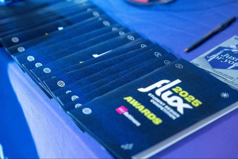
A board member shot this my way and I thought I show all of you out there. It sorta represent my answer to “What’s your favorite font.” No point in me lying: I’m not sophisticated enough to have love a font over another in that way. I think of them as voices. Each a little different. Some more poignant than others.
Fonts, like voices. Voices like Morgan Freeman in March For The Penguins. Or Matt Damon in The Departed. Voices need to fit the part. That’s what fonts are all about for print. Mostly, I’m a broad stroke person. For instance, as an NPR listener, I generally prefer that radio personalities not SHOUT. The individuals voices seem to fit an overall framework of not crazy, not overboard, not polemic, and not hysterical. They sort of seem like Univers to me: all useful with good light and ultra settings. Not mundane like perhaps Helvetica, but not ostentatious either.
By contrast, the trumpeting style of (insert name here) the crazy car salesman just rubs me wrong. What style is that? Is it some carnival font like Rockwell Outline, only in all CAPS, ALL THE TIME?
So, I may have a favorite, or more aptly, a mostly familiar voice and as such probably do have a favorite font. Perhaps it’s Caslon. Readable, great antique options. But anyway… jeez, if you need to think about it like that, it’s less of a “yes-no” question and more like an essay.


