Typefaces are an important part of our work. The fonts we use can drastically influence the direction of our designs. But rarely do we have to design our own. Designer Christian Schwartz, however, has made a rather successful career of it.
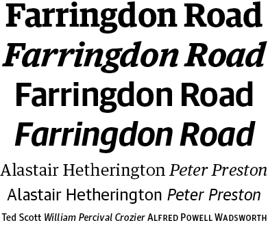
After graduating from Carnegie Melon University, Schwartz worked for design firms such as MetaDesign Berlin and The Font Bureau, eventually going on to co-found Orange Italic in 2001 and starting his own Schwartzco in 2006. His work has garnered a multitude of awards, having been honored by the Cooper-Hewitt National Design Museum, the New York Type Director’s Club, AIGA, and the International Society of Typographic Designers. He was awarded a gold medal by the German Design Council in 2007 for his work with Erik Spiekermann on the typeface system for German railway company Deutsche Bahn. Perhaps Schwartz’s best-known work was his 2005 collaboration with British designer Paul Barnes on the Guardian Egyptian font for UK newspaper The Guardian.
Despite having received so many awards and honors, Schwartz’s work hasn’t always been well-received. Although his work on Guardian Egyptian lead to honors from the Design Museum and D&AD, the font was harshly criticized initially. “The internet was merciless,” Schwartz said in regard to The Guardian’s 2005 redesign. “People hated everything about the newspaper, including (and in some cases, especially) the typefaces…” David Hillman, who had been responsible for The Guardian’s previous redesign in 1988, has some especially choice words for the type. However, the hate eventually died down, and the redesign and typefaces were accepted. Schwartz used it as a learning experience.
“The experience taught me to be wary of trusting the opinions of anonymous hordes of people on the internet, and this goes double for when they love you.”
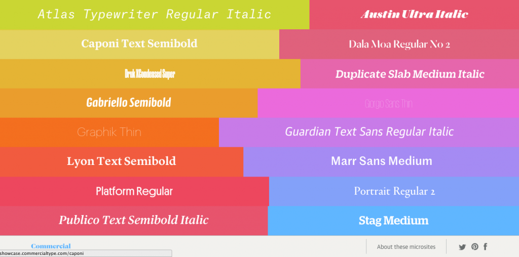
Currently, Schwartz, along with Paul Barnes, is running Commercial Type, one of the most influential and exciting type foundries. Based in New York and London, they’ve created both popular and critically acclaimed typefaces for a wide range of organizations, from The Guardian newspaper and Vanity Fair magazine, to jersey numbers for Puma in the FIFA 2010 World Cup. Their designs range from the utilitarian Graphik and Stag to the playful and expressive Dala Floda and Marian.
When asked where he draws inspiration from, Schwartz said “A lot of my ideas come from historical typefaces and various eras of graphic design, but I’m pretty omnivorous when it comes to time periods and high vs. low culture. If I see a piece of type I like, I try to trace its lineage back as far as I can, to try to understand where it came from, what the designer or punchcutter’s influences were, and how its original context shaped what it looks like.”
Looking to the future of type design, Schwartz is very excited about some of the work being produced by his contemporaries in the field. When asked about any designs in particular he liked, he cited Paris’ Production Type and their work for French newspaper Libération; Tal Leming’s Marigny font; and the work of European foundry Schick Toikka. But to Schwartz, the real future of type design is in technology. Since so few types are designed for screen resolution, they just don’t look good on the web. But Schwartz sees that as a challenge. “What I’m really excited about is the opportunity to embrace the new technology, and finally have a framework for designing screen fonts that will actually be used.”
On Thursday, October 22 at 6:30 PM, at MICA’s Fred Lazarus IV Center, Christian will be giving a talk on Five Years of Commercial Type and the process behind his designs. We’re certainly looking forward to more of Schwartz’s work in the future!
Hear more from Christian:
Mitchell Cole is the web sales manager at Service Photo Supply. Most of his free time is spent indulging in some sort of gaming, controller or dice never far from reach. Find him on Twitter at @mc_mittens.