The Power of an Optimized LinkedIn Profile

When I joined LinkedIn 14 years ago, the platform was known as the place where you transferred your resume and work history into an online version. LinkedIn has evolved far beyond a platform for just placeholding your digital resume, as your profile is the first impression you will make to people in and outside your network.

But a LinkedIn profile isn’t your resume–it is static, searchable, and offers more features to showcase your expertise beyond just the history of your job experience.   I’m going to touch on the impact of an optimized LinkedIn profile for designers, exploring how it can attract job opportunities, foster connections, and enhance your reputation (aka personal brand). Let’s embark on a journey to unravel the secrets of LinkedIn success in the design arena.

Where to Start?

LinkedIn provides a variety of sections for you to input information.  As a recruiter who proactively uses LinkedIn to source and identify potential prospects for job opportunities, I’ll emphasize the areas and content I seek out when scanning a profile to assess the alignment for a role.

Headliner

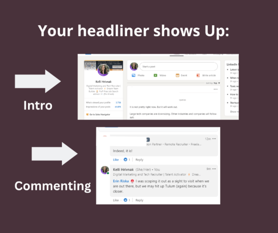
Your headliner is the copy that is located right below your name on the LinkedIn profile and it will be the first thing people see (along with your name).  Not only does it show on your profile page, but also when you comment, send invitations, “Who Viewed your Profile“, and in the intro section of your profile. You have a 220-character limit. A shortened version of your headliner will be visible when commenting (75 characters), sent invitation (80 characters), and in search results (82 characters).

The words in the headliner do affect the search results.  Keeping this in mind, I advise to be clear about your expertise and use keywords that a recruiter may look for when sourcing.  This may include job title, skill sets, certifications, and companies.  A Unique Value Prop (USP) is a popular choice for a headliner, like “turning ideas into visual symphony,” but I urge people that it’s not the best (SEO) option if you are in an active search.  A USP can be ambiguous and a recruiter isn’t using those keywords when searching.

A simple format I suggest is:

Job title + Company + (skill sets, results/achievements, awards) + (fun add about personality or USP).

If your current job title is vague or you are making a career pivot, the headliner is an alternative field to sub in your target job title.  Example:  Your job title is “creative specialist” which doesn’t encompass your expertise in design.  Use “Graphic designer” in your headliner instead.

Photo

Is there a greater chance of receiving outreach when you include a photo on your profile? Discrimination is real, unfortunately, and I’ve talked to people who strategically omit or strengthen their privacy settings by design to hide their headshots on their profiles. Make decisions based on your comfort level.

If you opt for a photo, a DIY iphone session can quickly produce a credible headshot Here is an article with some helpful tips!


Location

If a company is looking to hire a local candidate within commuting distance,  they could be using a radius search by location.  Users can search by by Region or Postal Code. The latter option enables a nuanced radius search, allowing users to filter results within 5, 10, 25, 35, 50, 75, and 100 miles.

To enhance your discoverability, consider selecting a broader metro area rather than specifying your exact city. For instance, instead of “Baltimore,” use “Washington DC-Baltimore” to increase your inclusion in wider-radius searches.   If you are in the midst or open to relocation, set the targeted location as your geography so your visibility will be amplified in those geographical searches.

Industry

Companies could be prioritizing their search by industry experience.  While you can include vertical exposure in your About and Experience section, you can choose an industry sector in your account settings.  LinkedIn expanded their industry codes from 24 core functions to sub categories, likely expanding to over 400+ soon.  Pick one most important to you, and again–you can mention others in other areas.

Keywords

Before I cover the About and Experience section, I encourage everyone to conduct keyword research to identify what skills and keywords are associated with your current job and target.  Wordtracker and Google Keyword Planner are excellent tools, but what works on Google won’t be a replica on LinkedIn.   ChatGPT can generate a list of associated words too.


Review the words and think about how you can integrate these words into the content of your profile. For example, instead of listing out a bullet-pointed list of keywords like “Storyboarding,” “campaign development,” and “advertising,”  try weaving them into the story of your experience and about section.


Consider the keywords you prefer not to be associated with on your LinkedIn profile. While retaining your work history is advisable, it’s beneficial to eliminate skills or keywords that hold no relevance to your future career aspirations.  Unfortunately, some recruiters are lazy and will mass message anyone who possesses a keyword they are searching for–regardless of context.  Proactively removing skills or titles misaligned with your target job can potentially curtail unwarranted outreach.


Scope out your competition.  Run a keyword search on job titles (like “Art Director” or “Sr. Graphic Designer) and pay particular attention to the initial pages of search results.  How does the algorithm prioritize profiles related to content?


About Section

This is your canvas to craft a narrative of your career journey and an opportunity to reveal more information beyond the facts of your experience.  Did you make a career pivot or your path has been non-linear?  Has design been your passion since you were a child? How did this path become your “why”?

What’s your opening hook?  Keep the mobile user in mind, as they’ll likely encounter the initial 90 to 150 characters of this section before having to click down. Desktop viewers may extend to around 300 characters.

As you share your story, consider incorporating a call to action (CTA) to encourage recruiters to engage further. This could involve providing a link to your portfolio, sharing your email address, or including a phone number (consider using Google Voice for added privacy). Embrace the first-person perspective to infuse authenticity into your narrative (a third-person narrative may be more suitable for fields like legal or finance.)

Reinforce your expertise.  Don’t forget to enhance your visibility by strategically integrating those relevant keywords and skills into the narrative.  You also have the option to add your top 5 skills that will be promoted in this section.


Experience Section

I’ll argue that this section is the most significant in your profile. While other sections can represent your branding, the experience section unveils the application of your keyword skills and the outcomes achieved. It provides the crucial context to assess your qualification for a role.

In each job experience, include details on project work, tasks, results, industry exposure, management roles, certifications, specific software proficiency, training, and promotions. Adopting a format with bulleted points or well-structured sentences enhances readability.

Utilize LinkedIn’s feature to add skills to each experience entry, showcasing your expertise aligned with each job title and company.  If you used Adobe XD in your current job but only Indesign at your prior, you can distinguish how recent you were exposed to tools here.  In addition to hard skills, consider adding other tasks like project management, motion design, business development, etc


Featured Section:

Designers, do not overlook this section!  This space is your place to add content, from articles, videos, URLS, podcasts, photos, and presentations.  Most importantly, if you have an online portfolio, include the link.  This is the visual “highlight real” of your achievements.

Contact Information

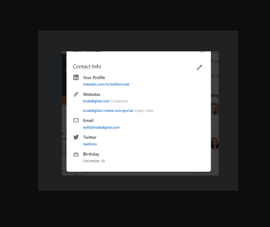
Ensure your email is up to date to efficiently receive timely notifications. If anyone is using Inmails, messages, or general invitations, your notifications will go to this email. If you using your work email domain, keep this in mind (especially if you fear that your employer is monitoring your emails). This article will show you how to adjust the visibility of your email. Consider a pseudo email strictly for LinkedIn outreach and messaging.

Along with the Featured section, you can include your portfolio link here. If you were assigned a generic URL, you can explore custom options.  If there is a custom domain that is available and aligned with your personal branding, snatch it up.

What else should you consider?

A background photo, which is the large image behind your profile picture, is customizable.  I usually recommend Canva as a tool to create a unique banner that highlights your brand or expertise, however I recognize an audience of designers will have the skills and other tools to execute this task at a higher level.  The dimensions are 1584 x 396 pixels and accepts PNG, JPG, and GIF files.

Should you use the Open to Work Banner?  My opinion is mine alone, but I do not hold a bias against anyone who is actively in a job search and chooses the visual cue of the banner.  My objective, as a recruiter, is to identify a candidate who is motivated and qualified to make a job move.  Some others may discriminate against people unemployed, so you need to make the best choice for yourself.  If your job search is confidential, I would encourage you to use the Recruiters Only option.  The Recruiters Only option is limited to users who subscribe to the Premium Recruiter seat, so that isn’t limited to recruiters only but to those who pay for that level of service.

A LinkedIn Allstar Status increases your visibility. While the meter is no longer on display in your profile, reference this link on how to access your level. Hint: Look for the “Suggested for you” prompt.

What qualifies as an Allstar Status?  Complete all of the following sections.

  • Industry/Location
  • 3 positions (including current). If you don’t have 3 job experiences, consider volunteering, freelance, or gap options.
  • Education
  • Skills (3 minimum)
  • Profile Photo
  • 50 Connections

In today’s competitive job market, having a well-optimized LinkedIn profile is more important than ever. This is a passive, one-stop effort that can generate inbound leads and increase your chances of being discovered by recruiters and potential employers.

About the writer

Kelli Hrivnak

LinkedIn | Website

Kelli Hrivnak is a leader with over 15 years of experience in staffing and recruitment services.  Recognizing the limitations of quantity-driven staffing models, Kelli embarked on a mission to create a forward-thinking alternative.  She is founder of Knak Digital, a recruiting agency prioritizing strategy and quality over high-volume recruitment. Throughout her career, Kelli has partnered with various companies, from Fortune 500 corporations to start-ups.  Her extensive background in the technology and marketing industry has provided her with valuable insights and a deep understanding of client needs.

An INside look at Baltimore magazine

Baltimore Magazine was first printed in 1907 by the Baltimore Chamber of Commerce. It is to this day, the oldest city magazine in the U.S. In 1994, Steve Geppi, owner of Rosebud Entertainment acquired the magazine with the goal of reviving the publication by rethinking its content as a channel to celebrate the great things that Charm City has to offer. With over 50,000 magazines in circulation, its in-house creative team collaborates diligently to keep the look and feel of the publication fresh and dynamic. Amanda White-Iseli has been Art Director for the publication for the last 16 years and shares insight on her in-house team.

How far in advance do you start working on your next issue?

Baltimore is a monthly publication designed on a 4- to 5-week production cycle. My team and I work closely with each other and with the editorial team throughout the cycle. Work begins even before the previous issue hits newsstands as art directors and designers meet with editors and writers to discuss the stories for the next issue. As a department, we all rely on each other for collaboration and critique at every step of the process. We’ve developed a strong, harmonious relationship with the editorial staff as well as with our digital and social media divisions, whom we also work closely with.

Special Editions and Marketing Art Director, Staci Lanham designs our quarterly Home section, our annual Baltimore Bride magazine, and all in-house promotional materials. Our Design and Print Division—headed up by Art Director Vicki Dodson and Senior Designer Michael Tranquillo—is creating fresh, new looks for businesses all over the region including print advertisements, stationary, media kits, newsletters, brochures, and more. Jon Timian is our Production Manager and is responsible for the top-notch production of the magazine—color correcting, along with the image, print, and paper quality. Production Artist, Marina Feeser designs ads and manages ad production for the monthly magazine as well as Baltimore Bride. Craig Forbes is our digital designer handling our web design and many of our online videos.

Understanding the broad strokes of the story and the writer’s tone influences the direction of the design and helps with the initial concept stage. Stephanie Shafer, the editorial design assistant, is responsible for part of the front of the book and all of the departments. Sophia Belitsos, the assistant AD, designs the rest of the front of the book, some features, and our Local Flavor section. I design the cover as well as features, provide direction to the assistant AD and design assistant, and manage the art department as a whole.

The three of us meet weekly to review progress, discussing design direction and potential illustrators and photographers that would be a good fit for the stories. Each person is responsible for creating art assignments for the stories they are working on.

October 2013 issue. Photography by Scott Suchman.
Baltimore’s Best Breakfast Spots. October 2013 issue. Photography by Scott Suchman.
Photography and Illustration have become a huge part of your publication, is all of this done in-house?

David Colwell, our Director of Photography, shoots a large part of the photography for any given issue. Front of the book sections such as “Charmed Life” are typically shot in our studio during the second week of the production cycle. The studio—which is a block away from our Lancaster Street offices in Harbor East—is a large, open space that provides an area where we can paint walls, build sets, and do whatever is necessary to shoot everything from fashion to portraits to product and detailed documentary photography for the monthly magazine as well as our annual Bride publication. (It was even used for a short scene in Season 2 of “House of Cards.”)

We also assign work to photographers in our extensive network of talented freelancers. We try to choose photographers whose style and aesthetic is a good fit for that particular project. We then send a detailed art assignment explaining the story and our design ideas, often including sample images that will help describe the look we are after. We try to give them two weeks to complete each assignment, although time is a luxury we don’t always have.

Baltimore magazine. September 2014. Photography by Mike Morgan. Hand lettering by Martin Schmetzer

We approach illustration projects in much the same way, providing art assignments and examples of illustrations that will help guide the illustrator’s concept and initial sketches. We have worked with renowned painters and illustrators from all over the world as well as those in our own backyard, including MICA graduates and even some professors. We find most of our illustrators either through artist reps or as a result of their own dogged determination to promote themselves via print mailings and email inquiries (yes, a well-written email or catchy postcard still works).

Can you give an example of a recent concept for a cover that you really enjoyed working on? What was the process?
October 2014 issue. Photography by Scott Suchman. Hand lettering by Lauren Hom.

We recently produced our October 2014 Cheap Eats cover which was a lot of work–but really fun to do. The food stylists who I usually work with were unavailable, so I tried my hand at styling the dogs myself. I worked with photographer Scott Suchman who is gifted at shooting food. It was a long process that involved lots of buns, lots of toothpicks, and a soldering iron! I was really happy with the results. I also worked with illustrator Lauren Hom who is amazing! She did the hand lettering for the piece. I provided sketches of what I wanted to include and where—and she worked her magic.

How do you coordinate what goes into your print publication vs. digital?

We meet monthly with digital team to maximize the capabilities of digital media and make the content fresh and dynamic. This can include everything from redesigning charts and incorporating infographics to shooting behind-the-scenes footage from photo shoots as a supplement to the editorial content. We are active on Pinterest and Facebook, posting contests, polls, and generally maintaining an online presence that further nurtures our relationship with existing readers and helps develop new ones. That relationship, and the resulting communication, helps us deliver designs that complement and support the stories and enhance the reader’s experience.

Follow Baltimore Magazine: Facebook | Twitter | Pinterest

Jennifer Marin is co-president of AIGA Baltimore, you can follow her on Twitter: @hungry4design

Nominate your favorite Baltimore Logo Designer!

This November, to highlight the contributions made by the many designers in Charm City, Edwin Gold, professor of Communications Design and director of Ampersand Institute for Words & Images, is curating a special exhibition featuring the very best logo designs by Baltimore creatives to be displayed in the UB Student Center Gallery.

The exhibit, which is to be on display for three months, opens with a reception for the designers and friends. Further information, including the panel of judges and instructions for mounting are to be finalized in coming weeks.

To nominate your favorite local designer (or yourself), contact Ed: egold@ubalt.edu and include name, contact information, and samples of your favorite logo designs.

DEADLINE FOR SUBMISSIONS: September 20, 2013.

Enter the Designer

Designers live in a world of challenges requiring unprecedented solutions, fostering the sort of individuals who want to lecture on or write about the details of their quests to teach those who will listen. These individuals who share their hard-earned secrets are, to other designers, what the Kung Fu master is to a student in a martial arts movie. Deke McClelland is known to practitioners of Illustrator and Chris Georgenes holds down the Flash animation dojo. Terry White is omnipresent in many areas of digital photography while digital painters follow Serge Birault.

This spring, AIGA Baltimore brought local design masters to the Ink & Pixels event at Towson University so they might impart their sage advice. Since the attendees reported hearing some very Zen-like wisdom that day, we couldn’t resist comparing their mastery to Kung Fu movies.

Our Design Masters were:

(For the sake of consistency, we’ll stick with the time-honored, generic title of “Kung Fu”, though the martial arts styles themselves vary according to the story being told.)

Your Style is Your Legend

“Your reputation precedes you,” says the lord to the old man, “You are said to be the Master of the Five-Element Fist. You believe you can defeat my oppressor?”

The old man’s style is what makes him worthy of the lord’s attention and has gotten him in for an interview. Were he not known for his mastery of the Five-Element Fist, a style explained to be an influence of the Ancestor System of Wuzuquan, the lord’s guards might have just locked down the fortress and lobbed fireballs at the old man until he went away.

Why do you design? Knowing the answer defines where you stand among other designers: understanding why you design is paramount to understanding how you design. Does your attitude towards what you do read like a technical manual, coldly stating, “I am a graphic designer”? Having a vague mantra represents a vague style, a style that is easily defeated by professionals who have a well-defined service to offer. Instead, consider  what it is you do, such as “I’m a print designer because I’m obsessed with color and its effect on everything” or “It’s 2013! Why do websites still look like this? That’s why I became a web designer: to make some decent sites”.  It’s the difference between saying “I know how to fight” or “I’m devoted to the Way of  the Thundering Mantis and will emerge victorious because of it”.

Presenting Worthiness

Before each Kung Fu movie challenge, the participants each give a preliminary demonstration, a quick succession of impressive moves which acts as a display of their respective knowledge of the art.

Demonstrating who you are and what you can do is vital to finding jobs. Effective networking is the ability to make meaningful connections with strangers combined with an online presence for your new connection to reference. Make yourself look good by creating a designer’s resume, using your tools of the trade instead of a Word template to create something that looks like experience. Have people look at it and give specific feedback. Choose appropriate typefaces and stay away from those free fonts: the measurements on those are often not professionally calculated. Bad type is the Egg Fist of the design world, a sure sign of an amateur.

In the movies, the Kung Fu student will face opponents possessing abilities the student is unaccustomed to. Upon defeating the opponent, an understanding of how to defeat a future adversary, through gain of skill, is achieved. In other words, the student learns something.

Apply for every job with an intention to learn a valuable lesson. Whether that lesson is a how to calculate web layout grids or why you should thoroughly explain your contract agreements, these experiences are necessary for achieving Design Mastery: no job is without merit. It’s important to step outside of known abilities in order to discover unknown ones, the ones that can only be resolved through battles fought with CTRL+Z and Google search dead-ends. Without accepting possibilities of conflict, there can be no understanding of resolution. And without an understanding of resolution, you will end up with disastrous image enlargement results.

The Non-Photo Blue Pencil is Mightier than the Sword

“Your weapons,” said Yoda with grim certainty, “you will not need them.”

Not heeding this advice, Luke hung onto them out of fear of being without. His weapons were a crutch. He didn’t need them to face his future that day (in fact, he freaked out a little), they didn’t help him later in Cloud City (when he got his hand cut off), and it wasn’t weapons that finally turned his father on the Emperor (that was the result of Vader’s heart growing three sizes that day).

Star Wars isn’t a Kung Fu movie proper, understood, but the point is similarly illustrated.

Build the use of tools into your workflow. Opt to draw out ideas on paper instead of in Sketchbook Pro. Choose to carefully light, arrange, and frame an image instead of spending time in Photoshop to achieve a similar effect. Sketch out or identify in writing the sort of typeface you would like to work with before searching your library. Spend as much of the process as possible without turning on your workstation, writing notes theorizing how something can be achieved, the steps involved, and exactly where to go for help.

Best Offense = Good Defense

The first thing Mr. Miyagi taught Danny was how to wash the car, paint the house, and sand the floor. These seemingly nonsense tasks turned out to be defensive maneuvers that kept Danny out of harm long enough to successfully execute the Crane Kick.

Creatively, to know why you are doing something prepares a defense for it. Reasons why you choose a typeface should be clear, concise, and straightforward, like an elevator pitch. The more words it takes to explain something in a disagreement, the more it sounds like an excuse.

Preparing for defense is also important on the business side for when an explanation is required as to why you will not be doing a complete revision for free. The design process shouldn’t be treated any different than any other journey: if there’s preventable backtracking involved, someone’s got to account for the resources used. Knowing the contract, discussing the process, and identifying the design stages are ways to keep both parties informed and attentive.

Most Honorable

We’re grateful to our Design Masters for sharing their wisdom. Also, many thanks to the legion of portfolio reviewers who came out to give the students an honest look at what worked and what they needed to improve.

After all, without a review, one is just breaking wooden boards and, as Bruce Lee will tell you, “Boards don’t hit back.”

Greg Jericho spends an awfully lot of time designing for clients that do not exist at his equally fake company, Myopic! Studio. Kate Lawless strategizes content for the web, develops e-learning, and designs digital signage by day. By night, she’s a freelance designer and socializer-extraordinaire.