Book Review: Illustration that Works by Greg Houston

Hours disappear in minutes whenever I’m drawing, so it’s great having a sketchbook with me for dull pauses in my day. If I sketch for 20 minutes while sitting in the dentist’s office, it feels like I’d just sat down when my name is called. Seriously, it’s like time travel.

Whenever I sketch in public, there’s a chance someone might notice what I’m doing and we’ll start chatting about drawing and the sort of work I do. Often, that person will tell me they’ve always admired people who could draw but that they aren’t “naturally talented”, themselves. Maybe they have a relative who is good but, “I didn’t get those genes, I guess”. Or “some people are just born with it”.

Ah, the legendary “natural talent”. It’s what allows a select few to paint like Rembrandt from the time they open their gifted little eyes. It’s the extra bonus granted to only the chosen. It’s the elusive strand of midi-chlorians that keeps the rest of us from ever being a Jedi. It’s the Secret Ingredient.

While it’s probably a lot more interesting to think my hand is guided by genetics or The Force, I really just learned how to draw. Everyone who knows how to draw learned to do so. There’s no Secret Ingredient.

Greg Houston would agree. He’s a professional illustrator with an enviable portfolio spanning twenty-five-plus years of working with clients like The Village Voice and Marvel Comics. He’s taught illustration courses at MICA and the art of cartooning to kids. Currently, he can be found at the newly-opened Baltimore Academy of Illustration, where he is a co-founder and instructor. When it comes to commercial art, this is someone you’d want to listen to. So it’s fitting that he’s just published a book on the subject, Illustration That Works. As the title suggests, Houston’s blue-collared approach to a successful career in commercial art preaches a strong work ethic.

IMG_20160804_114539_m

In the preface, he writes,

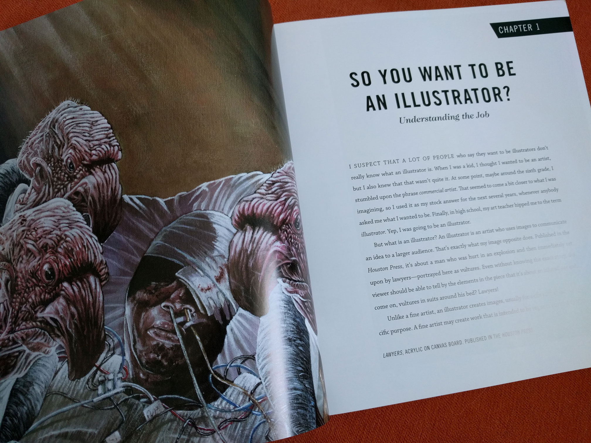
“It’s a working art. It serves a purpose. Unlike ‘fine art’, illustration isn’t about navel-gazing or finding greater truths in a tube of paint. It’s not for dilettantes or bored socialites. Illustration is an art and a profession.”

And Houston definitely respects his profession. In the chapter “Your Taste Doesn’t Matter”, he writes,

“Once you agree to take on that job, your assignment is to make the best work you can for the client. Trying to railroad the client into seeing things your way isn’t very professional, and giving the client a finished piece that’s different from what you both agreed to is entirely unacceptable.”

As proof of loyalty to these words, he includes multiple examples of work where the client had ideas he didn’t agree with but still realized those ideas with the same level of attention he’d give to any other project.

Other chapters focus on the technical parts of the job: developing concepts, creating effective compositions, research, and style. He writes, “A successful illustration is the perfect combination of style and substance. If that balance is off, the illustration suffers.” Accompanying each lesson are works by classic and contemporary illustrators, as beautiful and inspirational, as they are fantastic examples.

IMG_20160804_114521_m

Written at a quick pace not usually found in vocational guides, Illustration That Works is certainly informative and it’s also entertaining as hell. For example, while stressing the importance of correctly rendering the human form, Houston writes about (and draws!) a guy he saw in college who looked like a living checklist of amateur mistakes. He mentions Dracula enough times to notice and he’s very excited to tell you about gouache.

Illustration That Works is available now to purchase. Check out Greg Houston’s portfolio at www.greghoustonillustration.com and see which courses are being offered at the Baltimore Academy of Illustration at www.baltimoreillustration.com


Greg Jericho spends an awful lot of time designing for clients that do not exist. Check out his work at jerichovinegarworks.com

For the Love of Analog Design

With the recent launch of Adobe’s Creative Cloud came an assortment of new tools and features, most of which I’ll likely try to learn in an attempt to keep as current as possible. After hours of tutorial videos, I should be able to recognize which ones I’ll put into practice and which aren’t relevant to what I do. It’s sort of a labor of love for me, really, much like back when I was a more traditional artist and I’d spend an hour wandering through Utrecht’s, picking up new medium to try, trying it out, and either putting it into play, or abandoning it.

utrecht

Take my money..!

Since the digital design capabilities are already getting their press this week, I’d like to take this opportunity to recognize the analog  tools in my workflow, like pencils, paper, etc., and how I use them to start a digital project. If the finished project isn’t proprietary, I’ll have that original piece of work to sell, which wouldn’t be possible if the entire project were done, start to finish, in Photoshop or Sketchbook Pro.

Pencils!

No doubt, a #2 pencil with a full eraser on the end is a thing of joy. Because I learned how to draw while not paying attention in grade school, flipping a pencil around is more natural than using a separate eraser; therefore, the #2 is the favorite for sketching. I never was able to find a proper use for those pencil-packs with the range of lead-hardness but that rarely stops me from buying them every Fall.

#2 pencil and non-photo blue

Old Reliable and Blue

Once an idea and composition is nailed down, a Col-Erase non-photo blue is used on a fresh surface to fine-tune the details. This blue color is helpful because it’s dark enough to work with but appears faded compared to the final inking, hiding any un-erasable marks. Additionally, the blue can be easily filtered out after scanning when moving the work to a digital platform.

Color pencils have all but completely phased out of my process, mostly because I don’t finish the original illustration in color very much anymore. When I do, it’s Prismacolor and it always has been.

prismacolor pencils

My childhood was pretty much fueled on these and Watermelon Nerds.

Pens!

For years, I’ve used a fine-line Sharpie to make regular, everyday notes. It’s for legibility reasons, actually: nothing I write in ball-point can be read. When inking a drawing, I switch between Pitt artist pens (sizes F-XS) and, for the most delicate work, a Pilot Hi-Tec-C, which is engineered for precision with smudge-free ink. It’s probably my favorite pen ever but don’t tell Sharpie I said that.

sharpie, pitt pen, and hi-tec-c

Sharpie Ultra-Fine, Pitt artist pen, and the legendary Hi-Tec-C

Markers!

Markers are a newer addition to my analog arsenal. After trying out Prismacolors for a while and not liking the results, I bought a few made by Copic, based on user feedback.

copic markers

This is, like, $100 in markers.

These markers are expensive and their hype borders on cultism, but I’ve never used anything as satisfying as Copics to complete an illustration. That’s saying a lot, since all 24 of my markers are shades of warm and cool grays.

Paper!

I have three types of paper: dirty, clean, and notebook. The dirty paper is a sketchbook that comes from the dollar store, with 80 pages of cheap, grey, pulp. It’s not only inexpensive, alleviating worry about using it up too quickly, but it’s also not suitable for a finished piece, granting a sort of freedom to experiment and make mistakes.

Cheap, dollar-store sketchbook = priceless. Well, a dollar, actually.

Cheap, dollar-store sketchbook = priceless.
Well… it’s a dollar, actually.

This sketchbook is filled in every available space, worn spots or tears appearing if too much erasing is done, creating a healthy sort of forced revision of ideas rather than attempting perfectionism on a particular sketch. Perfectionism isn’t what a sketchbook is for.

Clearly.

Clearly.

The clean sketchbook is always the same for me: Strathmore Bristol Smooth. This is where the best parts of many dollar store pages goes, sewn together like Frankenstein’s monster, copied over in non-photo blue via grid, lightbox, or projector depending on the size.

So bright. So very, very bright...

So bright. So very, very bright…

This copy, once inked, is captured digitally either with a scanner or, if it’s over 8.5×11, a camera for Photoshop. Then the original can be completed with markers or colored pencils.

My everyday notebook of choice is Field Notes because it fits into a back pocket and their design aesthetic is enviable. Released seasonally, they come in themed packs of three and usually sell out fast.

The County Fair edition is in prize-winning ribbon colors. Sweet.

The County Fair edition is in prize-winning ribbon colors. Sweet.

So, during all of the digital design news this week, consider revisiting those analog tools of the trade or even discovering them for the first time. Stop in your local art supply store, browse the sketchpads, check out some pen options, and maybe find something that you can share with us here at AIGA Baltimore. We might be able to make an event out of it.

Hmm: Analog Design Day. That has a nice ring to it.

Greg Jericho spends an awful lot of time designing for clients that do not exist at his equally fake company, Myopic! Studio.