Posters, Narratives, and Linework: Recounting our Night with Daniel Danger and the National Poster Retrospecticus Exhibit

Posters, Narratives, and Linework: Recounting our Night with Daniel Danger and the National Poster Retrospecticus Exhibit

To kick off Baltimore Design Week 2015, we met at Stevenson University for a poster exhibit and art talk. The National Poster Retrospecticus (NPR) is a traveling poster show featuring over 400 pieces by over 125 artists from across the United States, with the purpose of celebrating and spreading appreciation of the made-by-hand poster movement. Curated by JP Boneyard, the exhibit included a wide range of styles. Minimal, intricate, flat, detailed, limited color…the variations showed attendees something new at every turn.

Art Talk and Opening Night for the National Poster Retrospecticus Exhibit

Daniel Danger, a New England-based illustrator and printmaker, and proprietor of Tiny Media Empire, lead the evening’s art talk. Asking first if we had anywhere to be anytime soon and warning us that he was about to “get weird with it,” Daniel walked us through his creative process, his work, and why he does what he does. A fan of “narratives stacked on narratives,” Daniel’s creations consist of fantasy settings mish-mashed together from various sources. Working with clayboard covered in black ink, Daniel painstakingly scrapes away the ink, creating the highlights in the piece. More than 200 hours of work goes into creating his large scale pieces.

Personal work ended up being key for Daniel during the tough points in his life. By creating work that had meaning just for him, he was able to deal with complex emotions and become a better illustrator in the meantime. Daniel gradually gained opportunities to sell his artwork. Work that he sarcastically described as “not at all personal” made its way onto posters commissioned for punk bands.

Art Talk and Opening Night for the National Poster Retrospecticus Exhibit

Closing his talk, Daniel was asked why he chose screenprinting as the final medium for his posters. Although he does not actively screenprint much anymore, Daniel described how much he loves the prepress process. Screenprinting, he said, is a very logical process. There either is, or isn’t ink. The intricate details of Daniel’s work can be recreated with a good printer, fine mesh screens, layering techniques and a lot of patience.

As far as subject matter—destroyed home towns, abandoned structures, memories of loved ones—no topic or life event is too dark to become the focus for his next piece. As Daniel so eloquently puts it, “everything is beautiful if you look at it the right way.”


Photography by Sophia Belitsos, a Baltimore native with a strong passion for photography—especially food, travel and photojournalism. View her work at sophiabelitsos.com.

Shannon Crabill is a HTML Email Developer at T. Rowe Price. Outside of the Internet you can find her riding her motorcycle and binge-watching home improvement shows on HGTV. Tweet her at @shannon_crabill.

Design & Dine: An Evening of Excellence

When we asked Baltimore designer Wesley Stuckey to come present his work at the Fork & Wrench while attendees noshed on items from a prix fixe menu, we didn’t know just how awesome the evening would be, but awesome it was. The cuisine was just as delectable to our taste buds as his presentation was to our creative eyes as Wesley showed us how he worked through several of his food-related design projects in the local area — like the branding for Dooby’s, Owl Bar, and Milk & Honey to name a few.

Take a look at the video, photos, and tweets from the evening, below:

AIGADW15 [Design and Dine] from AIGA Baltimore on Vimeo.


Check out more photos on our Flickr page, too.


Thanks again to all our attendees, our sponsors Exit 10Indigo Ink, and Fork & Wrench for a fantastic evening!  


Photo Credit: Jennifer Marin Jericho is an Industry Specialist for the School of Design and AIGA Chapter Advisor. Co-President Emeritus, AIGA Baltimore. Follow her on Twitter @hungry4design.

Video Credit: Leonard Brady is a University of Baltimore graduate who currently works as a video producer for Stevenson University’s marketing department. When Leo isn’t hiking trails in Maryland state parks, he enjoys taking photos. As a Baltimore City native, Leo is very involved in social justice and community organizing efforts in Baltimore.

Top 7 Takeaways from Baltimore Design Week 2015

Top 7 Takeaways from Baltimore Design Week 2015

This past October, AIGA Baltimore celebrated design by kicking off its 4th annual design week. With over a half dozen events between Oct 16th-23rd, it was one of our best registered and attended design weeks to date. For those who missed it or just want a recap of the week’s events to tide you over until Baltimore Design Week 2016, here is a list of our top seven takeaways from 2015.

  1. Failure isn’t the end of the world
    Alyson Beaton told us about her experiences with failure while developing her company, Lille Huset. Failure, as she says, teaches you when to let go, and when something needs to change.
  2. Personal projects—projects just for you—are important
    Not only do personal projects give you the opportunity to explore ideas or concepts outside of your day-to-day, but it can also be therapeutic. Daniel Danger spoke on how creating personal work helped him cope with complex emotions at the opening art talk for the National Poster Retrospecticus.21784967734_c759d5f1b9_o
  3. Inspiration can be anywhere. Even graveyards.
    While touring graveyards in Southwest England, Paul Barnes of Commercial Type was inspired by the worn, eroded tombstone lettering. This prompted him to create Dala Floda, an elegant stencil typeface that looks anything but military.showcase-dala-floda
  4. A-N-A-C-I-N
    Considered one of the oldest pain relief brands in the United States, Anacin made waves with their advertising strategy. Anacin television and radio ads were “designed to irritate” with their continually repeated unique selling proposition. One of the original television spots cost only $800 to create and generated $86 million in media buy revenue.Screen Shot 2015-12-21 at 5.47.55 PM
  5. Don Norman and the Norman Door
    In its simplest terms, a Norman Door is a door that at first glance does not quickly convey how it should be opened—pushed or pulled. Named after Donald Norman, it represents one of the key principles of user experience design: To empathize with the user.
  6. Mad Men was 90% accurate
    Thin ties aside, the 1960s marked the “age of the creative team”. Copywriters and art directors started working on advertising concepts together to share with the account executives, the true “Mad Men” of the era.SHAG: Mad Men: Myth vs Reality
  7. What do you do when your client hates the one concept you had to show them?
    Get back to the drawing board. Fast. Commercial Type experienced this exact moment of panic while showing lettering concepts to Puma for their sponsored teams in the Africa Cup of Nations. They scrambled to come up with a new concept, Crepello, which ended up being a winner for them and the client.
    crepello_specimen

Check back soon for more design week recaps. Who’s ready for Baltimore Design Week 2016?


Illustration by Niko Kwiatkowski

Shannon Crabill is a HTML Email Developer at T. Rowe Price. Outside of the Internet you can find her riding her motorcycle and binge-watching home improvement shows on HGTV. Tweet her at @shannon_crabill.

Ben Jenkins Lives Slow and Makes Fast

Ben Jenkins, founder of OneFastBuffalo, toured the East Coast hitting up six cities in six days to talk to six AIGA chapters about how he evolved his design business and his personal life into a more satisfying and fulfilling one. We laughed, we learned a lot about his concept of work-life balance, and we talked about how designers have a natural inclination to be designtrepreneurs.

“Twitchyness is contagious”

Ben Jenkins started his presentation with a disclaimer: “I can be a bit twitchy, and it can be contagious.” And as he continued through his talk, we watched him go into side tangents, witnessing just for ourselves how twitchy he was. We hung onto every word, anyway, as Ben told us a story about how he evolved his design business and his personal life into a more satisfying and fulfilling one.

About Ben

Growing up in the suburbs of Dallas, Ben Jenkins loved two things: art and baseball. He admitted it’s an odd combination; there aren’t many sports fanatics that are also into art and design. Following his dreams, he got a scholarship to play baseball at Mississippi State University, where he studied graphic design and architecture. After graduation, Ben went on to play for the Phillies in the minor leagues, and out on the road he passed the time working on small design projects for whoever asked him. These projects put him on the path to freelancing after Ben realized that his career as a baseball player was not going to land him in the big leagues. He continued his education at the School of the Art Institute of Chicago, where he earned an MFA in Art & Technology.

Everything is Bigger in Texas (Including Partial Male Nudity)

In 1998, OneFastBuffalo (OFB) was born from the idea that conventional wisdom isn’t always useful. Using his competitive nature as a ball player, Ben grew OFB from a two-person operation to a boutique firm. OneFastBuffalo would move from one office space to another as they expanded, and each time Ben would strive to create the dream office that any agency and their employees would love to have, especially one that would impress clients.

Through the growth of OFB, Ben sought validation as a successful graphic designer. He felt strongly that in order to be considered a good designer, he needed a client list full of the big ones. He was collecting his own design trophies, so to speak. Over time, he would spend more energy managing than designing, more time at the office than at his home, and more time making calls for work. Those 10 years of trophy collecting took a toll on Ben. The man who had been good enough to play in the minor leagues had gained substantial weight and it showed (literally) in the photos his wife took of him just wearing gym shorts.

Slimming the Buffalo (and the Man)

In 2008, Ben realized that it was time for another renovation, and not just one of office space. He turned his work and personal life upside down after realizing that he could work better in a different way. In a period of purging, Ben reduced not only his weight and a large portion of needless possessions, but also the size of OFB as the economy took a downturn.

He even subleased his office space (with the furniture), enabling him to do more with less. Plus this allowed him to spend more time with his wife and three sons. Instead of just heading off to work in the morning and getting home late from the office, he wakes up and has coffee with his wife, takes his sons to school, works in his home office (or wherever he feels like working), and spends time with the boys after school, too.

As Ben simplified the external aspects of his business, his branding process changed, as well. Now, instead of giving clients multiple logo concepts, Ben focuses on just one concept until he gets it right. This allows for more concentration and energy to be put into that one idea, as opposed to spreading the creative energy and time across two or three ideas, he says. And, as an added benefit, the client never picks his least favorite concept. And this process works, too! Since Ben began presenting one concept to clients in 2008, he’s only had to go back to the drawing board a few times.

Since 2008, one logo concept is shown to the client. This allows for more concentration and energy to be put into that one idea.
Since 2008, Ben shows only one logo concept to the client. This allows for more concentration and energy to be put into that one idea.

As his business evolved, Ben also stopped worrying about collecting trophies. He now focuses on creative work to help good people make famous brands, and he’s quickly learned that it’s more enjoyable and more fulfilling to work this way.

Where the Buffalo Roam (Have laptop, Will Travel)

While eating some authentic Mexican cuisine with his wife and kids, Ben came up with the idea of a Mobile Creative Lifestyle. Harking back to his days as a baseball player in the minor leagues and being out on the open road, Ben wanted to combine his passion for design and travel. Buying a 1958 Airstream trailer, Ben began to take his family out on “journeys” (not just vacations) and taught himself to “create big work in the smallest of ways,” by working within the confines of wherever he is at the time.

The OneFastBuffalo 1958 airstream mobile office
The OneFastBuffalo 1958 airstream mobile office.


You can now find Ben working on a brand concept in the back of his truck on a lawn chair, parked by a lake, while his wife and three sons enjoy some fly fishing or playing in a nearby playground. This is how “Live Slow, Make Fast” became his new mantra. Ben says that living and doing beautiful things that you enjoy while resting and relaxing will re-energize your work. Working in this way allows him to stay more focused and fill the eight hours (and only eight hours) with a more productive workflow. He uses the 8-8-8 principle to demonstrate this: 8 hours of sleep, 8 hours of play, and 8 hours of work make for a much more healthier work-life balance. There’s time to make and time to live, all in one day.

Ben quickly noticed that this new found freedom of working anywhere at any time made his work better, too. The famous brands that Ben used to chase around now just come to him because they recognize the quality of work he produces and the energy and focus he puts into it.

Designtrepreneur

With his new approach to working, Ben found he had the energy and focus to create brands for himself rather than for a client. He believes that designers are still artists at heart and that their ability to create and produce gives them a natural inclination to start their own personal brands. Armed with a passion for baseball, Ben started Warstic Bat Company, which produces handmade wood bats, baseball gear, and apparel. The company was recently featured in the pages of GQ and was even contacted by Coach to sell a limited run of men’s gear in their stores. Some other brands Ben has created are Treadsmith Board Co. (a snowboard producer), and INDIG (a strategic branding company for Native American owned companies).

Warstic_Pic
Warstic Bat Company, one of Ben’s many self-created brands.
The Journey Continues

The takeaway from Ben’s presentation is that a well-rounded work-life balance can be beneficial to re-energizing a creative professional’s focus and drive. He says you do not have to allow the pressure and distractions affect you as a whole. Spending time away from the computer and spending quality time doing things that make you happy will help you to be a better creative.

On June 1, 2015, Ben will shut OFB down for the summer and not reopen for business until September 1, 2015. He will travel around the country on a journey with his family, enjoying some quality time together while resting and relaxing. When September comes back around, with the energy he will have stored up, he most certainly will come out swinging his bat of creativity. And we can’t wait to see what he does next.


Chad Miller is a Senior Graphic Designer for MedStar Health who enjoys all things design and all things caffeinated.

From Reviewee to Reviewer: Ink & Pixels From the Other Side of the Table

I began attending Ink & Pixels in my junior year at Towson University. At the time, I was preparing to screen into the design program in order to complete my BFA in Graphic Design. The screening requires a phenomenal portfolio from all candidates to secure a spot, and as I walked into Ink & Pixels I thought I had one. I remember thinking how blown away the reviewers were going to be with my awesome portfolio and design skills. So I sat down across from my first reviewer and introduced myself.

Shockingly, the reviewer was appalled by my lack of professionalism. Despite my best efforts to enhance my appearance that day—I wore a shirt tucked in with a tie to match my personal brand colors—my work and portfolio presentation just didn’t stand up to the test. Looking back, it wasn’t much better put together than a wet rat. But I was stupidly cocky.

After a few questions in, I warmed up to the reviewer and we found our level ground. She complimented my work where it was deserved while detailing every nook and cranny that I needed to change in order to create a quality portfolio. My reviewer took the time to ask me about where I wanted to be professionally after graduating. She asked what designers influenced me and gave me tips to make my goals easier to obtain.

In the weeks to follow, when I was accepted into TU’s BFA program, I decided that my reviewer’s tough love was the best advice I could have gotten. I appreciated the feedback so much that I decided to return to Ink & Pixels the following year, too.

The review sessions from both Ink and Pixels ‘13 and ‘14 allowed me the opportunity to talk with professional designers, some of whom were hiring managers and many of whom I am still in touch with. They told me exactly what I needed to hear and didn’t sugarcoat it. No one held my hand nor did I receive a lollipop at the end. These professionals were there to make a real difference in the way I think and create as a designer, and the advice they gave me extended beyond just presenting my work.

In December 2014, I graduated with my BFA in Graphic Design from Towson University. Before graduation, I put together a fantastic portfolio using everything I had gained from Ink & Pixels. I also used the connections I made with my reviewers to get invited to 10 different interviews. Yes, 10! Those connections got me a full-time job.

So, now it’s my turn to dish out advice: if you’re a student thinking about attending an Ink & Pixels conference in the future, don’t think; DO. It will change your future.

For Ink & Pixels 2015, I knew it was time for me to give back as a portfolio reviewer. I helped several students take a look at their portfolios from a new perspective, guided them on their work and their portfolio presentation, and dished out all the advice and lessons I had learned over the past couple of years.

I reached out to each student I was fortunate to meet, and have even been able to pass on a resumé here and there to hiring managers who may have a fit for the graduating student. It feels fantastic knowing that I am now able to help make a difference in their careers.

A few more words of advice: if you’re a student who has passed through Ink & Pixels and working as a professional, please give back. We can continue to make sure great design is being ushered out on to the world, especially in Baltimore.

Register for Ink & Pixels Portfolio Review!


Liam Clisham, an AIGA member since 2012, owns and operates Five31, completing motion and graphic design for a variety of large and small business, including Exelon/BGE, Keller Williams, and recently Discovery Communications.

Human Rights Campaign: Designing for Equality

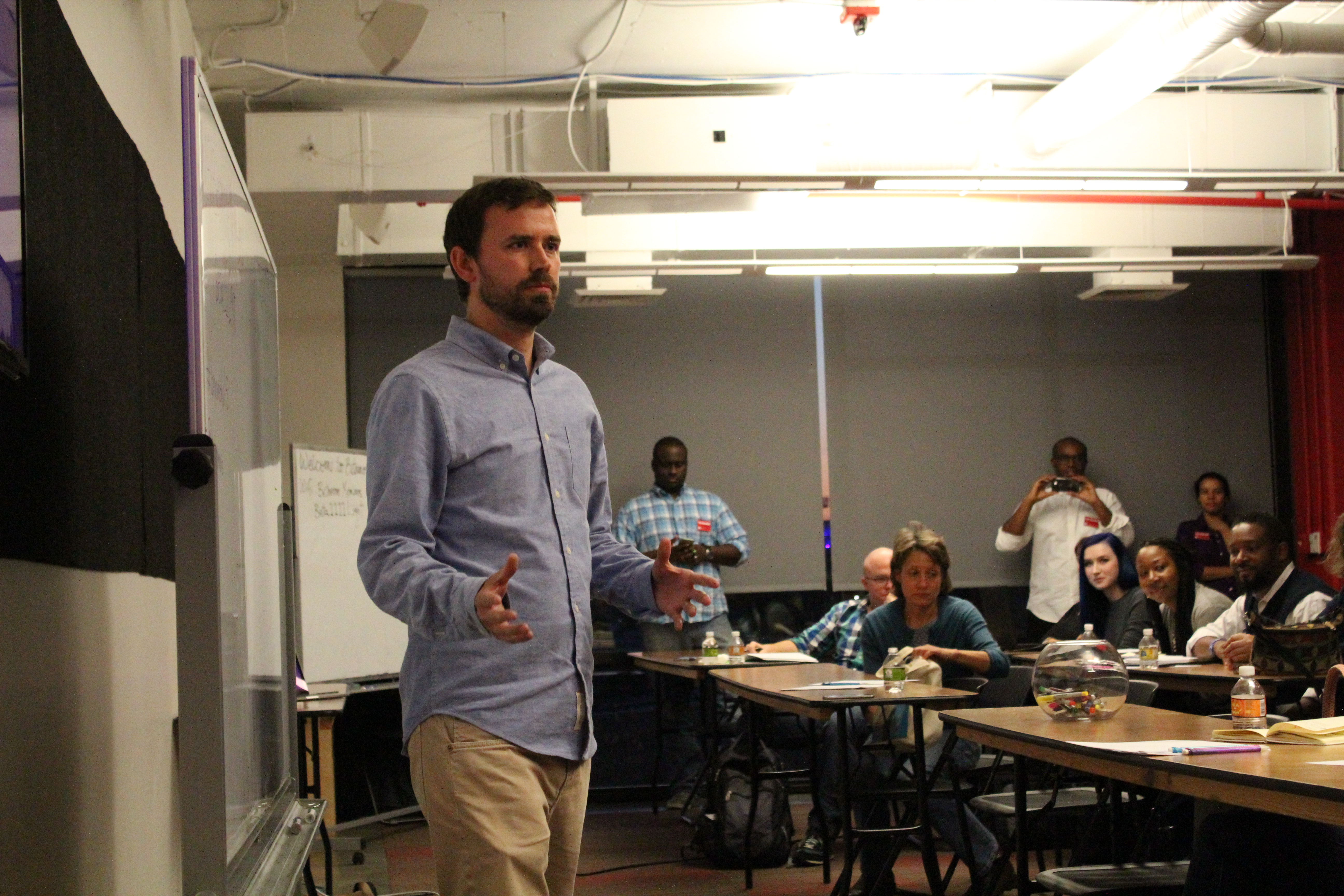
During Design Week 2014, AIGA Baltimore was joined by Bob Villaflor, the Design Director for the Human Rights Campaign. Bob talked with us about his experiences with the organization and the importance of design in his work.

About the Human Rights Campaign (HRC)

The Human Rights Campaign (HRC) is the largest LGBT civil rights organization that is fighting for LGBT equality. They aim to spread the word about important LGBT issues by featuring and supporting high profile people who are behind their cause. If you know about the HRC, then Design Director Bob Villaflor is doing his job!

Bob joined the HRC eight years ago and is believed to be the first non-LGBT creative in the organization. His fresh perspective reflects on how far we have come and where it will take us.

What we do as Designers

To quote Bob, “Design plays a critical role in what we do.” With over two million supporters and members, the design team pushes to reach as many people as possible. HRC volunteers are knocking on doors, sharing educational materials, and gathering pledges, which are just some of the tasks the creative team has to support. Being responsible for the visual presence of the organization allows them to put a face to the goal of driving movement among the public.

The most easily recognizable visual aspect of the Human Rights Campaign is their logo. Until its current version, the logo didn’t really exist on a social level, so the design team aimed to consolidate the old version in a way that still reflected the company. The logo had to be simple, elegant, and honest—values inherent to the organization.

Formerly known as the Humans Rights Campaign Fund (HRCF), the HRC was founded in 1980 and went through several logo iterations (here’s just a few of them). In the most recent redesign, the HRC design team partnered with SYPartners of San Francisco in a yearlong rebranding effort. SYPartners helped to solidify the brand and eventually settled on the yellow equal sign on a navy blue square. This now iconic logo helped to give an identity to the movement by representing the HRC core values.

Bob explained, “The logo became something for people to rally around.”

A Tipping Point

In 2012, Chad Griffin joined HRC as the organization’s President, which marked the start of a growth point for the organization. Shortly thereafter, the Supreme Court announced that it would hear arguments on California’s Proposition 8, a ballot proposition that had been passed into law by California voters to deny rights for gay couples to marry. This announcement gave HRC the opportunity to brand the event for its supporters in Washington, DC. Realizing that Proposition 8 was a “court case about love,” Bob and his design team chose to make red the signature color of the campaign. In a bold move, the HRC logo was temporarily changed to muted pink on a red background to show its support for turning over Proposition 8 in early 2013.

In an unexpected turn of events, the campaign went viral, with celebrities and supporters like George Takei, Alicia Keys and Budweiser changing their Facebook and Twitter profile pictures in support. Fans took the campaign and ran with it, remixing and personalizing the logo. The reach was global to the point that it crashed the HRC website and to this day remains one of the most successful campaigns in Facebook history as well as one of the most retweeted of all time. HRC could not have planned for this one hesitant change to be so big, but it made people realize who supported who—which was a big thing to see.


To learn more about HRC, their logo and how it went viral, visit:
http://www.hrc.org/the-hrc-story/about-our-logo


Equality Magazine, Annual Report and Other Campaigns

In addition to their social media and campaign presence, the HRC design team is also responsible for the layout and design of Equality Magazine. At 250,000 copies distributed each quarter, Equality Magazine is the largest LGBT rights publication in the United States. The magazine helps bring attention to anti-LGBT organizations such as the National Organization for Marriage; it also endorses its supporters, recognizing their work in the movement.

The annual report serves as another opportunity to focus on both positive and negative world trends. For the 2013 annual report, HRC partnered with design agency Column Five to develop something that went beyond the standard data-heavy reports that can overwhelm readers. Research and data was compiled into a sharable, easily digestible infographic printed on the reverse side of a book jacket for the annual report. Doubling as a poster, the infographic was shared outside of the organization’s list of major donors.

The HRC design team tackles other campaigns, too, like the “Love Conquers Hate” campaign leading up to the 2014 winter Olympics in Sochi. Equality Magazine started this campaign to show support for the LGBT community in Russia. It was punishable to show LGBT support in Russia, so HRC encouraged Olympians and celebrities to share pictures of themselves with the Russian-language version of the “Love Conquers Hate” shirt across social media.

The Future

In the future, the Human Rights Campaign will continue to “fight for people’s lives” not only in the U.S., but also across the globe. Campaigns such as Project One America aim to share the stories of real LGBT people and their families in less-than-supportive areas such as Central Mississippi, Alabama and Arkansas. On the international front, HRC continues to share their materials, design, strategy, and knowledge with fellow supporters who are trying to raise awareness to audiences across the globe.


Q&A With Bob

What is the biggest hurdle to design around at HRC?
Joint projects. Other departments or agencies can be sensitive over their content.

What advice would you give to designers working with nonprofits who might be against riskier design moves?
Don’t be afraid to put something out there. Consolidating branding of HRC was a big move—so was changing the logo in support of Proposition 8—but it allowed the community to think, to interact with it. Design solutions do take a lot of buy in from senior management, but they do have to trust your decisions in this dynamic time for the organization and LGBT community.

How do you feel about living, working and making changes in Washington, DC—the political heart of the country?
Seeing change is incredible. My family and kids live in a city where lives are being validated—which is funny in a city like Washington, DC that at times can’t seem to get anything done. Don’t Ask, Don’t Tell was a recent win that was seventeen years in the making.

As a designer, how do you handle a bad stakeholder review?
Beer! Think less about the rejection and more about moving forward, about the mission. You are not going to win them all. Some days there is just no time to come up with something perfect and sometimes it’s junk. Other times, it’s about the longview. With HRC, there’s the luxury of not having to have tangible results like numbers, sales, revenue, but that’s not always the case.


Shannon Crabill is a New Media Specialist at T. Rowe Price. Outside of the Internet, you can find her dancing, riding her motorcycle and binge-watching home improvement shows on HGTV. Tweet her at @shannon_crabill.

Mitchell Cole is the web sales manager at Service Photo Supply. Most of his free time is spent indulging in some sort of gaming, controller or dice never far from reach. Find him on Twitter at @mc_mittens.

NPR: Design for a Non-Visual World

One: Dissolve

The key to designing for listening is to realize that it is not quantitative. It is not about what it looks like, but about how long a user is listening. It is not about the type, the pixels, or the grids that we love so much, but about how the user feels when they are listening. Users want to be able to open a mobile or web app and start listening right away. Much like a high-quality, award-winning loudspeaker, it’s designed not to be seen and a user will often pay more for a seamless experience.

The challenge is that users are busy—they’re multi-taskers—and user interfaces can compete for their attention, so we need a different approach.

Two: Flow

In not designing a visual experience, the goal is to instead design a flow that will keep the user engaged. A ‘flow’ can be described as a structure or a language similar to what you would find in music. Just as verses, choruses, and bridges combine to create the flow of a song, the elements of good audio design combine to create an engaging listening experience. In that way, success is already programmed into the user experience.


“So much of what we know, and what we think, and what we feel, and what we remember is affiliated with how it all sounded.” — Colonel Chris Hadfield


An app designed as a listening experience should be extremely basic—only what’s necessary and without anything to distract the listener. It needs to be as easy as turning on the radio. For example, NPR’s app, NPR One, is responsive and is made to be tucked away behind another browser tab if you are listening to the radio while at work.

Three: Complement

The final concept to designing for listening is learning how to correctly read the audience. Like a good DJ, being able to read and to respond appropriately to the listener makes a better experience. People are busy and listening is often a parallel activity, so the challenge is to engage the listener by delivering the right programming all the time. Users’ habits—how or when they listen—are subtle signals that can help us deliver the best content.

The challenge is that NPR gives away their formula. The Application Program Interface (API) is available for free, which means anyone can take it, use it, remix it, and even make money off of it. A lot of people do the latter, but what they don’t have is the science or the algorithms behind the experience. Programs like Pandora use metadata to deliver a playlist, but not always in a way that equals what the user had in mind. The human element that NPR has created, of metadata and experience, is what makes a difference.


Q&A with Benjamin Dauer

What’s the Future of Public Radio?
In the future, public radio (especially NPR) will connect you to a handcrafted, personalized stream of local and national stories, both from shows you like and some we’ll surprise you with. You’ll be informed, entertained and connected to your community in a way that fits your life.

What is the biggest hurdle to design around?
NPR headquarters operates independently from local stations, but local stations do have needs that we try to address. For example, they want the functionality of listeners being able to donate money within the app while ensuring those funds stay local. A workaround hasn’t been figured out just yet, but little steps like linking to a donate page on website are a push in the right direction.

What advice would you give to designers working with nonprofits who might be against riskier design moves?
Educate the stakeholders. “Design is education.” Don’t show them how it looks, but how it will work. Show them a working example whenever possible to help support your reasoning.

As a designer, how do you handle a bad stakeholder review?
Beer! Take your ego out of it. It’s not really about you. In the case of NPR, it’s about the listener. I think about how I can give the listener that thing they want with all of these other crazy requirements.


Shannon Crabill is a New Media Specialist at T. Rowe Price. Outside of the Internet, you can find her dancing, riding her motorcycle and binge-watching home improvement shows on HGTV. Tweet her at @shannon_crabill.

Mitchell Cole is the web sales manager at Service Photo Supply. Most of his free time is spent indulging in some sort of gaming, controller or dice never far from reach. Find him on Twitter at @mc_mittens.

BMA’s Big Table Roundtable: A Conversation on Immersive Design

On Saturday, October 18th, AIGA Baltimore opened its third annual Design Week at the Baltimore Museum of Art with a roundtable discussion on immersive spaces.

The Big Table is a project headed off by Baltimore Museum of Art (BMA) that strives to address questions and criticisms about art posed by visitors. Each year, a designer or a team of designers is chosen to address one question or idea. Bruce Willen and Nolan Strals from Post-Typography, Ellen Lupton and Abbott Miller from MICA and Cooper-Hewitt (respectively), and David Plunkert of Spur Design, have all designed for The Big Table over the past few years. They gathered together to discuss their concepts at the BMA in the Fall of 2014.

Gamynne Guillotte, Director of Interpretation & Public Engagement for the BMA, talks about the purpose and format of The Big Table.
Words are Pictures are Words

How do contemporary artists use text in their work? Willen and Strals approached this question by considering language and how meaning changes depending on how it’s written. They created their immersive space, titled Words Are Pictures Are Words by using that same phrase in several contexts, including a room-sized infographic, showing how the meaning of the phrase changes depending on type, style, and arrangement.

Willen and Strals talk about their concept for Words Are Pictures Are Words.
Point, Line, Grid

“The idea becomes the machine that makes the art.” This quote by Sol Lewitt inspired Ellen Lupton and Abbott Miller to create the work Point, Line, Grid. They created a bulletin board-style grid that explores the way an artist thinks by inviting visitors to create and display their own artwork to dominate the room for the next year. The environment was created to point to the inspiring artwork while letting the visitors create something of their own.

Ellen Lupton talks about how they implemented the grid on the walls, and suddenly the room became an interactive experience for viewers...or shall we say, participants?
Ellen Lupton talks about how they implemented the grid on the walls, and suddenly the room became an interactive experience for viewers…or shall we say, participants?
Extra-Ordinary Objects

David Plunkett says that an object in a museum becomes something more important because it’s in a museum. He approached his Big Table project by studying the permanent exhibits in the contemporary wing and making a list of the common items he saw there and in an everyday environment. The resulting work, Extra-Ordinary Objects, is a room about objects one could find anywhere, remixed and displayed in ways that were unusual, presenting the viewer with a new, amusing way to see the relationships between those everyday objects. It will be on display in the Contemporary Wing until September 2015.

David Plunkert talks about a few of his extra-ordinary objects.

To see more photos from this event, check out the set on Flickr.


Greg Jericho spends an awful lot of time designing for clients that do not exist. Check out his work at gregoryjericho.prosite.com.

Kicking off with the Ravens Marketing Team

Kicking off AIGA Baltimore’s Design Week 2014 at ADG Creative, the Ravens in-house marketing team sent in three of their best to talk about how Baltimore’s own NFL team thinks creatively about design and marketing. Bryan McDonough, Heather Blocher, and David Lang discussed how they target Baltimore football’s wide audience across print, digital, social media, and broadcasting in a fascinating presentation, all while showing off their flashy Ravens World Champion rings.

Marketing the Ravens

Emphasize consistency. That’s the team’s key secret for seamless collaboration. The Baltimore Ravens’ marketing team only joins forces with outside agencies occasionally. Almost all efforts take place in-house, even broadcasting. As a graphic designer for the Ravens, presenter Bryan McDonough described the group as being a “mini agency”.

The marketing team has to “churn and burn”—they’re ready to react. While most NFL creative teams ask “how does this help us sell tickets?”, the Ravens are always sold out, allowing more creative freedom. Each campaign piece still must work across all platforms, including print, digital, broadcast, and environmental. The organization also reaches a wide and inclusive audience of women, men, families, young fans, and seasoned fans.

If that wasn’t enough of a challenge, the NFL has strict geographical marketing regions when it comes to things like print collateral and tv ads. The Ravens are uniquely sandwiched between two neighboring teams: the Washington Redskins and the Philadelphia Eagles. Luckily, there are no borders on the digital front. Even with the NFL limiting Ravens from print and tv in areas geographically associated with other teams, the web provides ways to market beyond these borders without regional terms.

How an idea becomes a campaign

Each season’s new campaign begins after the playoffs. The success of the players on the field decides when to shift focus to the year ahead. At this point, the design team’s first deadline is printing the next season’s tickets by May. During the summer months, the team prioritizes working with Ravens sponsors.

Ravens' 2014 season tickets
Ravens’ 2014 season tickets

From the very beginning of each campaign, the marketing department’s creative process includes senior management, creative, marketing, and board representatives. Several concepts are narrowed down to the best two or three ideas. The public relations, digital, and print teams collaborate to select which concepts should move forward. Polished into solid presentations, the concepts must be clear to the point where the executives—who don’t necessarily have creative backgrounds—understand the direction and ideas.

In charge of overseeing these efforts, event presenter Heather Blocher serves as Senior Manager of Advertising & Branding. Heather started as an intern and officially joined the marketing group as her first job after college, a prime example of how team members are given opportunities for growth.

The one surefire way to win a campaign? Have Coach John Harbaugh buy in. If creative and marketing have his vote, then the players and fans approve. John can be tough, however. Even with free lunch in the cafeteria, Harbaugh recently put everyone on a diet. No more “Pizza Friday.” It’s just salad. At least everyone gets cake after a win, though. On the other hand, losses do affect morale. The next day everyone is bummed right along with the fans—and a lot goes into game day behind the scenes.

How to “Play Like a Raven”

Give it your all, 110%, on and off of the field. That’s what it means to “Play Like A Raven”—the team’s tagline and annual marketing campaign since 2009. Praised by coaches, players and fans, the phrase remains one of their most successful campaigns.

Focusing on the human element and illustrating the off-the-field “Play Like A Raven” concept, new photo shoots show players training and behind-the-scenes. Quotes from Coach John Harbaugh integrate into the final design to reflect this more personal tone. Landscape posters using this imagery portrayed the players as heroes and role models. The posters were envisioned as inspirational collectables distributed at stadium practice events leading up to the season opening.

Their 2014 marketing both hints back to the original “Play Like A Raven” campaign and pushes the idea to the next level. Fan shots became a major part of the previous campaign’s success. The logical next step uses these even more expansively. Updated photography showcases the vast Baltimore cityscape. A new style guide allows visuals to easily translate from print to web, mobile, and broadcast as the team continues to improve the level of consistency.

Taking the campaign online

Hashtags for the Baltimore Ravens were once inconsistent with mixed messages and sources. Fans generated some with others in the marketing department. For example, #relentless is not specifically related to the Ravens alone. Rather than join these existing and wider conversations, their own threads were started specifically for the Ravens’ team. David Lang, as the Ravens’ Senior Digital Media Manager, discussed how he oversees the website and digital presence, including social media and broadcasting.

David Lang, discussed how he oversees the Ravens' website and digital presence.
David Lang, discussed how he oversees the Ravens’ website and digital presence.

Tackling the confusion, the 2014 campaign includes just one hashtag: #playlikearaven. Since the Ravens are a newer team, creating an abbreviation like the Redskins hashtag—#HTTR for Hail To The Redskins—was deemed less meaningful and effective. Instead, #playlikearaven was trademarked. Beginning in 2014, posters and promotional materials added #playlikearaven, and this encouraged players and fans to share virally on social media.

The marketing team found creative ways to involve the players and the rest of the organization as the official hashtag gained popularity. The most positive and encouraging Facebook posts, tweets and photos were printed after sifting through thousands of social media posts. Displayed at the Ravens’ cafeteria entrance, these images help connect the staff and players with their fans. This interactive element that goes beyond an online “like” or “retweet” reinforces the idea that the Ravens marketing is not just a one-way conversation.

Outside of social media, President of the Baltimore Ravens Dick Cass is a driver for old school methods. Even though holiday cards are still printed, the marketing team did take to the streets late one night. With permission, the team stenciled graphics across the city using an environmentally safe paint from Germany to engage with their fans. But most often, the Baltimore Ravens leave street-level tactics to the fans themselves. They’re the ones who do guerrilla marketing best.


Photos by ADG Creative

Shannon Crabill is a New Media Specialist at T. Rowe Price. Outside of the Internet, you can find her dancing, riding her motorcycle and binge-watching home improvement shows on HGTV. Tweet her at @shannon_crabill.

Brian E. Young is an art director and magazine designer by day and artist by night. When not painting, he’s helping unlock imaginations via his blog and The Uncanny Creativity Podcast. Ask him anything: sketchee.com.

Event Recap: Adobe Responsive Design Workshop

AIGA Baltimore’s Adobe Edge workshop wasn’t just about the tools we have at our disposal; it was also about the process of designing responsively. Most of us in attendance were designers who happen to code but that wasn’t our specialty, so Brian Wood, our guest lecturer, went over plenty of web basics to catch us up.

The Tools

Brian worked for Adobe for 13 years and now spends more time doing what he loves most: lecturing about web design, including Adobe’s own suite of development tools for designing, coding, and testing responsive design. The suite includes:

  • Edge Animate – Useful for making animations, web banners, etc. using HTML, CSS, and JavaScript. Interactive elements can be built using Edge Animate; however, it’s not meant for building an entire site.
  • Edge Reflow – Used for rapid prototyping and visually showing responsive elements.
  • Edge Code – A simple, text-only code editor, similar to Sublime Text.
  • Edge Inspect – Built for testing on actual devices in real time via an app on your device (tablet, phone, etc.) and a Chrome plug-in. A local or live site can be mirrored on each device on same network.
  • Edge Web Fonts / Typekit – Hosted fonts that are free with an Adobe Creative Cloud subscription.

Additionally, we had access to free web fonts available outside of a Creative Cloud subscription, such as Google fonts.

What is Responsive Design?

Mark Boulton, whose design studio created the Gridset responsive layout tool, says, “It’s making sure your layout doesn’t look like crap on different sized screens.”

Responsive design, also called mobile optimization, refers to a website that is viewed on various devices without degradation in user experience. There are two main types of responsive design. The first is based on overall screen percentages, called a liquid layout. The second uses liquid in conjunction with breakpoints (or media queries) to force elements to adjust at specific points based on the size of the browser or viewport window.

Responsive design differs from adaptive layouts where the widths are static, or set, and media queries are used to establish breakpoints that adjust the layout where it starts to fall apart. For more information, check out the great resources at the end of this article.

Let’s Get Started

It used to be that a web designer would build a mockup of a website in Photoshop, show it to the client for approval, send it to development, and bam! we’re done. Now, the job is generally more difficult because there’s so much more to consider when building a responsive website, not to mention many designers are expected to take on the front-end development themselves.

One of the first steps we can take when designing a responsive site is to decide if we should start a design for mobile first or desktops. Looking into the analytics for a client can be helpful in determining which direction to start, but when working with Reflow, it doesn’t really matter because at the end of the Photoshop design process, the mockup can be plugged directly into Reflow, which will do the hard work for you. While it’s possible to start from scratch in Reflow, the connection with Photoshop is the power behind the program.

Also, it’s always a good idea to see what everyone else is doing before beginning the design. Learn from the experts. Compare notes. Be awesome.

Best Practices in Photoshop

The client-specific devices you’re supporting are tailored to fit their needs. The size ranges, or device map, dictates your initial wireframe and document setup.

Using a grid is key in developing a clean responsive site mockup. Not only does designing in a grid make it easy to keep elements aligned and balanced, but developers also often use grid frameworks. If you know you’ll be working with a developer, ask what grid they’re using. Knowing this and designing with it in mind can minimize how much of your layout your developer has to fix during production, which ultimately gives you control over your design.

While it is possible to manually create a grid by dragging and measuring guides in Photoshop, there are plug-ins available that will speed up the process. Check out the reference section below to find those.

If you design for mobile first, the term “above the fold” may come to mind when scaling up proportionately for the desktop. While this still matters somewhat, modern audiences know to scroll down, so don’t sacrifice too much based on print design principles.

You will want to use vector objects for graphics because, when moving your design into Reflow, a vector object allows for scalability while a raster object does not. Also, Smart Objects should also be used for editing images so the process can be as non-destructive as possible. Since you’re designing for big and small devices, images should always be bigger than you need. SVG is the recommended format for saving logos. It works in most browsers, it allows for the logo to scale, and it can easily fallback to a PNG should the browser not support an SVG.

Moving into Reflow

Reflow is a very visual program with five simple tools: Move, Shape, Text, Image, and Form.

The program looks at your layer order in Photoshop to determine where elements fall within the HTML document, so remember to place the elements for the top of design at the top of the Photoshop layers.

Overall, we found that Reflow does a really good job of developing code based on the Photoshop document, but minor tweaks were still needed. While moving and editing elements, Reflow updates the HTML and CSS as needed and in the end, all code can be exported to a code editor for additional fine-tuning. There are no semantics, as classes in the HTML and CSS code are created based on layer names and not HTML attributes like <h1> or <p>.

Fixing our Design in Reflow / Using Media Queries

Once you’ve decided what direction you’re designing for (mobile vs. desktop), it’s time to start setting up breakpoints in Reflow. Developers used to code for three breakpoints, but now not only are there many more devices and sizes to compare to, but we should also consider breakpoints based on the size of the viewer’s current browser window to make sure the design doesn’t fall apart at any size.

When making a change to the layout in Reflow, you’ll either need to be in a specific breakpoint or add a new breakpoint. Otherwise, the changes may only apply to the default breakpoint, which controls the global style for all devices.

Within Reflow, all elements are arranged using margins and all items are floated left by default. Understanding this, we can keep a consistent visual experience by using the control panel on the left in conjunction with our breakpoints, telling the elements when and how to change. This includes changing percentage widths for the horizontal layout elements, where to add or remove columns, and when to show or hide elements.

Wrap Up

Although Brian was only able to scratch the surface of what Reflow can do, through this workshop I was pleasantly surprised to learn how far forward Adobe Edge has come in recent years. Not only can Reflow speed up the production and prototyping phase, but its ties with Photoshop allows us—the designers—to stay in control of our designs and how they render across devices. In turn, this allows us to work out usability, legibility or breakpoint issues before our project is handed over to our developer. Alternatively, in the case that we, the designers, are also the developers, Reflow has already done the bulk of the hard work for us.

Responsive Design References

http://alistapart.com/article/responsive-web-design/
– The article that started what we now know as responsive design

http://johnpolacek.github.io/scrolldeck.js/decks/responsive/
– What The Heck Is Responsive Web Design?

http://mediaqueri.es/
– Inspirational gallery featuring responsive websites at various screen and device sizes

http://viljamis.com/blog/2012/responsive-workflow/device-map-2012.pdf
– A sample device map

http://gs.statcounter.com/
– Statistics showing what device resolutions (and more) are using the web

http://www.getskeleton.com/
– A common web developer boilerplate that includes a grid system for mobile and desktop

Photoshop Guide References

http://guideguide.me/
– Plug in for Photoshop that makes creating grid systems easy

http://gridpak.com/
– Responsive grid generator that includes a grid CSS file and PNG’s for use in Photoshop


Shannon Crabill is a New Media Specialist at T. Rowe Price. She has a love for social media, tech, all things do-it-yourself, baking, coffee and the occasional cringe-worthy pun. Check out her work at http://shannoncrabill.com/