Tall Tales From a Large Man at UMBC

Using scientific proof and state-of-the-art multimedia techniques, Aaron James Draplin of the Draplin Design Codelivers a sucker punch of a talk that aims to provide bonafide proof of work, the highs and lows of a ferociously independent existence and a couple tall tales from his so-called career in the cutthroat world of contemporary graphic design.

Just a regular guy with a trajectory a little dirtier than yours, his talk is open to all oncomers brave enough to show up. If you are a youngster, you may find yourself inspired to attack your design future in a different way. If you are established, you may just leave feeling grateful you don’t have anything to do with him. Hard to say. Be there!

For more information visit Visual Arts UMBC

Date:
Thursday, April 9th
7:00 pm to 8:30 pm

Address:
University of Maryland, Baltimore County
First floor of the Albin O. Kuhn Library
1000 Hilltop Circle
Baltimore, MD 21250

Price:
Free and open to the public

Parking:
Top Floor of the Walker Avenue Garage. This is adjacent to the Library. For more information see the Parking Map.

  • Visitor parking is available in metered lots with either single space mechanical meters or a pay and display station.
  • Mechanical meters are enforced year round Monday-Friday from 7:30 am until 9:00 pm. Meter fees are $.25 for each 15 minutes, quarters only, maximum time of 5 hours. Parking Services does not guarantee that change will be available on campus. The mechanical meters are located at the Administration Drive Garage.
  • Pay and display visitor parking is $2.00 per hour and payable by MasterCard, Visa or exact currency (no change provided). Pay and display parking is enforced Monday-Friday from 7:00 am until 7:00 pm. Pay and display visitor parking is located at Lot 7, Lot 9, Commons Garage first level and Walker Ave Garage top level.
  • A visitor with a disabled plate/placard may park in a metered space on Administration Dr Garage without cost for a maximum of 5 hours. The Pay and Display visitor pay stations are ADA compliant and visitors with disabled plate/placard will need to pay when parking in these areas.

Skillshare Subscriptions Giveaways (& MORE!) to Student Ink & Pixels Attendees

UPDATE: Anyone registered for the Ink & Pixles Student Design Conference will not only be eligible for one of four one-year Skillshare subscriptions (see below), but also:

Register Now!


We’re giving away four one-year Skillshare subscriptions to Student Ink & Pixels attendees, and registrants will have many opportunities to win a prize:

  • The first 25 registrants are already entered to win one of the four prizes!
  • The next 25 people to register for Ink & Pixels will be entered to win a Skillshare subscription. Tell your friends and fellow design students!
  • Snap a photo of your recent sketches, comps, or completed design work and post it on Facebook, in the Facebook event, on Twitter, or on Instagram* using the hashtag #inknpix15 and you’ll be entered to win a Skillshare subscription. Triple your chances and post up to 3 photos!
  • Everyone who registers for Ink & Pixels will be entered to win a Skillshare subscription.

All four Skillshare prizes will be selected during Ink & Pixels 2015! Only one prize will be given per winner, and you must be registered for Ink & Pixels to win.

*Your privacy settings on Facebook, Twitter, and/or Instagram must allow the AIGA Baltimore accounts to see your photos.

And don’t forget to RSVP to the event on Facebook to get the latest #inknpix15 updates!

Meet the Ink & Pixels 2015 Speakers

This year’s Ink & Pixels speakers come from a wide variety of backgrounds. Some work fingers-deep in code, while others passionately design for good. Their experience displays the range of career possibilities in the design world: advertising agencies such as LMO; in-house design teams for major brands like Under Armour; government agencies such as the FDA; and consulting and freelancing for all sorts of clients. Meet the men and women we’ll hear from at Ink & Pixels 2015!


Students: Don’t forget to register for Ink & Pixels, a design conference just for you!


Missan MadaniMissan Madani
Social Design: Creating a Professional Pathway for Good
Missan earned a bachelor’s degree in Graphic Design from her hometown of Jeddah, Saudi Arabia, continued her design on to receive a master’s degree from Florence Design Academy in Italy, and went on to earn a post-graduate degree in Design Management in Toronto in 2011. Throughout her studies, she’s focused intensely on global, social, and cultural issues pertaining to design. She strives to integrate design thinking methods and strategies into creative projects that focus on the role of design in serving the public health sector and generating public awareness.


Anna SpisakAnna Spisak
Social Design: Creating a Professional Pathway for Good 
Anna Spisak became a designer by accident. Upon graduating from Susquehanna University,where she studied communications and studio art, she lucked her way into working as an experience designer at Andculture. Immediately prior to beginning the Master of Arts Social Design program at MICA, Anna worked as a design strategy consultant for technology startups. As a designer, Anna is invested in exploring the relationships and intersections among a wide variety of focus areas, including civic innovation, community organizing, education reform, fostering entrepreneurship, storytelling, and making Design accessible to the general population.


Jen SullivanJen Sullivan
Social Design: Creating a Professional Pathway for Good 
Jen Sullivan graduated from the the Columbus College of Art and Design in Spring 2014 with a BFA in Advertising and Graphic Design. She is passionate about merging her love of visual communication with her desire to cultivate social change; this passion lead her to the Master of Arts program at MICA. While Jen has a myriad of career interests in the world of social change, she would like to focus her time and talent towards working for causes that support orphans, promote physical and mental health, and protect the environment.


Maged AbdelsalamMaged Abdelsalam
Social Design: Creating a Professional Pathway for Good
Maged earned a Bachelor of Art in Visual Arts from the American University of Cairo and a Certificate in Web design from the University of Washington in Seattle. He is interested in web applications and social media as tools for social problem solving. He has worked as a visual designer, designing brands, coding sites, and directing ad campaigns with young startups and non-profit organizations.


Angelique WegerAngelique Weger@messypixels
30 Tech Concepts in 30 Minutes
Angelique Weger is a senior front-end developer at Detroit Trading and co-organizer of the Baltimore chapter of Girl Develop It. She splits her time between those two cities and her energy between crafting clean, effective code and teaching others to do the same. Strike up a conversation with her about the command line, comic books, Sass and/or sharks.


Dan BlakeDan Blake, @designbyblake
COGS in the Machine
Dan Blake is a veteran front-end developer with over 10 years professional coding experience. Starting his career coding in closet at a small company he quickly advanced to working in a larger closet at a larger company. Over the last 7 years Dan has worked for two of the best web development shops in Baltimore and has built websites for The Maryland Science Center, The Visionary Arts Museum, The Coast Guard, The National Guard and a variety of other unnamed government agencies.


Panayiotis KarabetisPanayiotis Karabetis
COGS in the Machine
Panayiotis Karabetis has ridden the Internet wave since before it was called “the web,” and is a fifteen-year veteran of designing business and information systems. His admiration for digital / online solutions began with boutique web design business in high school and continued with several startups through college. He completed his education at University of Maryland Baltimore County graduating Cum Laude with a Bachelors of Science in Visual Design and Communications. By age 30, Panayiotis built and sold two businesses with dual roles in each as partner and lead User Experience Designer. As Director of User Experience at LMO Advertising, he leads a talented team of information architects and visual designers and coordinates their efforts with various disciplines within the organization.


Michael JovelMichael Jovel, @mjovel
For Web and Country
Michael is a Front-end Developer at Food and Drug Administration. He also organizes Bmoresponsive, a conference dedicated to creating things for the multi-device web. Prior to joining the FDA Michael worked for the Department of Defense.


davecolsonDave Colson
The Local of Global
Dave is a Canadian-born graphic designer whose professional experience includes an apprenticeship, working at a studio, a mid-sized agency, a start-up and now for an international brand (Under Armour). He graduated with a BFA from MICA in 2010. Dave has lived on two continents, in three countries and thinks it’s important to look after your neighbors.


elyseexpositoElyse Exposito
The Local of Global
With a background in media, publishing and design, Elyse has always been fascinated with visual communication. After graduating with a BS from Towson University in 2008 and a BA from UMBC in 2012, she’s now a 2D Designer at Under Armour. Craving new experiences always, Elyse is planning a trip to Thailand and pursuing her yoga license.


theopintoTheo Pinto
The Local of Global
Born and raised in Belo Horizonte Brazil, Theo left home at age 18 to pursue his passion for design and fine arts. He graduated from MICA in 2013 with a BFA in Environmental Design and is currently a 3D Designer at Under Armour and the Co-founder and Design Director of BeTheTo Studios in Baltimore. He’s also a self-proclaimed travel junky.

And The Winners Are…

After drooling over very colorful and inspiring workspaces of the AIGA Baltimore Instagram community, it is finally time to announce the winners of last month’s Instagram challenge. DRUMROLL, please! May we present:


Emilee Beeson:

http://instagram.com/p/zqqWxoO555/


and Tiff Mason:


http://instagram.com/p/ys3d–xC2Q/


Congratulations to Emilee and Tiff! They each won a 1-year subscription to Skillshare!


We’d like to give all our challenge participants a BIG THANKS for sharing your workspaces with us. We loved seeing where you work, your colorful walls, pretty posters, creative desktop backgrounds, and awesome adaptations of our challenge hashtag, #bmoreAIGA100. To see all the entries, head over to Instagram and search the hashtag #bmoreAIGA100, and stay tuned for more challenges and Skillshare giveaways!


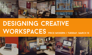
Now that we’re feeling workspace inspired, how about joining us for a mix-and-mingle at Price Modern on Tuesday this week?


20150310_workspaces_1000x600

We’re getting together to dive deep into the topic of designing creative workspaces and we want you to come join us! Light refreshments will be provided, and we may head over to the Ottobar afterwards, too. See you there!

An INside look at Baltimore magazine

Baltimore Magazine was first printed in 1907 by the Baltimore Chamber of Commerce. It is to this day, the oldest city magazine in the U.S. In 1994, Steve Geppi, owner of Rosebud Entertainment acquired the magazine with the goal of reviving the publication by rethinking its content as a channel to celebrate the great things that Charm City has to offer. With over 50,000 magazines in circulation, its in-house creative team collaborates diligently to keep the look and feel of the publication fresh and dynamic. Amanda White-Iseli has been Art Director for the publication for the last 16 years and shares insight on her in-house team.

How far in advance do you start working on your next issue?

Baltimore is a monthly publication designed on a 4- to 5-week production cycle. My team and I work closely with each other and with the editorial team throughout the cycle. Work begins even before the previous issue hits newsstands as art directors and designers meet with editors and writers to discuss the stories for the next issue. As a department, we all rely on each other for collaboration and critique at every step of the process. We’ve developed a strong, harmonious relationship with the editorial staff as well as with our digital and social media divisions, whom we also work closely with.

Special Editions and Marketing Art Director, Staci Lanham designs our quarterly Home section, our annual Baltimore Bride magazine, and all in-house promotional materials. Our Design and Print Division—headed up by Art Director Vicki Dodson and Senior Designer Michael Tranquillo—is creating fresh, new looks for businesses all over the region including print advertisements, stationary, media kits, newsletters, brochures, and more. Jon Timian is our Production Manager and is responsible for the top-notch production of the magazine—color correcting, along with the image, print, and paper quality. Production Artist, Marina Feeser designs ads and manages ad production for the monthly magazine as well as Baltimore Bride. Craig Forbes is our digital designer handling our web design and many of our online videos.

Understanding the broad strokes of the story and the writer’s tone influences the direction of the design and helps with the initial concept stage. Stephanie Shafer, the editorial design assistant, is responsible for part of the front of the book and all of the departments. Sophia Belitsos, the assistant AD, designs the rest of the front of the book, some features, and our Local Flavor section. I design the cover as well as features, provide direction to the assistant AD and design assistant, and manage the art department as a whole.

The three of us meet weekly to review progress, discussing design direction and potential illustrators and photographers that would be a good fit for the stories. Each person is responsible for creating art assignments for the stories they are working on.

October 2013 issue. Photography by Scott Suchman.
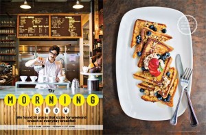
Baltimore’s Best Breakfast Spots. October 2013 issue. Photography by Scott Suchman.
Photography and Illustration have become a huge part of your publication, is all of this done in-house?

David Colwell, our Director of Photography, shoots a large part of the photography for any given issue. Front of the book sections such as “Charmed Life” are typically shot in our studio during the second week of the production cycle. The studio—which is a block away from our Lancaster Street offices in Harbor East—is a large, open space that provides an area where we can paint walls, build sets, and do whatever is necessary to shoot everything from fashion to portraits to product and detailed documentary photography for the monthly magazine as well as our annual Bride publication. (It was even used for a short scene in Season 2 of “House of Cards.”)

We also assign work to photographers in our extensive network of talented freelancers. We try to choose photographers whose style and aesthetic is a good fit for that particular project. We then send a detailed art assignment explaining the story and our design ideas, often including sample images that will help describe the look we are after. We try to give them two weeks to complete each assignment, although time is a luxury we don’t always have.

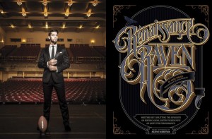
Baltimore magazine. September 2014. Photography by Mike Morgan. Hand lettering by Martin Schmetzer

We approach illustration projects in much the same way, providing art assignments and examples of illustrations that will help guide the illustrator’s concept and initial sketches. We have worked with renowned painters and illustrators from all over the world as well as those in our own backyard, including MICA graduates and even some professors. We find most of our illustrators either through artist reps or as a result of their own dogged determination to promote themselves via print mailings and email inquiries (yes, a well-written email or catchy postcard still works).

Can you give an example of a recent concept for a cover that you really enjoyed working on? What was the process?
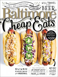
October 2014 issue. Photography by Scott Suchman. Hand lettering by Lauren Hom.

We recently produced our October 2014 Cheap Eats cover which was a lot of work–but really fun to do. The food stylists who I usually work with were unavailable, so I tried my hand at styling the dogs myself. I worked with photographer Scott Suchman who is gifted at shooting food. It was a long process that involved lots of buns, lots of toothpicks, and a soldering iron! I was really happy with the results. I also worked with illustrator Lauren Hom who is amazing! She did the hand lettering for the piece. I provided sketches of what I wanted to include and where—and she worked her magic.

How do you coordinate what goes into your print publication vs. digital?

We meet monthly with digital team to maximize the capabilities of digital media and make the content fresh and dynamic. This can include everything from redesigning charts and incorporating infographics to shooting behind-the-scenes footage from photo shoots as a supplement to the editorial content. We are active on Pinterest and Facebook, posting contests, polls, and generally maintaining an online presence that further nurtures our relationship with existing readers and helps develop new ones. That relationship, and the resulting communication, helps us deliver designs that complement and support the stories and enhance the reader’s experience.

Follow Baltimore Magazine: Facebook | Twitter | Pinterest

Jennifer Marin is co-president of AIGA Baltimore, you can follow her on Twitter: @hungry4design

What’s Up With Your Workspace?

If there’s one thing for certain, it’s that Baltimore designers have some fantastic workspaces. This is only evidenced by the growing number of Instagrammers out there tagging #bmoreAIGA100 on their #workspace photos this month.
So far, we’ve seen that many local creatives have multiple screens:

http://instagram.com/p/zCoI_JN2w0


some expansive workspaces:

http://instagram.com/p/ysn6O3RHii/


and even miniature workspaces with big visuals:

http://instagram.com/p/y0fCtbLLMH/


Speaking of big visuals, we’ve got some inspirational walls:

http://instagram.com/p/yu9mZ6qAtg/


a few ‘remote’ coffee shop spaces:

http://instagram.com/p/y5aydMvgQb/


and some well-appointed cubicles, too:

http://instagram.com/p/zAwgnJOx_i/


And this isn’t even half of the postings on Instagram, so go check out the rest with hashtag #bmoreAIGA100.
While you’re at it, snap a pic of your own #workspace and tag it on Instagram with #bmoreAIGA100. We don’t care if it’s messy and cluttered or clean and dust-free; just do it by February 28th and you’ll be entered to win one of two year-long Skillshare subscriptions!
BONUS ROUND: Want to double your chances? Come up with a creative way to spell out #bmoreAIGA100 in your photo for a second entry.
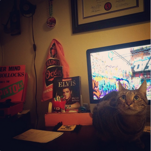
Oh, and here’s one last Instagram with a lovely Bmore feline to leave you feeling cozy on a cold winter’s night:


workspace with O's gear and a kitty
rmadar1: My lil corner workspace, lots of orange, lots of cat. #bmoreAIGA100 #workspace #Baltimore


Meet Megan Brohawn, Baltimore Designer

Megan Brohawn

Megan Brohawn is a powerhouse designer who brings a modern perspective and fresh approach to her projects at Novak Birch. Check out her work and get to know her a little better:

What’s your favorite project in your portfolio right now?
My favorite recent project was designing the Baltimore Triathlon logo. It was a really fun collaboration with Will, the owner of Elite Race Management. The inaugural race takes place in a few weeks, and I can’t wait to see the logo on the final materials – shirts, medals, stickers, banners, and more!

Who’s your favorite designer or design studio?
Jessica Hische; I am really inspired by her hand lettering.

What music do you listen to while you’re working?
Music is an absolute must for me when working! Currently I am listening to a lot of St. Vincent, Jack White, Yeah Yeah Yeahs, and Arcade Fire.

Choose one: Adobe Illustrator, InDesign, or Photoshop?
Indesign.

Why do you love AIGA?
I love AIGA because I enjoy sharing experiences with other designers and taking part in our local design community.

Human Rights Campaign: Designing for Equality

During Design Week 2014, AIGA Baltimore was joined by Bob Villaflor, the Design Director for the Human Rights Campaign. Bob talked with us about his experiences with the organization and the importance of design in his work.

About the Human Rights Campaign (HRC)

The Human Rights Campaign (HRC) is the largest LGBT civil rights organization that is fighting for LGBT equality. They aim to spread the word about important LGBT issues by featuring and supporting high profile people who are behind their cause. If you know about the HRC, then Design Director Bob Villaflor is doing his job!

Bob joined the HRC eight years ago and is believed to be the first non-LGBT creative in the organization. His fresh perspective reflects on how far we have come and where it will take us.

What we do as Designers

To quote Bob, “Design plays a critical role in what we do.” With over two million supporters and members, the design team pushes to reach as many people as possible. HRC volunteers are knocking on doors, sharing educational materials, and gathering pledges, which are just some of the tasks the creative team has to support. Being responsible for the visual presence of the organization allows them to put a face to the goal of driving movement among the public.

The most easily recognizable visual aspect of the Human Rights Campaign is their logo. Until its current version, the logo didn’t really exist on a social level, so the design team aimed to consolidate the old version in a way that still reflected the company. The logo had to be simple, elegant, and honest—values inherent to the organization.

Formerly known as the Humans Rights Campaign Fund (HRCF), the HRC was founded in 1980 and went through several logo iterations (here’s just a few of them). In the most recent redesign, the HRC design team partnered with SYPartners of San Francisco in a yearlong rebranding effort. SYPartners helped to solidify the brand and eventually settled on the yellow equal sign on a navy blue square. This now iconic logo helped to give an identity to the movement by representing the HRC core values.

Bob explained, “The logo became something for people to rally around.”

A Tipping Point

In 2012, Chad Griffin joined HRC as the organization’s President, which marked the start of a growth point for the organization. Shortly thereafter, the Supreme Court announced that it would hear arguments on California’s Proposition 8, a ballot proposition that had been passed into law by California voters to deny rights for gay couples to marry. This announcement gave HRC the opportunity to brand the event for its supporters in Washington, DC. Realizing that Proposition 8 was a “court case about love,” Bob and his design team chose to make red the signature color of the campaign. In a bold move, the HRC logo was temporarily changed to muted pink on a red background to show its support for turning over Proposition 8 in early 2013.

In an unexpected turn of events, the campaign went viral, with celebrities and supporters like George Takei, Alicia Keys and Budweiser changing their Facebook and Twitter profile pictures in support. Fans took the campaign and ran with it, remixing and personalizing the logo. The reach was global to the point that it crashed the HRC website and to this day remains one of the most successful campaigns in Facebook history as well as one of the most retweeted of all time. HRC could not have planned for this one hesitant change to be so big, but it made people realize who supported who—which was a big thing to see.


To learn more about HRC, their logo and how it went viral, visit:
http://www.hrc.org/the-hrc-story/about-our-logo


Equality Magazine, Annual Report and Other Campaigns

In addition to their social media and campaign presence, the HRC design team is also responsible for the layout and design of Equality Magazine. At 250,000 copies distributed each quarter, Equality Magazine is the largest LGBT rights publication in the United States. The magazine helps bring attention to anti-LGBT organizations such as the National Organization for Marriage; it also endorses its supporters, recognizing their work in the movement.

The annual report serves as another opportunity to focus on both positive and negative world trends. For the 2013 annual report, HRC partnered with design agency Column Five to develop something that went beyond the standard data-heavy reports that can overwhelm readers. Research and data was compiled into a sharable, easily digestible infographic printed on the reverse side of a book jacket for the annual report. Doubling as a poster, the infographic was shared outside of the organization’s list of major donors.

The HRC design team tackles other campaigns, too, like the “Love Conquers Hate” campaign leading up to the 2014 winter Olympics in Sochi. Equality Magazine started this campaign to show support for the LGBT community in Russia. It was punishable to show LGBT support in Russia, so HRC encouraged Olympians and celebrities to share pictures of themselves with the Russian-language version of the “Love Conquers Hate” shirt across social media.

The Future

In the future, the Human Rights Campaign will continue to “fight for people’s lives” not only in the U.S., but also across the globe. Campaigns such as Project One America aim to share the stories of real LGBT people and their families in less-than-supportive areas such as Central Mississippi, Alabama and Arkansas. On the international front, HRC continues to share their materials, design, strategy, and knowledge with fellow supporters who are trying to raise awareness to audiences across the globe.


Q&A With Bob

What is the biggest hurdle to design around at HRC?
Joint projects. Other departments or agencies can be sensitive over their content.

What advice would you give to designers working with nonprofits who might be against riskier design moves?
Don’t be afraid to put something out there. Consolidating branding of HRC was a big move—so was changing the logo in support of Proposition 8—but it allowed the community to think, to interact with it. Design solutions do take a lot of buy in from senior management, but they do have to trust your decisions in this dynamic time for the organization and LGBT community.

How do you feel about living, working and making changes in Washington, DC—the political heart of the country?
Seeing change is incredible. My family and kids live in a city where lives are being validated—which is funny in a city like Washington, DC that at times can’t seem to get anything done. Don’t Ask, Don’t Tell was a recent win that was seventeen years in the making.

As a designer, how do you handle a bad stakeholder review?
Beer! Think less about the rejection and more about moving forward, about the mission. You are not going to win them all. Some days there is just no time to come up with something perfect and sometimes it’s junk. Other times, it’s about the longview. With HRC, there’s the luxury of not having to have tangible results like numbers, sales, revenue, but that’s not always the case.


Shannon Crabill is a New Media Specialist at T. Rowe Price. Outside of the Internet, you can find her dancing, riding her motorcycle and binge-watching home improvement shows on HGTV. Tweet her at @shannon_crabill.

Mitchell Cole is the web sales manager at Service Photo Supply. Most of his free time is spent indulging in some sort of gaming, controller or dice never far from reach. Find him on Twitter at @mc_mittens.

NPR: Design for a Non-Visual World

One: Dissolve

The key to designing for listening is to realize that it is not quantitative. It is not about what it looks like, but about how long a user is listening. It is not about the type, the pixels, or the grids that we love so much, but about how the user feels when they are listening. Users want to be able to open a mobile or web app and start listening right away. Much like a high-quality, award-winning loudspeaker, it’s designed not to be seen and a user will often pay more for a seamless experience.

The challenge is that users are busy—they’re multi-taskers—and user interfaces can compete for their attention, so we need a different approach.

Two: Flow

In not designing a visual experience, the goal is to instead design a flow that will keep the user engaged. A ‘flow’ can be described as a structure or a language similar to what you would find in music. Just as verses, choruses, and bridges combine to create the flow of a song, the elements of good audio design combine to create an engaging listening experience. In that way, success is already programmed into the user experience.


“So much of what we know, and what we think, and what we feel, and what we remember is affiliated with how it all sounded.” — Colonel Chris Hadfield


An app designed as a listening experience should be extremely basic—only what’s necessary and without anything to distract the listener. It needs to be as easy as turning on the radio. For example, NPR’s app, NPR One, is responsive and is made to be tucked away behind another browser tab if you are listening to the radio while at work.

Three: Complement

The final concept to designing for listening is learning how to correctly read the audience. Like a good DJ, being able to read and to respond appropriately to the listener makes a better experience. People are busy and listening is often a parallel activity, so the challenge is to engage the listener by delivering the right programming all the time. Users’ habits—how or when they listen—are subtle signals that can help us deliver the best content.

The challenge is that NPR gives away their formula. The Application Program Interface (API) is available for free, which means anyone can take it, use it, remix it, and even make money off of it. A lot of people do the latter, but what they don’t have is the science or the algorithms behind the experience. Programs like Pandora use metadata to deliver a playlist, but not always in a way that equals what the user had in mind. The human element that NPR has created, of metadata and experience, is what makes a difference.


Q&A with Benjamin Dauer

What’s the Future of Public Radio?
In the future, public radio (especially NPR) will connect you to a handcrafted, personalized stream of local and national stories, both from shows you like and some we’ll surprise you with. You’ll be informed, entertained and connected to your community in a way that fits your life.

What is the biggest hurdle to design around?
NPR headquarters operates independently from local stations, but local stations do have needs that we try to address. For example, they want the functionality of listeners being able to donate money within the app while ensuring those funds stay local. A workaround hasn’t been figured out just yet, but little steps like linking to a donate page on website are a push in the right direction.

What advice would you give to designers working with nonprofits who might be against riskier design moves?
Educate the stakeholders. “Design is education.” Don’t show them how it looks, but how it will work. Show them a working example whenever possible to help support your reasoning.

As a designer, how do you handle a bad stakeholder review?
Beer! Take your ego out of it. It’s not really about you. In the case of NPR, it’s about the listener. I think about how I can give the listener that thing they want with all of these other crazy requirements.


Shannon Crabill is a New Media Specialist at T. Rowe Price. Outside of the Internet, you can find her dancing, riding her motorcycle and binge-watching home improvement shows on HGTV. Tweet her at @shannon_crabill.

Mitchell Cole is the web sales manager at Service Photo Supply. Most of his free time is spent indulging in some sort of gaming, controller or dice never far from reach. Find him on Twitter at @mc_mittens.

BMA’s Big Table Roundtable: A Conversation on Immersive Design

On Saturday, October 18th, AIGA Baltimore opened its third annual Design Week at the Baltimore Museum of Art with a roundtable discussion on immersive spaces.

The Big Table is a project headed off by Baltimore Museum of Art (BMA) that strives to address questions and criticisms about art posed by visitors. Each year, a designer or a team of designers is chosen to address one question or idea. Bruce Willen and Nolan Strals from Post-Typography, Ellen Lupton and Abbott Miller from MICA and Cooper-Hewitt (respectively), and David Plunkert of Spur Design, have all designed for The Big Table over the past few years. They gathered together to discuss their concepts at the BMA in the Fall of 2014.

Gamynne Guillotte, Director of Interpretation & Public Engagement for the BMA, talks about the purpose and format of The Big Table.
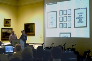
Words are Pictures are Words

How do contemporary artists use text in their work? Willen and Strals approached this question by considering language and how meaning changes depending on how it’s written. They created their immersive space, titled Words Are Pictures Are Words by using that same phrase in several contexts, including a room-sized infographic, showing how the meaning of the phrase changes depending on type, style, and arrangement.

Willen and Strals talk about their concept for Words Are Pictures Are Words.
Point, Line, Grid

“The idea becomes the machine that makes the art.” This quote by Sol Lewitt inspired Ellen Lupton and Abbott Miller to create the work Point, Line, Grid. They created a bulletin board-style grid that explores the way an artist thinks by inviting visitors to create and display their own artwork to dominate the room for the next year. The environment was created to point to the inspiring artwork while letting the visitors create something of their own.

Ellen Lupton talks about how they implemented the grid on the walls, and suddenly the room became an interactive experience for viewers...or shall we say, participants?
Ellen Lupton talks about how they implemented the grid on the walls, and suddenly the room became an interactive experience for viewers…or shall we say, participants?
Extra-Ordinary Objects

David Plunkett says that an object in a museum becomes something more important because it’s in a museum. He approached his Big Table project by studying the permanent exhibits in the contemporary wing and making a list of the common items he saw there and in an everyday environment. The resulting work, Extra-Ordinary Objects, is a room about objects one could find anywhere, remixed and displayed in ways that were unusual, presenting the viewer with a new, amusing way to see the relationships between those everyday objects. It will be on display in the Contemporary Wing until September 2015.

David Plunkert talks about a few of his extra-ordinary objects.

To see more photos from this event, check out the set on Flickr.


Greg Jericho spends an awful lot of time designing for clients that do not exist. Check out his work at gregoryjericho.prosite.com.