Kicking off with the Ravens Marketing Team

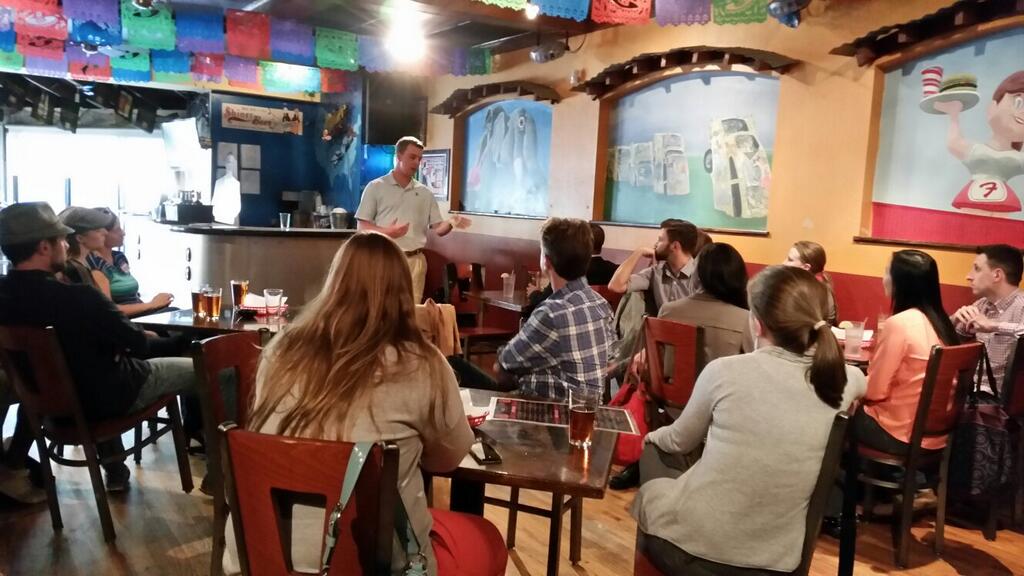
Kicking off AIGA Baltimore’s Design Week 2014 at ADG Creative, the Ravens in-house marketing team sent in three of their best to talk about how Baltimore’s own NFL team thinks creatively about design and marketing. Bryan McDonough, Heather Blocher, and David Lang discussed how they target Baltimore football’s wide audience across print, digital, social media, and broadcasting in a fascinating presentation, all while showing off their flashy Ravens World Champion rings.

Marketing the Ravens

Emphasize consistency. That’s the team’s key secret for seamless collaboration. The Baltimore Ravens’ marketing team only joins forces with outside agencies occasionally. Almost all efforts take place in-house, even broadcasting. As a graphic designer for the Ravens, presenter Bryan McDonough described the group as being a “mini agency”.

The marketing team has to “churn and burn”—they’re ready to react. While most NFL creative teams ask “how does this help us sell tickets?”, the Ravens are always sold out, allowing more creative freedom. Each campaign piece still must work across all platforms, including print, digital, broadcast, and environmental. The organization also reaches a wide and inclusive audience of women, men, families, young fans, and seasoned fans.

If that wasn’t enough of a challenge, the NFL has strict geographical marketing regions when it comes to things like print collateral and tv ads. The Ravens are uniquely sandwiched between two neighboring teams: the Washington Redskins and the Philadelphia Eagles. Luckily, there are no borders on the digital front. Even with the NFL limiting Ravens from print and tv in areas geographically associated with other teams, the web provides ways to market beyond these borders without regional terms.

How an idea becomes a campaign

Each season’s new campaign begins after the playoffs. The success of the players on the field decides when to shift focus to the year ahead. At this point, the design team’s first deadline is printing the next season’s tickets by May. During the summer months, the team prioritizes working with Ravens sponsors.

Ravens' 2014 season tickets
Ravens’ 2014 season tickets

From the very beginning of each campaign, the marketing department’s creative process includes senior management, creative, marketing, and board representatives. Several concepts are narrowed down to the best two or three ideas. The public relations, digital, and print teams collaborate to select which concepts should move forward. Polished into solid presentations, the concepts must be clear to the point where the executives—who don’t necessarily have creative backgrounds—understand the direction and ideas.

In charge of overseeing these efforts, event presenter Heather Blocher serves as Senior Manager of Advertising & Branding. Heather started as an intern and officially joined the marketing group as her first job after college, a prime example of how team members are given opportunities for growth.

The one surefire way to win a campaign? Have Coach John Harbaugh buy in. If creative and marketing have his vote, then the players and fans approve. John can be tough, however. Even with free lunch in the cafeteria, Harbaugh recently put everyone on a diet. No more “Pizza Friday.” It’s just salad. At least everyone gets cake after a win, though. On the other hand, losses do affect morale. The next day everyone is bummed right along with the fans—and a lot goes into game day behind the scenes.

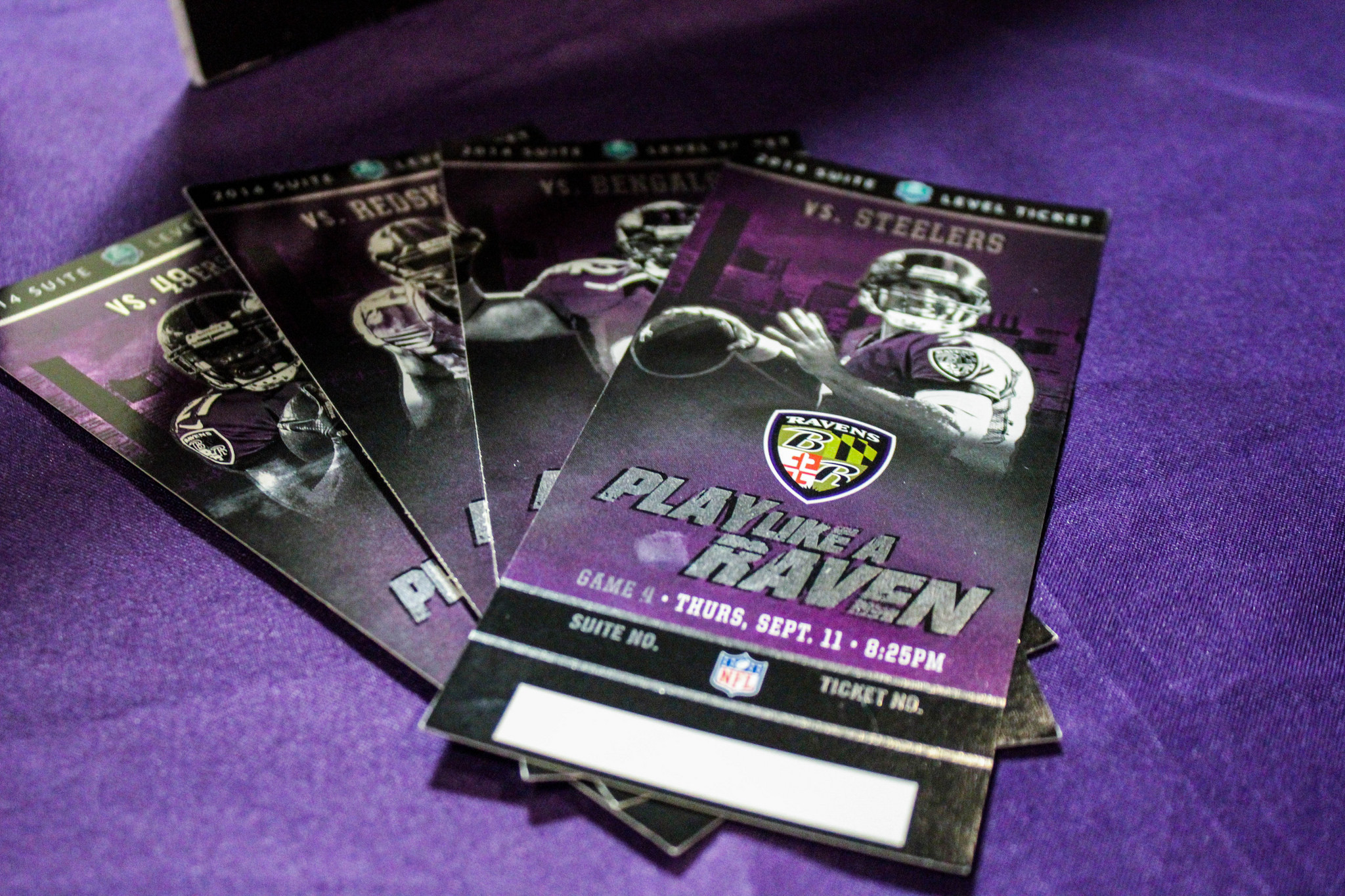
How to “Play Like a Raven”

Give it your all, 110%, on and off of the field. That’s what it means to “Play Like A Raven”—the team’s tagline and annual marketing campaign since 2009. Praised by coaches, players and fans, the phrase remains one of their most successful campaigns.

Focusing on the human element and illustrating the off-the-field “Play Like A Raven” concept, new photo shoots show players training and behind-the-scenes. Quotes from Coach John Harbaugh integrate into the final design to reflect this more personal tone. Landscape posters using this imagery portrayed the players as heroes and role models. The posters were envisioned as inspirational collectables distributed at stadium practice events leading up to the season opening.

Their 2014 marketing both hints back to the original “Play Like A Raven” campaign and pushes the idea to the next level. Fan shots became a major part of the previous campaign’s success. The logical next step uses these even more expansively. Updated photography showcases the vast Baltimore cityscape. A new style guide allows visuals to easily translate from print to web, mobile, and broadcast as the team continues to improve the level of consistency.

Taking the campaign online

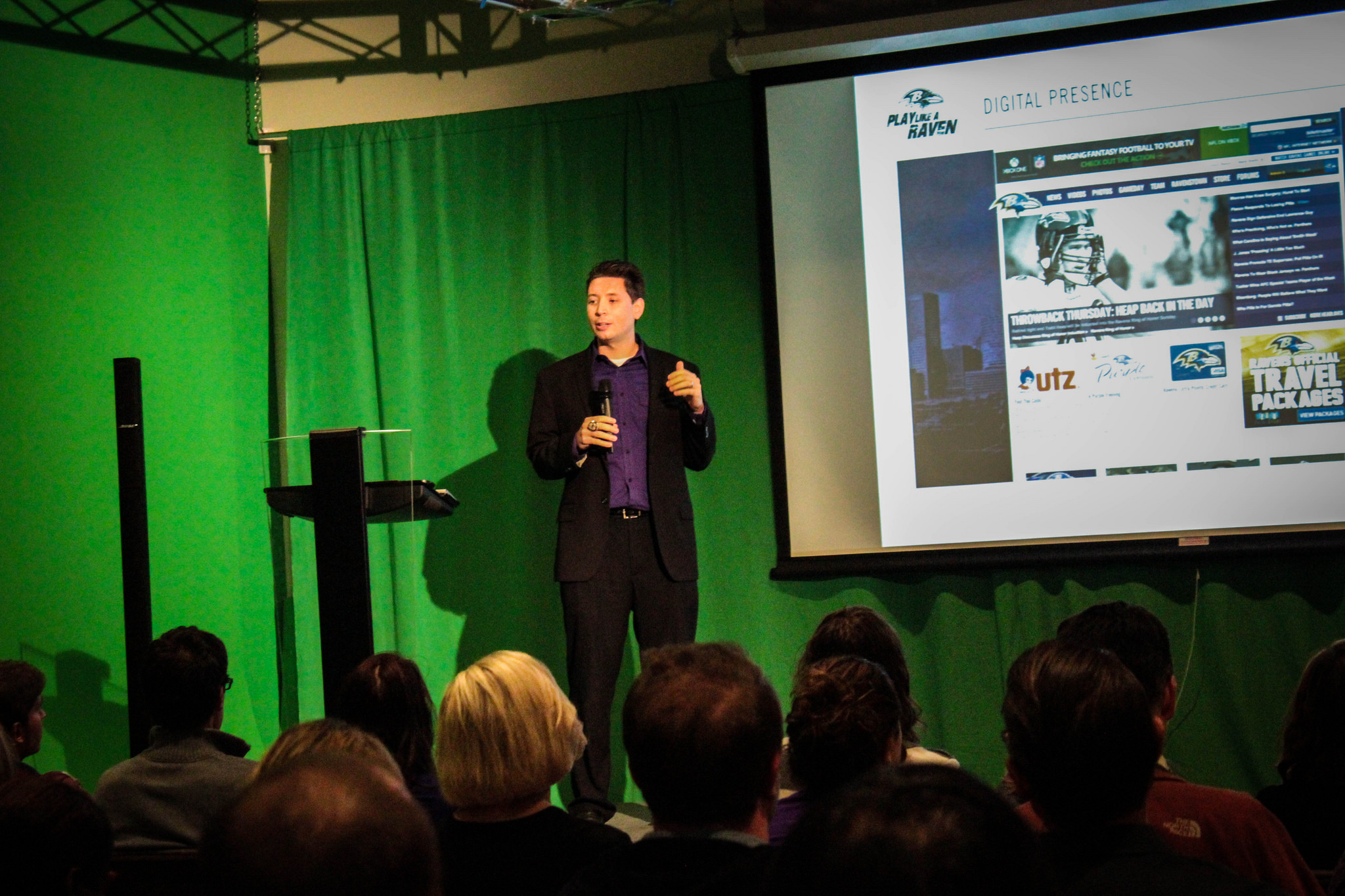
Hashtags for the Baltimore Ravens were once inconsistent with mixed messages and sources. Fans generated some with others in the marketing department. For example, #relentless is not specifically related to the Ravens alone. Rather than join these existing and wider conversations, their own threads were started specifically for the Ravens’ team. David Lang, as the Ravens’ Senior Digital Media Manager, discussed how he oversees the website and digital presence, including social media and broadcasting.

David Lang, discussed how he oversees the Ravens' website and digital presence.
David Lang, discussed how he oversees the Ravens’ website and digital presence.

Tackling the confusion, the 2014 campaign includes just one hashtag: #playlikearaven. Since the Ravens are a newer team, creating an abbreviation like the Redskins hashtag—#HTTR for Hail To The Redskins—was deemed less meaningful and effective. Instead, #playlikearaven was trademarked. Beginning in 2014, posters and promotional materials added #playlikearaven, and this encouraged players and fans to share virally on social media.

The marketing team found creative ways to involve the players and the rest of the organization as the official hashtag gained popularity. The most positive and encouraging Facebook posts, tweets and photos were printed after sifting through thousands of social media posts. Displayed at the Ravens’ cafeteria entrance, these images help connect the staff and players with their fans. This interactive element that goes beyond an online “like” or “retweet” reinforces the idea that the Ravens marketing is not just a one-way conversation.

Outside of social media, President of the Baltimore Ravens Dick Cass is a driver for old school methods. Even though holiday cards are still printed, the marketing team did take to the streets late one night. With permission, the team stenciled graphics across the city using an environmentally safe paint from Germany to engage with their fans. But most often, the Baltimore Ravens leave street-level tactics to the fans themselves. They’re the ones who do guerrilla marketing best.


Photos by ADG Creative

Shannon Crabill is a New Media Specialist at T. Rowe Price. Outside of the Internet, you can find her dancing, riding her motorcycle and binge-watching home improvement shows on HGTV. Tweet her at @shannon_crabill.

Brian E. Young is an art director and magazine designer by day and artist by night. When not painting, he’s helping unlock imaginations via his blog and The Uncanny Creativity Podcast. Ask him anything: sketchee.com.

Designing How You Hear It: NPR’s Benjamin Dauer

“I love being in-house because I am tightly integrated with the teams I work with and have a deep understanding of a product’s full lifecycle.”

Benjamin Dauer is a Senior Product Designer at National Public Radio in Washington, D.C. and was recently the Lead Product Designer at SoundCloud in Berlin, Germany. AIGA Baltimore took a field trip to interview Benjamin about designing in-house for NPR.

How did you get started designing user experiences for audio platforms?

You could say it all began in 5th grade while learning music. As a musician I have always been drawn to the listening experience. Everything from how the sound was performed and recorded, to the equipment used in the process, to the components used to deliver the audio to the user – all of these tools and methods have been designed, ultimately, not to be seen.

While growing up I was a “backseat listener” of NPR. As a musician I have been using SoundCloud since their founding 7 years ago. I am very fortunate to be able to combine my love of sound and design while working with these organizations on their listening experiences.

soundcloud
SoundCloud app for iOS

What would be your advice for someone looking to improve their skills to be competitive in today’s job market?

Keep your finger on the pulse of the industry. When deciding which organization you want to work for, examine its maturity. By this I mean, startups typically seek generalists while more established companies have the flexibility to seek specialists. This will help you to focus on which skills are in demand. Then set to work teaching yourself what you need to know and surround yourself with people from whom you can constantly learn.

If I had to leave you with three things, I’d say: be humble – know when you’re right and know when you’re wrong; be honest – with yourself, with your team, and with your time; and don’t be afraid to fail – challenge yourself at all times and learn from every experience, both good and bad.

You recently received an Interactive Design award from Communication Arts for the NPR Music for iPad app. Can you tell me about that process?

From a high level, this was the first NPR app to be completely conceived, designed and developed in-house. As you can imagine, it generated a lot of excitement throughout the organization. While lots of feedback poured in during the process, from all areas of NPR, we remained sharply focused on the user.

Tactically, we operate using Agile/Scrum and Lean methodologies here. We have tight, two-week sprints involving research, design, development, user-testing, and QA. These processes encourage transparency and thus keep us honest and iterating. At the end of each cycle we demo our work to key stakeholders and solicit further feedback. Rinse and repeat until app submission.

NPR Music for iPad
NPR Music for iPad

Do you always design with iOS in mind?

No. For me, context is very important so there will always be some variation in how I approach a particular design problem. Different contexts require different solutions. This helps inform which platform (and/or OS) is most suitable to design for – desktop, tablet, phone, television, car, iOS, Android, etc.

In general my process involves some/all of these elements: framing the problem, asking the right questions, challenging assumptions, researching markets/competition/patterns, sketching, prototyping, designing, testing, iterating, iterating, and more iterating.

You’re currently working on the new NPR One listening experience. What’s your biggest challenge?

There are many. One of the biggest has to be the challenge of transforming a traditional broadcast framework into a digital, on-demand framework. In doing so, we are creating a new kind of listening experience for our audience: a seamless mix of local and national content that learns what you enjoy, allows you to make a habit of those, and relinquishes you from the clock. In this new framework, we can create the best show for you, no matter what type of listener you are – casual, regular, or power.

NPR One on iPhone
NPR One

What do you see is the future of streaming music/audio?

In my ideal universe, I would love to see an environment where organizations can continue to embrace experimentation, especially around the concept of personalization. There are several different approaches to this on the market already, but they all require active input from the listener. Those mood surveys, interest questionnaires, and settings pages full of checkboxes all miss the mark for me. There are lots of signals we can glean from a listener’s more passive activity – how far have they listened through a piece of content, what types of content are they skipping most, at what point during their listening session do they stop, or what have they searched for? All of these put the onus on us to work harder and be more mindful, not the listener.

 Check out Benjamin’s portfolio site www.benjamindauer.is and follow him @benjamindauer.

Learn more about NPR One at www.npr.org/about/products/npr-one/

How to Relax in the Digital Age: 11 Ways to Get Some Balance

The latest research suggests that people check their smartphones 20 ba-jillion times per day (appx). That stat completely describes me — I get the shakes if my phone is more than 20 feet way. However, I do accept this despicable condition as one of my own making and do hereby swear to help other digital/phone/technology addicts in their own quests to dial down their obsession… or at least relax a bit. I think it’s pertinent at this point to pull out a great Marshall McLuhan quote that diagnoses this state more aptly:

In the electric age, when our central nervous system is technologically extended to involve us in the whole of mankind and to incorporate the whole of mankind in us, we necessarily participate, in depth, in the consequences of our every action. It is no longer possible to adopt the aloof and dissociated role of the literate Westerner.

When we’re constantly connected to digital media we become thin and stretched in our psyche’s trying to see and sort all the information in all the world all the time. On a good day it’s that we’re fiddling with our phones too much. On a bad day it becomes insomnia and restlessness. So with this technologically extended hyper-state in mind, let me offer some lifestyle tips for tech lovers that might be a good first step toward getting our digital connectivity under control.

When you go to a restaurant with someone keep your phone in your pocket. If you’re a total psycho you can check your phone when you got to the restroom.

Give commercials 100% of your attention just like you do the show. This unifies the experience and (speaking as someone in marketing) gives credit to all the hard work that goes into making commercials. Honor them.

Watch the credits after the movie. Same reason as above.

Don’t channel surf. Spend the time sharpening your axe (aka using the show guide), then watch what you want to watch like you’re showing up to a doctor’s appointment (credit to LL Cool J for this one).

Yield to the largest screen in the room when tempted to play with multiple devices. The more devices you’re fiddling with the less you’re able to separate and absorb the content.

Put your phone in a different room during dinner time. And mute it. Is 30 minutes going to kill you?

Read right before bed instead of scanning Facebook or some other consumption-of-humanity social network.

Pick one day a week not to wear a watch. I don’t know about you but without it I feel lost and afloat in a dark sea of emptiness and inefficiency. But I need that feeling every now and then to remind me to chill the heck out.

Don’t use news apps. Ever.

Have a friend text you for 5 straight minutes but refuse to look at your phone. This will build up your “ignore that ding” muscle. Apple has gone Pavlov on all of us so yes, it’s going to feel great to get a Twitter update or text. Don’t instantly eat that candy.

Get out in nature. Without your iGizmo. Force yourself. Apparently a week in nature will reset all your human/time/sleep settings. If you can’t take a week then just get outside, even just for a walk here and there.

Do you have a tip that’s helped for you?  Share it in the comments the next time you’re multi-tasking on your iPad during a video conference while watching TV.

Jon Barnes is the Director of Communications for ADG Creative and a heck of a guy. Read more over at ADG’s blog, Brain Juice, including that one time when we all went and took a crash course in Letterpress.

Would you like to be a guest blogger for AIGA Baltimore? Email Greg to find out more information!

Spotlight: Kit Hinrichs

We are proud to introduce Kit Hinrichs, the keynote speaker for the upcoming opening of the O! Say Can You Design a Poster Exhibition. A noted graphic designer and former partner at Pentagram, he will be presenting a series of unusual case studies about his eclectic assortment of American flag memorabilia and how he has integrated his passion for flags into his design practice.

Kit Hinrichs is a graduate of Art Center College of Design in Los Angeles, California. He served as principal in several design offices in New York and San Francisco and spent 23 years (1986–2009) as a partner of Pentagram, an international design consultancy, before opening Studio Hinrichs in San Francisco in 2009. His design experience incorporates a wide range of projects, including corporate communications, brand development, promotion, packaging, catalogs, environmental graphics, and editorial and exhibition design.

In addition to teaching at the School of Visual Arts in New York, the California College of Arts in San Francisco, and the Academy of Art in San Francisco, Kit has been a guest lecturer at the Stanford Design Conference, AIGA National Conferences, the HOW Conference, and numerous other design associations and universities worldwide. His work is included in the permanent collections of the Museum of Modern Art, New York, the San Francisco Museum of Modern Art, and the Library of Congress. He is co-author of five books, including Typewise, Long May She Wave, and The Pentagram Papers.

Kit’s list of distinguished clients includes United Airlines, Sappi Fine Paper, Design Within Reach, Muzak, Gymboree, University of Southern California, Safeco, Museum of Glass, Symantec, KQED, the San Francisco Zoo, Restoration Hardware, and many more.

During his career, he co-founded @issue: The Journal of Business and Design, was chair of the AIGA California Show (the first regional show in AIGA’s 85-year history), co-chaired the Alliance Graphique Internationale San Francisco Congress, chaired the AIGA Business Conference and San Francisco Design Lecture Series, and launched the @issue Design Conference. Kit is a recipient of the prestigious AIGA medal, in recognition of his exceptional achievements in the field of graphic design and visual communication. He is also a past executive board member of the American Institute of Graphic Arts; a member of the Alliance Graphique Internationale, and a trustee of Art Center College of Design since 1996.

The O! Say Can You Design a Poster Exhibition Opening will be held September 15, 2014, 5:30-8pm, at the University of Baltimore Student Center Gallery. The event is free for all to attend — RSVP by September 3rd.

Event Recap: Adobe Responsive Design Workshop

AIGA Baltimore’s Adobe Edge workshop wasn’t just about the tools we have at our disposal; it was also about the process of designing responsively. Most of us in attendance were designers who happen to code but that wasn’t our specialty, so Brian Wood, our guest lecturer, went over plenty of web basics to catch us up.

The Tools

Brian worked for Adobe for 13 years and now spends more time doing what he loves most: lecturing about web design, including Adobe’s own suite of development tools for designing, coding, and testing responsive design. The suite includes:

  • Edge Animate – Useful for making animations, web banners, etc. using HTML, CSS, and JavaScript. Interactive elements can be built using Edge Animate; however, it’s not meant for building an entire site.
  • Edge Reflow – Used for rapid prototyping and visually showing responsive elements.
  • Edge Code – A simple, text-only code editor, similar to Sublime Text.
  • Edge Inspect – Built for testing on actual devices in real time via an app on your device (tablet, phone, etc.) and a Chrome plug-in. A local or live site can be mirrored on each device on same network.
  • Edge Web Fonts / Typekit – Hosted fonts that are free with an Adobe Creative Cloud subscription.

Additionally, we had access to free web fonts available outside of a Creative Cloud subscription, such as Google fonts.

What is Responsive Design?

Mark Boulton, whose design studio created the Gridset responsive layout tool, says, “It’s making sure your layout doesn’t look like crap on different sized screens.”

Responsive design, also called mobile optimization, refers to a website that is viewed on various devices without degradation in user experience. There are two main types of responsive design. The first is based on overall screen percentages, called a liquid layout. The second uses liquid in conjunction with breakpoints (or media queries) to force elements to adjust at specific points based on the size of the browser or viewport window.

Responsive design differs from adaptive layouts where the widths are static, or set, and media queries are used to establish breakpoints that adjust the layout where it starts to fall apart. For more information, check out the great resources at the end of this article.

Let’s Get Started

It used to be that a web designer would build a mockup of a website in Photoshop, show it to the client for approval, send it to development, and bam! we’re done. Now, the job is generally more difficult because there’s so much more to consider when building a responsive website, not to mention many designers are expected to take on the front-end development themselves.

One of the first steps we can take when designing a responsive site is to decide if we should start a design for mobile first or desktops. Looking into the analytics for a client can be helpful in determining which direction to start, but when working with Reflow, it doesn’t really matter because at the end of the Photoshop design process, the mockup can be plugged directly into Reflow, which will do the hard work for you. While it’s possible to start from scratch in Reflow, the connection with Photoshop is the power behind the program.

Also, it’s always a good idea to see what everyone else is doing before beginning the design. Learn from the experts. Compare notes. Be awesome.

Best Practices in Photoshop

The client-specific devices you’re supporting are tailored to fit their needs. The size ranges, or device map, dictates your initial wireframe and document setup.

Using a grid is key in developing a clean responsive site mockup. Not only does designing in a grid make it easy to keep elements aligned and balanced, but developers also often use grid frameworks. If you know you’ll be working with a developer, ask what grid they’re using. Knowing this and designing with it in mind can minimize how much of your layout your developer has to fix during production, which ultimately gives you control over your design.

While it is possible to manually create a grid by dragging and measuring guides in Photoshop, there are plug-ins available that will speed up the process. Check out the reference section below to find those.

If you design for mobile first, the term “above the fold” may come to mind when scaling up proportionately for the desktop. While this still matters somewhat, modern audiences know to scroll down, so don’t sacrifice too much based on print design principles.

You will want to use vector objects for graphics because, when moving your design into Reflow, a vector object allows for scalability while a raster object does not. Also, Smart Objects should also be used for editing images so the process can be as non-destructive as possible. Since you’re designing for big and small devices, images should always be bigger than you need. SVG is the recommended format for saving logos. It works in most browsers, it allows for the logo to scale, and it can easily fallback to a PNG should the browser not support an SVG.

Moving into Reflow

Reflow is a very visual program with five simple tools: Move, Shape, Text, Image, and Form.

The program looks at your layer order in Photoshop to determine where elements fall within the HTML document, so remember to place the elements for the top of design at the top of the Photoshop layers.

Overall, we found that Reflow does a really good job of developing code based on the Photoshop document, but minor tweaks were still needed. While moving and editing elements, Reflow updates the HTML and CSS as needed and in the end, all code can be exported to a code editor for additional fine-tuning. There are no semantics, as classes in the HTML and CSS code are created based on layer names and not HTML attributes like <h1> or <p>.

Fixing our Design in Reflow / Using Media Queries

Once you’ve decided what direction you’re designing for (mobile vs. desktop), it’s time to start setting up breakpoints in Reflow. Developers used to code for three breakpoints, but now not only are there many more devices and sizes to compare to, but we should also consider breakpoints based on the size of the viewer’s current browser window to make sure the design doesn’t fall apart at any size.

When making a change to the layout in Reflow, you’ll either need to be in a specific breakpoint or add a new breakpoint. Otherwise, the changes may only apply to the default breakpoint, which controls the global style for all devices.

Within Reflow, all elements are arranged using margins and all items are floated left by default. Understanding this, we can keep a consistent visual experience by using the control panel on the left in conjunction with our breakpoints, telling the elements when and how to change. This includes changing percentage widths for the horizontal layout elements, where to add or remove columns, and when to show or hide elements.

Wrap Up

Although Brian was only able to scratch the surface of what Reflow can do, through this workshop I was pleasantly surprised to learn how far forward Adobe Edge has come in recent years. Not only can Reflow speed up the production and prototyping phase, but its ties with Photoshop allows us—the designers—to stay in control of our designs and how they render across devices. In turn, this allows us to work out usability, legibility or breakpoint issues before our project is handed over to our developer. Alternatively, in the case that we, the designers, are also the developers, Reflow has already done the bulk of the hard work for us.

Responsive Design References

http://alistapart.com/article/responsive-web-design/
– The article that started what we now know as responsive design

http://johnpolacek.github.io/scrolldeck.js/decks/responsive/
– What The Heck Is Responsive Web Design?

http://mediaqueri.es/
– Inspirational gallery featuring responsive websites at various screen and device sizes

http://viljamis.com/blog/2012/responsive-workflow/device-map-2012.pdf
– A sample device map

http://gs.statcounter.com/
– Statistics showing what device resolutions (and more) are using the web

http://www.getskeleton.com/
– A common web developer boilerplate that includes a grid system for mobile and desktop

Photoshop Guide References

http://guideguide.me/
– Plug in for Photoshop that makes creating grid systems easy

http://gridpak.com/
– Responsive grid generator that includes a grid CSS file and PNG’s for use in Photoshop


Shannon Crabill is a New Media Specialist at T. Rowe Price. She has a love for social media, tech, all things do-it-yourself, baking, coffee and the occasional cringe-worthy pun. Check out her work at http://shannoncrabill.com/

Star Spangled Showcase

In honor of the 200th Anniversary of the Star Spangled banner we are partnering with the University of Baltimore (and AIGA Blueridge!) to host a poster competition.

Below is some inspiration from Studio Hinrichs.


Kit Hinrichs is a graphic designer and a collector of American flag iconography and memorabilia. He founded Studio Hinrichs in 2009, following 23 years as a partner of the international design firm Pentagram. He has design directed projects for the California Academy of Sciences graphic identity program, Sony Metreon Entertainment Complex identity and interior graphics, United Airlines’ Hemispheres magazine, Design Within Reach identity and catalog, and a number of others. He is co-founder and design director of @Issue: Journal of Business and Design, and has taught at the School of Visual Arts in New York, the California College of the Arts, and the Academy of Art in San Francisco. Several of his pieces are in the permanent collections of the Museum of Modern Art and the Smithsonian Institution’s Cooper-Hewitt Museum of Design.

Kit will be coming to Baltimore September 15th, 2014 for the gallery opening of the poster exhibition as well as to participate as one of the judges. More details to come.

Enter today and be part of the celebration! Entry is Free!


The Value of Design: MICA’s Social Design Fellowship Program

Traditionally the designer’s role was to communicate someone else’s vision, however as the practice has evolved designers are now using their well honed design thinking skills to provide solutions to problems that affect our society on a larger scale. You may know it as Social Design, yet when asking people what the definition of social design is, you tend to receive a varying number of answers.

In April, AIGA Baltimore joined Maryland Institute College of Art’s Robert W. Deutsch Foundation Social Design Fellows to hear from Director for Design Practice and MICA Master of Arts Social Design (MASD) program Mike Weikert and MASD fellows; Mira Azarm, Briony Evans Hynson, Jonathan Erwin and Becky Slogeris. Providing insight into what effective social design is, why designers deserve a seat at the table in social initiatives and, more specifically, how MICA’s Social Design program and Robert W. Deutsch Foundation Social Design Fellowship cultivated and propelled their passion for social intervention.

After a brief introduction by AIGA Baltimore’s Jami Dodson and Jennifer Marin, Mike Weikert opened the presentation by giving us an idea behind the thought process that brought about the MASD program and the Robert W. Deutsch Foundation Social Design Fellowship. The impetus for this fellowship came as Weikert realized that upon completing the intensive 1-year MASD graduate program, students were ready to translate the knowledge they had gained into real world applications. With this understanding, Mike decided it was time for the students to get out in the community and start utilizing those skills.

The Robert W. Deutsch Social Design Fellowship

Working with Jane Brown and Neil Didriksen from the Robert W. Deutsch Foundation, Weikert built a fellowship that provides two graduates a stipend, accommodations, and support to stay an additional year continuing the research and implementation of their project.

The program emphasizes four key components: (1) Keep innovative ideas and talent in Baltimore. (2) Demonstrate the value of design in addressing social problems (a core objective of MASD). (3) Focus on significant real world challenges facing our communities. (4) Provide a foundation to generate additional support and a sustainable context for the program’s work and its graduates. The fellows are also encouraged to build their own social design practice and context by creating new work, networks, funding resources as well as advocating for the discipline and practice of design.

And build their practice they did, as we heard from multiple fellows who shared the impact they made and continue to have, in part due to the MASD program and Robert W. Deutsch Fellowship. They also expressed just how important a role design plays in spurring social change, using design thinking to create sustainable solutions to communities of need.

Mira Azarm

The first MASD fellow of the evening was Mira Azarm, AIGA DC President, who revealed that after spending over 10 years as a communications designer her knack for getting involved behind the scenes and constant hunger for professional change led her to the MASD program where she began to “unlearn everything I had learned up until that point”.

With her focus in the fellowship pertaining to food access, Mira worked with Gather Baltimore (a group that collects unused and unsold food to distribute it to those around Baltimore) in an effort to help them expand their outreach efforts. This experience led her to one of the most resonant lessons of the evening: the design shouldn’t be bigger than the problem you’re attempting to solve. Or, as Mira so aptly put it, “Maybe your design is not that important,” a sentiment echoed in the fellows’ presentations.

In her post-fellowship work with Gather Baltimore, she continues to attack food access issues around the area, currently working to reduce food waste in DC schools. She also teaches in the MASD program and advocates the value of design thinking teaching the creative process to students in “non-creative” disciplines through the UMD Academy for Innovation and Entrepreneurship. Mira wrapped her presentation with 4 keys learned in the fellowship, “Change whenever you can. Grow wherever you can. View design as a change maker. Facilitate innovation.”

Briony Evans Hynson

Briony shared her social design initiatives and insights from the past ten years, whether at MASD or otherwise. In speaking of her experiences she emphasized the need for collaboration in social design, allowing for personal expertise of the people involved and possession, or lack thereof, of a college degree shouldn’t limit one’s input.

Striving to work across disciplines and focused on directly impacting people, Briony believes that the creative process can provide new avenues for intervention. With her knowledge of sculpture and 3D media, she takes a hands-on approach to many of her projects, including teaching carpentry in Anacostia. This ultimately led to the development of a community arts center that acts as an international artist exchange program and community arts hub. She credits this experience with opening her eyes to the broader needs of underserved communities.

Several social initiatives later and Briony found herself in a similar spot as Mira described, looking for a way to change her perspective, which led her to the MASD program. At MICA she jumped right in and got hands on, working to provide kids in low-income areas of Baltimore with access to the basic human right of play. While her thesis work provided a design strategy and theory to transform a vacant lot into a place for kids of the neighborhood to play, being awarded with the Deutsch Fellowship grant allowed her to successfully implement her plan: turning an eyesore into a point of pride within the community.

Jonathan Erwin

The next speaker, Jonathan Erwin, stressed the need for collaboration and transparency throughout the social design process. Driving the point deeper, Jonathan shared an early initiative to remove a community garden that had degraded into a neighborhood dumpsite, impacting residents’ health and community pride. He showed how poor collaboration from a previous initiative becoming a blot on the community, a social-design-gone-bad scenario, and resulted in him undoing what should have been someone else’s social good. “On the bright side” he said, “I got a nice home-cooked breakfast from appreciative residents.”

With the belief that it’s the people that matter, Jonathan sought to further improve social capital of residents in the McElderry Park neighborhood in Baltimore. He demonstrated the power of design by creating a community newsletter that works to open dialogue amongst residents and restore a sense of ownership to the people living in the area.

Becky Slogeris

Wrapping up the lecture portion of the evening was Becky Slogeris whose roots in education and art run deep, providing a primary focus area for her social design practice, centering on changing apathy in school children and the backlog of teachers. Researching deeper into the issue, she found that students didn’t see a real-world connection to their schoolwork and teachers were concentrating on curriculums with no time to focus on the students themselves.

She worked with Franklin High School in Baltimore to develop a plan where the lessons were relevant and useful to the students. Using a service learning program, students revitalized a vacant lot, taking stock in their community while seeing real-world uses for math and science. During her fellowship she did curriculum design, providing professional development tools to save teachers time in their workday. Since the fellowship Becky remains active in a host of other social design causes, including developing behavioral management tools using movement to calm students in moments of conflict and energize them to learn.

Each fellow demonstrated how design instincts and an understanding of the creative process are invaluable assets in social design. Complex social issues require meaning to have impact and designers are, at the core, developers of meaning.

Following the presentation, attendees went into the main lobby to see thesis presentations from current MASD students.

Joseph Anthony Brown is AIGA Baltimore’s Programming Chair and is a partner/designer at Rogue Squirrel, Inc. Check out his portfolio at www.behance.net/abcreates.

Jennifer Marin is Co-President for AIGA Baltimore. Follow her @hungry4design.

BLEND Recap: Tim Bojanowski at Zen West Road Side Cantina

Last Tuesday, Tim Bojanowski spoke at AIGA Baltimore’s monthly Blend. Tim is the leading adviser and principal of Zest Social Media Solutions and to him and his team, brands concentrating only on increasing their number of followers are sweating the small stuff.

blendsm

He told us that online consumers are looking for information and that social media is as crucial to their search as Google. Brands that take of advantage of providing free information through their social media channels capitalize on an opportunity to build what he calls a “tribe.”

“A tribe of loyal followers is more likely to comment on, share, and read posts,” said Tim, “Each follower within the tribe subsequently possesses a higher potential to convert.”

To brands interested in building tribes over a massive following, Tim advises them to use storytelling. He said, “The best narratives follow a series of causality surrounding the brand’s niche in the market. They say, ‘I am good at these things, here’s how I do them and here’s why.’ Taking 20 minutes to create a post that tells a story about something your brand created will go farther to increase your social equity. More than relying on the grumpy cat.”

Joshua Uzzell is a Baltimore-based graphic artist who provides illustrative branding, web design and development services. Follow him @joshuzzell.

Board Spotlight: Kara Turner

Kara Turner, AIGA Baltimore’s Communications Director and all-around Renaissance woman, grew up on Maryland’s Eastern Shore. She was a varsity lacrosse player in high school (“the only girl on the team”) and, between games, she acted in plays. After a few years of freelance work in Manhattan and Daytona Beach, she returned to Maryland to focus on a professional career in communications and media.

Since we’re shining the Spotlight on Kara this month, we wanted to find out what makes her tick. She says she’s has always thrived when thrown into challenging situations and prefers to work on multiple projects at a time.

“I love the process that goes into creating,” she tells us, “It could be an event I’ve organized for work or a character I’m playing on stage but I just like creating things. I like to see the results of something I’ve done that’s had a lot of hard work put into it. But I also strive to get a reaction from people.”

She’s looking forward to our upcoming events and the opportunities to network with other designers.

“Design is powerful,” she says, “Great design has the ability to add order to our lives. It can express humor. It can make people think. It can make people safer and can teach others. The design of a space, or the lack of, affects the way people feel and the way people act.”

Kara lives in Annapolis but knows her way around Charm City, seeing shows at CenterStage, having drinks in Fell’s Point, and performing in the local theatres. Since we at AIGA Baltimore are always thinking of new symbols to replace the crab, we asked her if she had any ideas. She suggests a purple and orange foam #1 finger then changes her mind.

“Baltimore has so many fantastic outdoor events,” she says, “Artscape, Sowebo, the Greek Folk and Ukraine festivals. So, I’d say a good symbol for the city would be a festival tent.” She also tells us that everyone should experience being out on a rooftop deck in Pigtown on the Fourth of July.

“There’s the view of the fireworks, of course, but you can also see all the distant ones from other towns all around you. Then, you see hundreds of car headlights creep around the highways and hear the mass of people leaving the Harbor.”

The Joy of Sketch

My design career started with a burning envy of artists.

I was in sixth grade when I read in a magazine (possibly Highlights), that there were kids who had started drawing pretty much as soon as they could hold a crayon. Seeing album art, movie posters, and the covers of paperbacks in the supermarket made me think about how long they must have practiced their craft to be able to create these fantastic works of art without a struggle. At 12 years old, I was, in my perspective, too late to the game. Hell, I couldn’t even trace Iron Maiden cover-art, much less draw it freehand.

eddie shirt
In my defense, I was trying to trace on my t-shirt.

A chance malfunction with my family’s television set combined with the discovery of hundreds of discarded yellow flyers with blank space on the back resulted in a summer of illustration so prolific that I doubt I’ve ever equaled it. I started copying models from my mom’s Vogues as well as each panel from Cracked Magazine featuring the fictional entertainment reporter Nanny Dickering.

nanny pinup

I used to read Cracked for the interviews. Seriously.

Since the magazine was monthly, I would copy the same issue’s Nanny again and again, often until dawn, and pretty much throw them away right afterwards because they looked like sketches. I had to see that slick, finished look of the magazine illustrations in my own work to believe I had this mythical talent buried deep somewhere. I figured I’d be able to express myself better if I just had the tools. I wanted to show the world what was important to me.

Sor b

Keep in mind it was 1989 and I was 12, so this was considered “important”.

Finally, I asked for a legitimate sketchbook after months drawing because some of my work started to look almost fridge-worthy and that yellow paper wasn’t very professional-looking. Unfortunately, that sketchbook actually began a sort of neurosis that I still struggle to break today.

See, those printouts were going in the trash anyway but that sketchbook, with its clean, white paper, was something that needed to be bought. I couldn’t just put anything on there; it had to be finished and worthy to show. Eventually, my sketchbook went almost entirely unused as I continued to work with those disposable flyers. The cartoons became figures and the concepts of perspective and dimension, while primitive, seemed to develop on their own.

nagel print

I quickly advanced to copying Nagel prints at the mall.

Unfortunately, my environment just wasn’t conducive to a career in art. I went to Catholic school most of my life and there wasn’t much encouragement for what I was doing. Plus, nothing I did ever looked good enough for me because, as I somewhat correctly reasoned, I didn’t have access to things like an airbrush or a Linotype machine. They were just too far out of my reach without any support and I wasn’t aware of any other options. So, I pretty much abandoned drawing altogether until about ten years ago when I saw a video of an artist working with traditional-looking brushes and type in Photoshop. All the tools I needed to create professional work were in one package.

dale cooper

Which meant even better robotic pin-up monster women.

A career in art appeared to be a realistic goal once again. I abandoned my sketchbook while obsessing with the software, using the illustration skills I’d developed throughout adolescence as an anchor. It was easy to think of sketching as wasting valuable time because, after all, aren’t I just drawing the same thing, again and again, when I could go right into the software, knock out a design, then start a new, more exciting project I’d been thinking about?

For me, the bane of Photoshop was that while I was creating designs that looked clean, they weren’t as composed as the stuff in my old sketchbooks. With those solid colors and perfect type, I was fooled into a false sense of accomplishment; the exact opposite of what had happened back in school. Some of my earliest digital works show promise but there’s little of the original intent within the finished project.

I was denying the design its sketch-roots. I was denying it a soul.

starship troopers badge

Because nothing needs a soul like my badge honoring Klendathu veterans.

Sketching is also my way of being happily productive on my time off. It’s not everyone’s idea of a good time, I know, and I’ve been accused of being too involved with my work. Sketching isn’t work, though. It’s therapeutic and fun, a secret I keep to myself until I get that random assignment that can benefit from a sketch I might have made years ago. Although, when it comes to beginning an assignment, I often find myself going to the computer first to “save time”.

wikipage

And because my sketchpad doesn’t have Wikipedia on it.

So, I’ve recently deemed a room in my house “The Analog Room”. No Photoshop or Wacoms. No computers at all. There’s only a record player for music because iPhones are forbidden. I’ve even got an old-school desk, much like the one I had at Holy Angels, back in 6th grade. It’s proven to be exactly the sort of seating and surface I need to produce my best work. The increase in quality is noticeable enough to keep me motivated.

enfant of prague

Also increased: Catholic artifacts.

Interested in developing a sketch habit? Check out Mike Rohde’s great, quick read, The Sketchnote Handbook. Here’s a preview:

sketchnote1

sketchnote2

sketchnote3

Greg Jericho is the Digital Publications Chair for AIGA Baltimore.  He also admits that, despite all the posters and t-shirts he had as a teenager, he never actually listened to Iron Maiden.