Can You Teach Yourself How To Be A Graphic Designer?

Looking to learn graphic design? You’re in the right place.

What a time to be alive! The internet is an amazing resource, the likes of which has never before existed in human history. This entire catalog of knowledge, gathered over thousands of years, can now be accessed in a matter of seconds from anywhere in the world.

Information used to be a huge barrier to entry in most professions, design included, but those walls have largely come down. Skillsets which previously could only be gained through an apprenticeship –– or years of study at certain prestigious schools –– are now available to everyone who knows where to look.

Information is cheap. In fact, it’s often free. It’s so freely available that it brings a whole new set of challenges. Just because it’s all out there, doesn’t mean it’s easy to sift through the noise and properly absorb the most important parts. You will still face a steep road ahead to reach your creative and professional goals, but it’s very doable.

Knowledge and information is a huge piece of the puzzle, but it’s not everything. Applying what you have learned consistently, practicing and failing, is the second piece that transforms information into real skills. Many people will fail here. They’ll watch hours upon hours of YouTube videos, get super excited about their newfound passion, but never enter the next phase of applying what they’ve learned.

‘Learning’ can quickly fall into the realm of ‘entertainment’, if you are not taking an active role in getting involved with the material. This isn’t necessarily a bad thing. Considering all the media content that we consume these days, there are certainly less enriching and educational things we can waste our time on. But if your goal is to hone your craft and move closer to your professional goals, it’s important to be honest with yourself and admit when you’re just being a passive spectator.


4 Tips for Self-Taught Designers, From a Self-Taught Designer

teaching yourself graphic design

1. Embrace your unique journey

Unlike a fully structured college syllabus, the road ahead is going to be completely up to you. The good news is that you can cut through a lot of the fluff and focus on the topics and skills that you can apply immediately. The bad news is that nobody will be holding your hand and guiding you. It’s very easy to get lost in the weeds of information overload, distraction, and “shiny object syndrome.”

First, be crystal clear with your short, medium and long-term goals. Actually spend the time to sit down and think about this and write it out. Yes, that means you. No, you can’t skip this step. If you set the right targets, you can catapult yourself up the learning curve and get ‘pretty good’ at a particular skill in a matter of weeks or months. If you have unclear goals about what you want to do in graphic design, you could wander aimlessly for years before giving up… thinking you somehow lacked the innate talent to be a success.

What is your next logical step? Should you be building a portfolio? Are you missing a skill needed at your dream job? Can you learn something new and use it to help someone in your life, for free, to build up your confidence and network of references? These are some examples of excellent targets you can aim your learning journey towards.

learn from other designers

2. Model yourself after the designers and artists that inspire you most.

Figure out who’s doing the work you wish you could do and try to recreate it yourself. No, I’m not saying to plagiarize someone else’s work and pass it off as your own to others… but purely as a learning tool, it’s perfectly ok.

Try to ‘reverse engineer’ every element of their work and understand why they made the creative decisions they did. If you want to showcase this piece in your portfolio, then you will need to put your own spin on it and not blindly copy. However, don’t worry if your work is ‘derivative’ at this stage of the game. Finding your unique creative style is something that comes later, after you’ve learned the fundamentals.

There’s a reason behind Picasso’s classic quote, “Good artists copy, great artists steal.” Don’t take it too literally, but there is a lot of truth in it. Model yourself after those who are successful to help ‘catch up’ in your skill level, before taking it to the next level on your own.

Dedicate a lot of time each week looking at design from experts. Yes, this might make you feel a little bad about your relatively amateurish creations, but it’s something you need to do. This helps you develop ‘good taste’ which is the driving force that will help you close the gap between where you’re currently at and those at the top of their game.

Depending on your specialty, there are several good sites for this. Dribbble is a good example, across the board. For motion design, Vimeo is the industry standard and as a bonus allows you to go through pieces frame-by-frame. Pinterest is another classic source of inspiration for many designers.

aiga design community

3. Join a community. Online is great, in-person is even better.

One hurdle you will run into on this path are ‘gatekeepers’. People who will say you cannot do it, or who make things seem overly difficult to discourage you from even getting started. Often, these people are insecure about their own position, fearing that more competition could cost them their livelihood.

Also, they are afraid that the spread of free information will undermine their own education and experience, rather than seeing the opportunities to enrich their own careers by using these resources to continue their own education.

Don’t be discouraged if you run into a few naysayers. The internet can bring out the worst in people. Keep this in mind, try to develop a thick skin, and keep on moving.

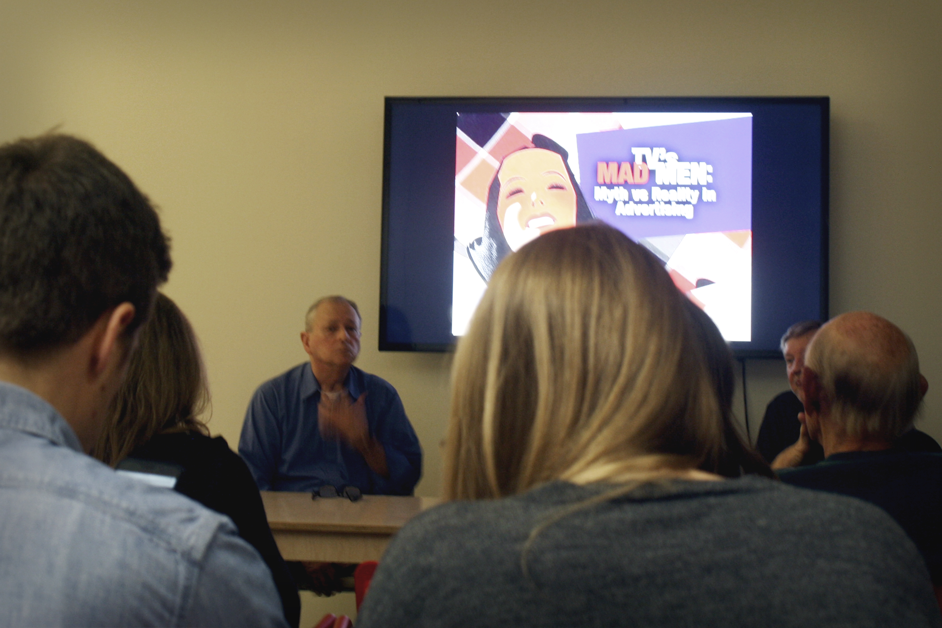
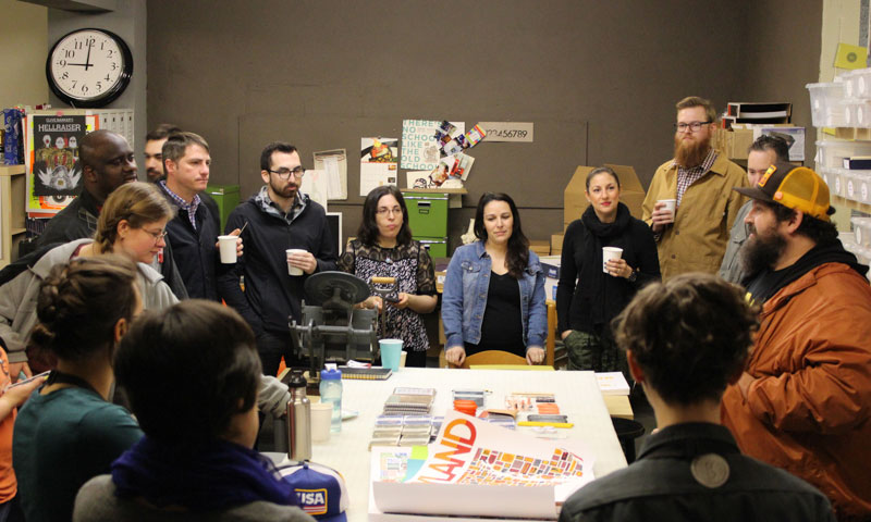
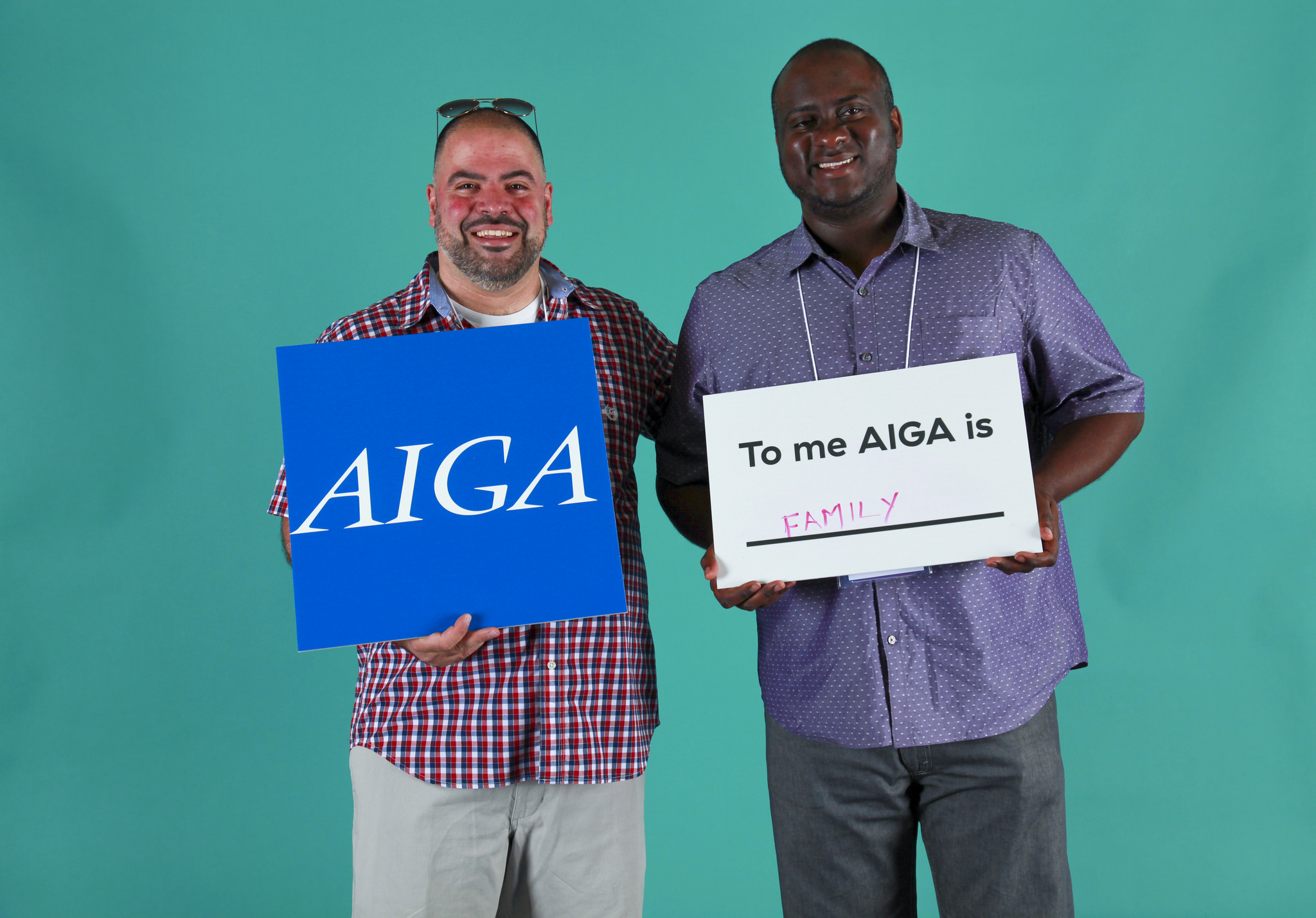
You will also find supportive communities that are welcoming to newcomers and more than willing to help in any way they can. AIGA is one such example. Make sure that you are willing to give back and add value to others, even if all you have to contribute is a positive attitude. Be respectful of others’ time, be humble and willing to learn, and people will point you in the right direction.

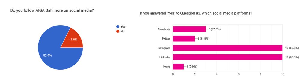
Find Your Community With AIGA Baltimore ask for feedback

4. Ask for others to critique your work.

This is a tough one. None of us want our egos bruised, especially when we already feel like imposters and amateurs. But constructive criticism is the best way to refocus your efforts and move up the ladder quickly.


Websites for learning graphic design

youtube

This is obviously everyone’s first go-to when looking for short video tutorials. Surprisingly, there is a lot of high-quality content here… it’s just a matter of sorting through all the junk to find it. Unfortunately, YouTube is full of distractions, misinformation, and worst of all… people trying to sell you something under the guise of free help.

Overall it’s an excellent resource to look up any specific knowledge when you need it. If you’re just starting out however, you may do better with a more structured and well-curated source.

Find Design Tutorials on YouTube skillshare

Skillshare has over 18,000 online classes and continues to grow every year. The classes are project-based, and there is a vibrant community of fellow students to help provide feedback and critique.

The projects are fun, highly relevant to the latest design trends, and taught by some big names that we all know and admire.

Baltimore’s own Ellen Lupton has several classes on the platform. Her typography classes are a great foundation for anyone serious about learning graphic design.

Overall, the course format is a little more bite-sized, than the more intensive format of courses on LinkedIn Learning and others. This is great to hit the ground running on a project after only a few hours of tutorial, but may lack the broad foundation needed by a total newcomer.

AIGA members can receive a free two-month trial.

Learn Design Skills on Skillshare lynda

Lynda has a smaller catalog of courses than Skillshare, but they are far more intensive. Where a Skillshare course can be 3-5 hours of learning material, Lynda might be 20-40 hours. The potential downside is the time commitment, and the possibility to lose focus and enthusiasm, especially if a large portion of the course is reviewing the basics.

However, Lynda’s deep dives can get you up and running on the latest technology and trends in your industry even if you’re coming in as a blank slate. If you dive in and treat these with the same commitment as you would a college course, you will be rewarded with a solid foundation of knowledge.

This is also a monthly paid subscription, with a free trial that allows you full access to all of the courses.

Expand Your Skillset With LinkedIn Learning adobe

If you’re serious about Graphic Design, there’s a good chance that you are already using Adobe’s suite of products. With yearly updates, the software is constantly changing. Luckily, Adobe provides a large library of free tutorials that will help you find your way around the basics in all of these programs.

These tutorials are generally pretty short, so if you want to learn about every facet and feature of the latest Photoshop, for example, the above-mentioned Lynda might be a better choice.

Explore Design Tutorials With Creative Cloud pluralsight

Like Skillshare, with a smaller library of short-format courses. I’d probably check out the others first, then consider a free trial here to see if there’s some particular topic or teacher that interest you and isn’t on the other sites.

Check it out on Pluralsight udemy

Here you will find a similar deep-dive format as Lynda, but instead of an unlimited access monthly subscription, you pay by the course. This might make sense if there is only one particular course that interests you, or if it will take you several months to complete since there is no time limit once you’ve bought the course. Unlike some of the other sites, you won’t automatically be billed monthly regardless of your progress.

Learn More on Udemy

Online Design Programs & Courses

If you feel like you’ve gotten everything you can out of all of these sources, and you want to further hone your craft with an advanced level of online education, there is another tier (price-wise) of courses that exist.

For motion design, the two most prominent examples are School of Motion and Mograph Mentor. SoM’s courses start at around $1k, and MM at about $2k. There are other similar companies for other specializations.  These big-ticket courses are a long way from the ‘free’ information on YouTube.

Are they worth it? Maybe… To be honest, most of the information itself that is presented in these courses is probably available elsewhere, but they offer a higher level of personalized attention. These are 6-10 week ‘bootcamp’ intensity courses, usually focused on one large project that can be used as a showcase portfolio piece.

If you’re already 90% of the way there, the personalized feedback and coaching through every phase on the project could take your skill level from advanced to elite. If you’re still a hopeless newbie, you’re probably not going to get that much out of it. You will not be magically transformed from someone with no knowledge to an expert just because you shelled out a lot of money for a course.

Feedback and mentorship can be had for free elsewhere if you ask nicely and respect peoples’ time. And the amount you can actually learn and absorb in 6 weeks is limited. If you have the money to spend, and you feel like putting serious cash down will motivate you to work harder, go for it.

Education is a lifelong road, not a finish line that you cross once.

Education is a lifelong road, not a finish line that you cross once. Those who stop learning risk falling behind and stalling out in their careers. This is especially relevant now as technology advances as an accelerating pace. If you’re not learning something new every year, you’re probably already behind where the industry is headed. 

The good news is that where there were once walls, there are now an endless number of ladders. You don’t have to feel stuck doing something that doesn’t excite you. Life’s too short, and you’re never too old to change directions or decide you want to try something new. You can make a lot of progress in learning something new, in a relatively short amount of time, if you know how to sort through the information overload and focus clearly on your desired destination.

Can you teach yourself to be a graphic designer? Absolutely.


About the author:

Vaibhav Sharma headshot

Vaibhav Sharma

Vaibhav is an NJ native, who has called Baltimore home since 2013. He loves motion design, cooking, cats… and most of all, being a dad. Vaibhav is an introvert but loves to make new friends. Feel free to say ‘Hi!’ on Facebook, Dribbble, or in a comment below this article.


Mental Models, Design Patterns, and the Norman Door: A Night of UX Design

Exactly what is user experience (UX) design? In a hands-on workshop lead by Phil Bolles, a DC-based designer and educator, that very question was asked to the crowd of 20+ attendees. Responses included “the easiest way to get from Point A to Point B” and references to the Norman Door, but ultimately, attendees agreed that the essence of UX is asking the questions, “Who is this for?” and “What are they trying to do?”

While the role of a UX designer is multidisciplinary, the ultimate goal is to be an advocate for the user. How one goes about this, with respect to web and mobile applications, was explored through rich discussions, activities, and real world examples.

One of those examples was an exercise in developing the mental model of a pizza tracker app. The goal of the mental model is not to illustrate how ordering a pizza via an app works, but how the user thinks that it works. Through this exercise, we were able to anticipate a user’s goals and tasks as they walk through the ordering process.

In the end, attendees were left with not only an excellent list of UX resources (see our list below), but also a deeper knowledge of design patterns, qualitative insight and mental models, and an understanding of how they all these things fit into the role of a UX designer.

22650413265_c949ba8e15_k
22029274863_b94fdf4aa3_k
22650398455_90c37519f2_k

What are your favorite UX resources? Share them with us on Twitter!

UX Resources:

DeDesign the Web
http://dedesigntheweb.com/
Test your knowledge of popular websites just by looking at the wireframes

The Design of Everyday Things by Don Norman
http://www.jnd.org/books/design-of-everyday-things-revised.html
Donald Norman’s book on the good–and bad–design theories behind everyday products

Designer Hangout CO
https://www.designerhangout.co/
Join 5800+ UXers from around the world on Slack to discuss user experience.

Apps

UX Companion
http://www.uxcompanion.com/

POP App (Prototyping on Paper)
https://popapp.in

Books

A Book Apart
http://abookapart.com/

Rosenfeld Media
http://rosenfeldmedia.com/

User Experience Team of One by Leah Boule
http://rosenfeldmedia.com/books/the-user-experience-team-of-one/

Podcasts

Accidental Tech Podcast
http://atp.fm/

The Big Web Show
http://5by5.tv/bigwebshow

Let’s Make Mistakes
http://www.muleradio.net/mistakes/

A Responsive Web Design Podcast
http://responsivewebdesign.com/podcast/

Other

A List Apart
http://alistapart.com/

Boxes and Arrows
http://boxesandarrows.com/

Daring Fireball
http://daringfireball.net/

Jesse James Garret’s visual vocabulary
http://www.jjg.net/ia/visvocab/

LukeW Ideation + Design
http://www.lukew.com/

Nielsen Norman Group
http://www.nngroup.com/


Shannon Crabill is a HTML Email Developer at T. Rowe Price. Outside of the Internet you can find her riding her motorcycle and binge-watching home improvement shows on HGTV. Tweet her at @shannon_crabill.

Top 7 Takeaways from Baltimore Design Week 2015

Top 7 Takeaways from Baltimore Design Week 2015

This past October, AIGA Baltimore celebrated design by kicking off its 4th annual design week. With over a half dozen events between Oct 16th-23rd, it was one of our best registered and attended design weeks to date. For those who missed it or just want a recap of the week’s events to tide you over until Baltimore Design Week 2016, here is a list of our top seven takeaways from 2015.

  1. Failure isn’t the end of the world
    Alyson Beaton told us about her experiences with failure while developing her company, Lille Huset. Failure, as she says, teaches you when to let go, and when something needs to change.
  2. Personal projects—projects just for you—are important
    Not only do personal projects give you the opportunity to explore ideas or concepts outside of your day-to-day, but it can also be therapeutic. Daniel Danger spoke on how creating personal work helped him cope with complex emotions at the opening art talk for the National Poster Retrospecticus.21784967734_c759d5f1b9_o
  3. Inspiration can be anywhere. Even graveyards.
    While touring graveyards in Southwest England, Paul Barnes of Commercial Type was inspired by the worn, eroded tombstone lettering. This prompted him to create Dala Floda, an elegant stencil typeface that looks anything but military.showcase-dala-floda
  4. A-N-A-C-I-N
    Considered one of the oldest pain relief brands in the United States, Anacin made waves with their advertising strategy. Anacin television and radio ads were “designed to irritate” with their continually repeated unique selling proposition. One of the original television spots cost only $800 to create and generated $86 million in media buy revenue.Screen Shot 2015-12-21 at 5.47.55 PM
  5. Don Norman and the Norman Door
    In its simplest terms, a Norman Door is a door that at first glance does not quickly convey how it should be opened—pushed or pulled. Named after Donald Norman, it represents one of the key principles of user experience design: To empathize with the user.
  6. Mad Men was 90% accurate
    Thin ties aside, the 1960s marked the “age of the creative team”. Copywriters and art directors started working on advertising concepts together to share with the account executives, the true “Mad Men” of the era.SHAG: Mad Men: Myth vs Reality
  7. What do you do when your client hates the one concept you had to show them?
    Get back to the drawing board. Fast. Commercial Type experienced this exact moment of panic while showing lettering concepts to Puma for their sponsored teams in the Africa Cup of Nations. They scrambled to come up with a new concept, Crepello, which ended up being a winner for them and the client.
    crepello_specimen

Check back soon for more design week recaps. Who’s ready for Baltimore Design Week 2016?


Illustration by Niko Kwiatkowski

Shannon Crabill is a HTML Email Developer at T. Rowe Price. Outside of the Internet you can find her riding her motorcycle and binge-watching home improvement shows on HGTV. Tweet her at @shannon_crabill.

Event Recap: Adobe Responsive Design Workshop

AIGA Baltimore’s Adobe Edge workshop wasn’t just about the tools we have at our disposal; it was also about the process of designing responsively. Most of us in attendance were designers who happen to code but that wasn’t our specialty, so Brian Wood, our guest lecturer, went over plenty of web basics to catch us up.

The Tools

Brian worked for Adobe for 13 years and now spends more time doing what he loves most: lecturing about web design, including Adobe’s own suite of development tools for designing, coding, and testing responsive design. The suite includes:

  • Edge Animate – Useful for making animations, web banners, etc. using HTML, CSS, and JavaScript. Interactive elements can be built using Edge Animate; however, it’s not meant for building an entire site.
  • Edge Reflow – Used for rapid prototyping and visually showing responsive elements.
  • Edge Code – A simple, text-only code editor, similar to Sublime Text.
  • Edge Inspect – Built for testing on actual devices in real time via an app on your device (tablet, phone, etc.) and a Chrome plug-in. A local or live site can be mirrored on each device on same network.
  • Edge Web Fonts / Typekit – Hosted fonts that are free with an Adobe Creative Cloud subscription.

Additionally, we had access to free web fonts available outside of a Creative Cloud subscription, such as Google fonts.

What is Responsive Design?

Mark Boulton, whose design studio created the Gridset responsive layout tool, says, “It’s making sure your layout doesn’t look like crap on different sized screens.”

Responsive design, also called mobile optimization, refers to a website that is viewed on various devices without degradation in user experience. There are two main types of responsive design. The first is based on overall screen percentages, called a liquid layout. The second uses liquid in conjunction with breakpoints (or media queries) to force elements to adjust at specific points based on the size of the browser or viewport window.

Responsive design differs from adaptive layouts where the widths are static, or set, and media queries are used to establish breakpoints that adjust the layout where it starts to fall apart. For more information, check out the great resources at the end of this article.

Let’s Get Started

It used to be that a web designer would build a mockup of a website in Photoshop, show it to the client for approval, send it to development, and bam! we’re done. Now, the job is generally more difficult because there’s so much more to consider when building a responsive website, not to mention many designers are expected to take on the front-end development themselves.

One of the first steps we can take when designing a responsive site is to decide if we should start a design for mobile first or desktops. Looking into the analytics for a client can be helpful in determining which direction to start, but when working with Reflow, it doesn’t really matter because at the end of the Photoshop design process, the mockup can be plugged directly into Reflow, which will do the hard work for you. While it’s possible to start from scratch in Reflow, the connection with Photoshop is the power behind the program.

Also, it’s always a good idea to see what everyone else is doing before beginning the design. Learn from the experts. Compare notes. Be awesome.

Best Practices in Photoshop

The client-specific devices you’re supporting are tailored to fit their needs. The size ranges, or device map, dictates your initial wireframe and document setup.

Using a grid is key in developing a clean responsive site mockup. Not only does designing in a grid make it easy to keep elements aligned and balanced, but developers also often use grid frameworks. If you know you’ll be working with a developer, ask what grid they’re using. Knowing this and designing with it in mind can minimize how much of your layout your developer has to fix during production, which ultimately gives you control over your design.

While it is possible to manually create a grid by dragging and measuring guides in Photoshop, there are plug-ins available that will speed up the process. Check out the reference section below to find those.

If you design for mobile first, the term “above the fold” may come to mind when scaling up proportionately for the desktop. While this still matters somewhat, modern audiences know to scroll down, so don’t sacrifice too much based on print design principles.

You will want to use vector objects for graphics because, when moving your design into Reflow, a vector object allows for scalability while a raster object does not. Also, Smart Objects should also be used for editing images so the process can be as non-destructive as possible. Since you’re designing for big and small devices, images should always be bigger than you need. SVG is the recommended format for saving logos. It works in most browsers, it allows for the logo to scale, and it can easily fallback to a PNG should the browser not support an SVG.

Moving into Reflow

Reflow is a very visual program with five simple tools: Move, Shape, Text, Image, and Form.

The program looks at your layer order in Photoshop to determine where elements fall within the HTML document, so remember to place the elements for the top of design at the top of the Photoshop layers.

Overall, we found that Reflow does a really good job of developing code based on the Photoshop document, but minor tweaks were still needed. While moving and editing elements, Reflow updates the HTML and CSS as needed and in the end, all code can be exported to a code editor for additional fine-tuning. There are no semantics, as classes in the HTML and CSS code are created based on layer names and not HTML attributes like <h1> or <p>.

Fixing our Design in Reflow / Using Media Queries

Once you’ve decided what direction you’re designing for (mobile vs. desktop), it’s time to start setting up breakpoints in Reflow. Developers used to code for three breakpoints, but now not only are there many more devices and sizes to compare to, but we should also consider breakpoints based on the size of the viewer’s current browser window to make sure the design doesn’t fall apart at any size.

When making a change to the layout in Reflow, you’ll either need to be in a specific breakpoint or add a new breakpoint. Otherwise, the changes may only apply to the default breakpoint, which controls the global style for all devices.

Within Reflow, all elements are arranged using margins and all items are floated left by default. Understanding this, we can keep a consistent visual experience by using the control panel on the left in conjunction with our breakpoints, telling the elements when and how to change. This includes changing percentage widths for the horizontal layout elements, where to add or remove columns, and when to show or hide elements.

Wrap Up

Although Brian was only able to scratch the surface of what Reflow can do, through this workshop I was pleasantly surprised to learn how far forward Adobe Edge has come in recent years. Not only can Reflow speed up the production and prototyping phase, but its ties with Photoshop allows us—the designers—to stay in control of our designs and how they render across devices. In turn, this allows us to work out usability, legibility or breakpoint issues before our project is handed over to our developer. Alternatively, in the case that we, the designers, are also the developers, Reflow has already done the bulk of the hard work for us.

Responsive Design References

http://alistapart.com/article/responsive-web-design/
– The article that started what we now know as responsive design

http://johnpolacek.github.io/scrolldeck.js/decks/responsive/
– What The Heck Is Responsive Web Design?

http://mediaqueri.es/
– Inspirational gallery featuring responsive websites at various screen and device sizes

http://viljamis.com/blog/2012/responsive-workflow/device-map-2012.pdf
– A sample device map

http://gs.statcounter.com/
– Statistics showing what device resolutions (and more) are using the web

http://www.getskeleton.com/
– A common web developer boilerplate that includes a grid system for mobile and desktop

Photoshop Guide References

http://guideguide.me/
– Plug in for Photoshop that makes creating grid systems easy

http://gridpak.com/
– Responsive grid generator that includes a grid CSS file and PNG’s for use in Photoshop


Shannon Crabill is a New Media Specialist at T. Rowe Price. She has a love for social media, tech, all things do-it-yourself, baking, coffee and the occasional cringe-worthy pun. Check out her work at http://shannoncrabill.com/

HOW Interactive Conference 2013: Tools & Resources

When I first set out to write about what I learned over 3 fabulous days at the HOW Interactive Design Conference in Chicago, I realized (as I sifted through pages and pages of notes) that what’s needed here isn’t another recap of sound bites from the event. What I usually hear from design conference attendees is “it was good but I was expecting more” or “I had a great time but it only reinforced what I already knew.” If you’ve scoured hundreds of articles, blogs, and books about how to be a better designer then you don’t need to learn more, you need to do more. So, with this article, I figured you’d want tools to get the job done.

I’ve put together the tools and resources that the speakers shared at HOW, some of which are free.

PROTOTYPING & WIREFRAME TOOLS

sketches

Axure.com
Make interactive wireframe and prototypes without writing code.

UIStencils.com
Get the tools you need to sketch any type of prototype with pen and paper. Check out this iPhone Stencil Kit!

Protosketch
Build fully-interactive prototypes from your UI Stencil Sketches.

FluidUI.com
Design working mockups for mobile and tablet apps in the browser to share instantly.

Invision
Quickly share a mockup or demo a mobile app with this prototyping and collaboration tool for designers.

Flinto
Make your designs interactive. Create iOS prototypes with your rough sketches or final mock-ups. This tool adds interactivity by linking screens so you can quickly share with your client.

Skala preview
Send pixel perfect previews from your Mac to as many devices as you like. And if you’re working in Photoshop CS5 or higher, you can preview as you edit.

Codiga
A cloud-based drag-and-drop mobile interface builder. Import your own code or choose from their JQuery powered library of components.

Wirify.com
Convert any web page into a wireframe. The PRO version lets you export and edit the wireframes into a variety of formats.

Sketch
A vector graphics app (Mac only) for web and UI design. Render text, create artboards, and use its adjustable 960 grid for wireframes. Using Sketch Mirror, you can preview your work on your iPhone and tablet over Wi-Fi.

USABILITY TESTING

Silverback
Usability testing software for designers and developers. Screen capture, record live video & audio of your users testing your website.

Optimizely
Website Optimization and A/B Testing

UXrecorder
Mobile Website Testing for iOS

DESIGNING & BUILDING

Chris Butler

Macaw
Tired of designing in Photoshop and Illustrator? This web design tool writes code as you draw it.

Codrops
A web design and development blog that publishes articles and tutorials on the latest trends and techniques.

Hammer.js
Javascript library for multi-touch gestures.

Adobe Generator for Photoshop CC
Create image assets in real time.

Adobe Edge Reflow
Design responsive CSS layouts for all screen sizes and export to an HTML code editor with Adobe Edge Reflow CC.

Communication is Key

BOOKS, BLOGS, AND MORE…

Want to know more? Here are some books from the HOW speakers themselves. If I hadn’t brought all carry-on luggage, I might have bought every one of these. Thank goodness for the internet.

Patrick McNeal Twitter
Creator of designmeltodown.com
Session:  What You Need to Know To Be An Effective Web Designer
Books: The Mobile Web Designer’s Idea Book, The Web Designer’s Idea Book

Chris Converse – Twitter
Codify Design Studio
Session: How to Turn Your PSD Documents into Web Pages
Some Great Resources and Templates can be found here

James Victore – Twitter | YouTube
Keynote Speaker
Book: Victore or, Who Died and Made You Boss?

James Pannafino
Associate Professor, Millersville University
Session: Interdisciplinary Approach to Interactive Design
Book: Interdisciplinary Interaction Design

Chris Butler – Twitter | Blog
COO, Newfangled
Session: Master (minding) the Process: Presentation Slides
Book: The Strategic Web Designer

Margot Bloomstein – Twitter
Principal, Appropriate, Inc.
Session:  Making Meaning in Content and Design – Presentation Slides
Book: Content Strategy at Work

Todd Zaki Warfel
Co-Founder, Nimbly App
Session: Interactive Prototyping & Exploration of Standard Prototyping Tools
Book:  Prototyping A Practitioner’s Guide

Terry White, Sr.
Worldwide Evangelist, Adobe
Session: Create HTML Websites, iPad Apps and eBooks Without Writing Code
Tutorials

Cameron Moll
Founder, Authentic Jobs
Session: Visual Execution of Branding Across Platforms
Books: CSS Mastery , Mobile Web Design

Christopher Cannon
Senior Designer, Bloomberg
Session: Designing Data: How to Create Meaningful Visualizations – Presentation Slides

Brian Wood
Co-Owner, AskBrianWood.com
Session: Bridging the Designer/Developer Divide

David Sherwin – Blog
Principal Designer, frog
Session: Using Storytelling Techniques to Create Better Interactive Experiences
Book: Success By Design: The Essential Business Reference for Designers

Dan Rhatigan
Type Director, Monotype
Session: Tailored Type for Screens – Website

Want a play by play of the event? Here’s a beautiful summary of the social media from the conference as it happened.

Have you used some of these? Do you have something to add? We want to hear about them!

Jennifer Marin is the co-president of AIGA Baltimore and she clearly loves resources.

Converse: I love print, but I need to do websites too!

Last Thursday, we had our monthly Converse event. Converse is an opportunity for lovers of design to come talk casually about a specific topic. This month’s topic was “I love print, but I need to do websites too!”

In case you missed it, here is a little bit of what was discussed that night:

  • Web design and web development are two different things.
  • Don’t try to become a developer. It is a completely different set of skills. Would you ask a developer to design a brochure or logo?
  • Do understand that you are designing for something interactive, its not static like print. Otherwise, the process is all the same.
  • Find a good developer to partner with on projects. You might be able to find them at CMS conferences. You need someone who you can have good communication and respect for a good working relationship.
  • Bring your developer early into the process. Ask them what kind of design files they prefer and bring them into client discussions to talk about functionality and design.
  • Don’t take a job that wants the “everything” type designer. That type of employer does not have realistic expectations or an understanding of the web design process
  • It is necessary to educate the client about all of the planning needed to design a website well

And here are some possible resources to consider:

Thank you to b.Creative for sharing their space and their wealth of knowledge with us!

Converse is our roundtable event regularly occurring on the third Thursday of each month. Each event focuses on a different topic for discussion. Email converse@baltimore.aiga.org if you have any questions or if you would like to suggest a topic for a future Converse night.

Moving your portfolio to the AIGA Member Gallery

COPIED FROM A EMAIL BULLETIN:
Last month, we wrote to invite you to AIGA’s new portfolio service on Behance, the AIGA Member Gallery. We hope you’ve been able to take the system for a test drive since then. We wanted to let you know that we’ve set a firm transition date for member portfolios:
Design Jobs portfolios will be deactivated on February 28.

Current members with a portfolio on Design Jobs, this means you’ll need to set up your new portfolio on the AIGA Member Gallery before February 28. After that date, you’ll no longer have access to your Design Jobs portfolio.

Get started
a) The AIGA Member Gallery is an advanced, integrated platform for you to showcase your work, get connected with like-minded creatives and be found by employers and recruiters. Here’s how to get started in the new system:
b) Create a Behance account (If you already have a Behance account, skip to the next step.)
c) Edit your profile in Behance
d) Select My Networks tab
e) Select All Networks
f) Click “Join” link next to AIGA Member Gallery
g) Enter your AIGA credentials (Forgot them? Use the Find Me link on My AIGA.)

See www.aiga.org/aiga-member-gallery for more information, including answers to FAQs and links for further support.
Thanks for taking the time to set up your new portfolio!

I learned everything I need to know about SEO from watching TV

Alright, that’s probably true because I know very little about Search Engine Optimization. But I’ve always been a big-picture guy frankly. And the big picture here is that a print designer who grew up in a in-house design environment who worked solely on those type of projects, my best education is looking at the world outside of the web and creating associative experiences. One such corollary is the use of the satellite television guide to manage my television watching.

In the past, not to distant if you ask me, when I wanted to watch tv, I just turned the thing on and sat down and watched. I’d start movies in the middle, I’d hunt and peck for shows I like. I’d watch stuff I otherwise wouldn’t AND I’d know when the shows I wanted to watch were coming on.

It seems to me that I’m now smarter and dumber about the way I watch television. Nowadays, the biggest difference between tv now and tv then is the use of the guide information that networks use to tell me a bout the programs coming on the tv. Guide information can be as detailed as to tell me if the Top Gear episode I’m planning to watch is a rerun that I may have seen or can be as empty as letting me know that there is simply a show called Top Gear. These are big differences and not every network uses them to their fullest extent.

Every channel would benefit from having the most detailed information on episodes to accommodate the modern television-watching habits. Some years back, a lecturer to MICA (sorry, can’t remember whom) referenced research that showed that MTV watchers watch an average of six contiguous minutes before turning. I hadn’t thought about whether the research asks or answers if they turn back!!! But the fact of the matter is when I channel-surf, I’m surfing around the dead-spots and surfing into the live moments. Can the guide help me with that? Probably. Could the guide help me tune in at just the moment when Snookie gets punched… (I know, I know. Too much TV.)

What if the NFL Replay broadcast told me the exact moment to tune in to see that great interception in an otherwise boring game, it might revolutionize Sundays for men. (BTW: I had a female client once who lamented that her husband watched all three games on Sundays. I told her accept the first two—1pm and 4pm starts—and ask him to be reasonable about the third—8pm.)

How does this relate to your website or your artwork? Doing the work to adequately tag your posts, your artwork, build meta keywords into your site allows your universe of followers and those who don’t follow you to find you and educated themselves on exactly what you and they have in common interest. While you may have a more tightly-knit universe of followers who follow you just for you, recognize that many of us are tangential followers. We follow similar and like interests.

Keeping your tags focused can help solidify your audience and represents a “brand promise” to the potential or current consumer. If on the AIGA Baltimore blog I only talked about sports—which I totally could (I struggle not to)—would the true value of the blog be reached for creatives? Possibly, but not certainly.

We live in the world of the iTunes single track download, the single Google image search and the Today Show interview of the unknown who no one ever heard of who is expert at that one thing and all these are examples of the fleeting attention of the consumer. Build adequate planning for these experiences as well as the more in-depth experiences which you may already have and reap the added attention that can be gained from it be it more hits to your site or more attention to your initiatives.