We need YOU! Volunteer your time and talents to help our community

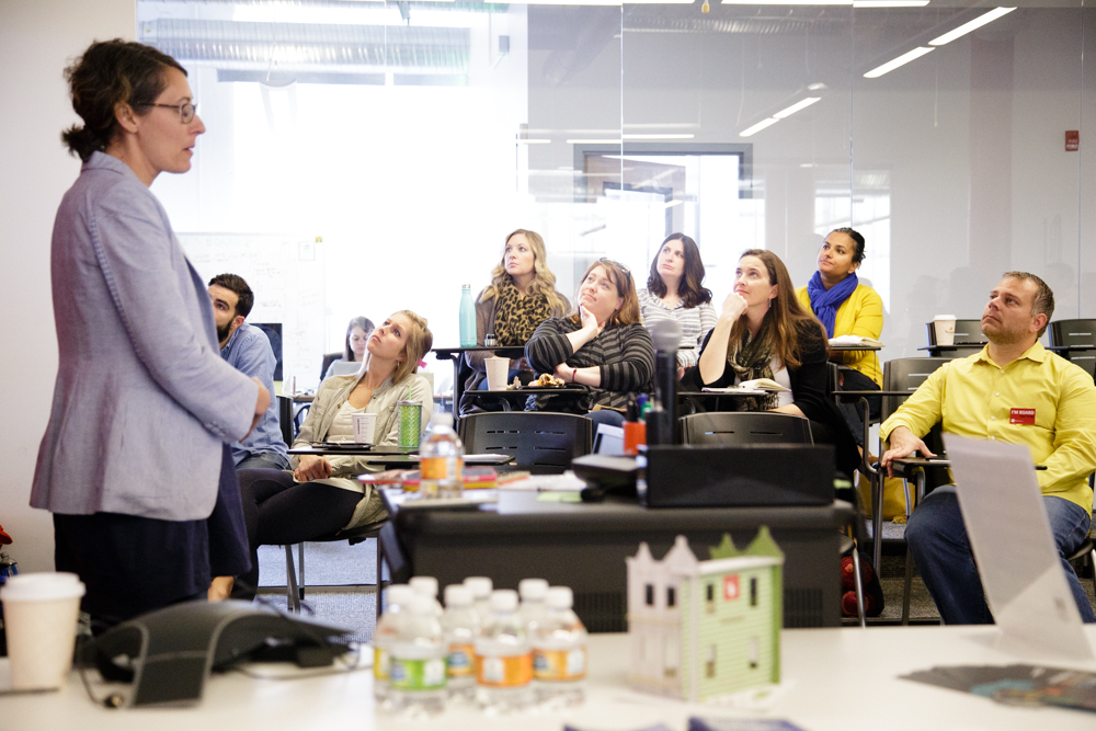
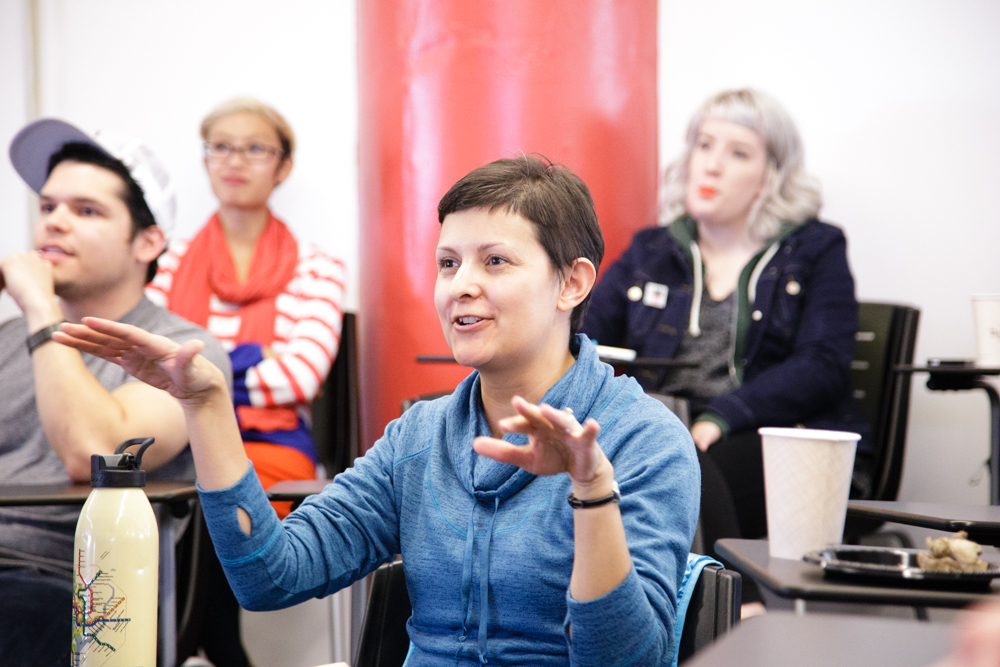
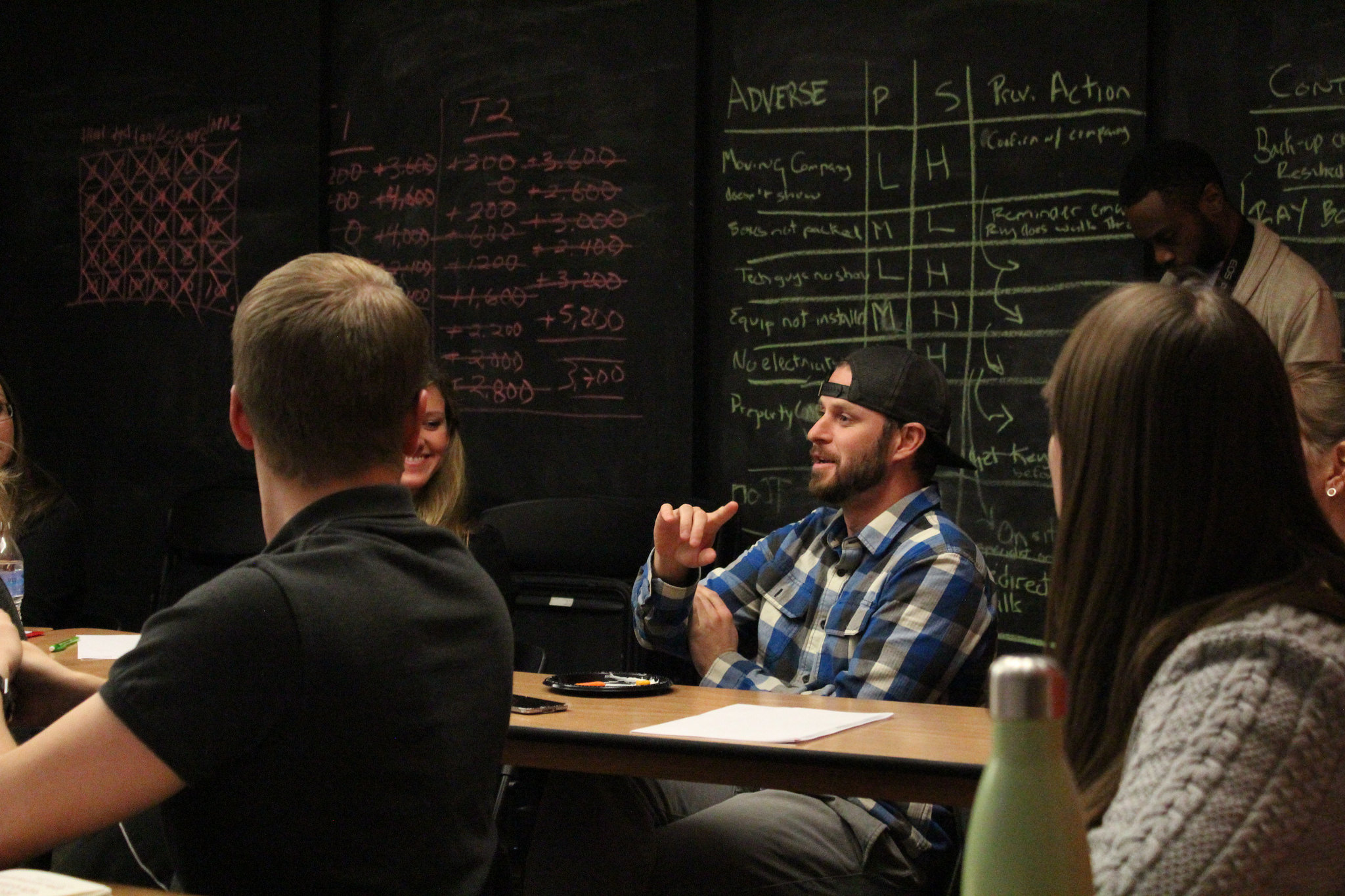
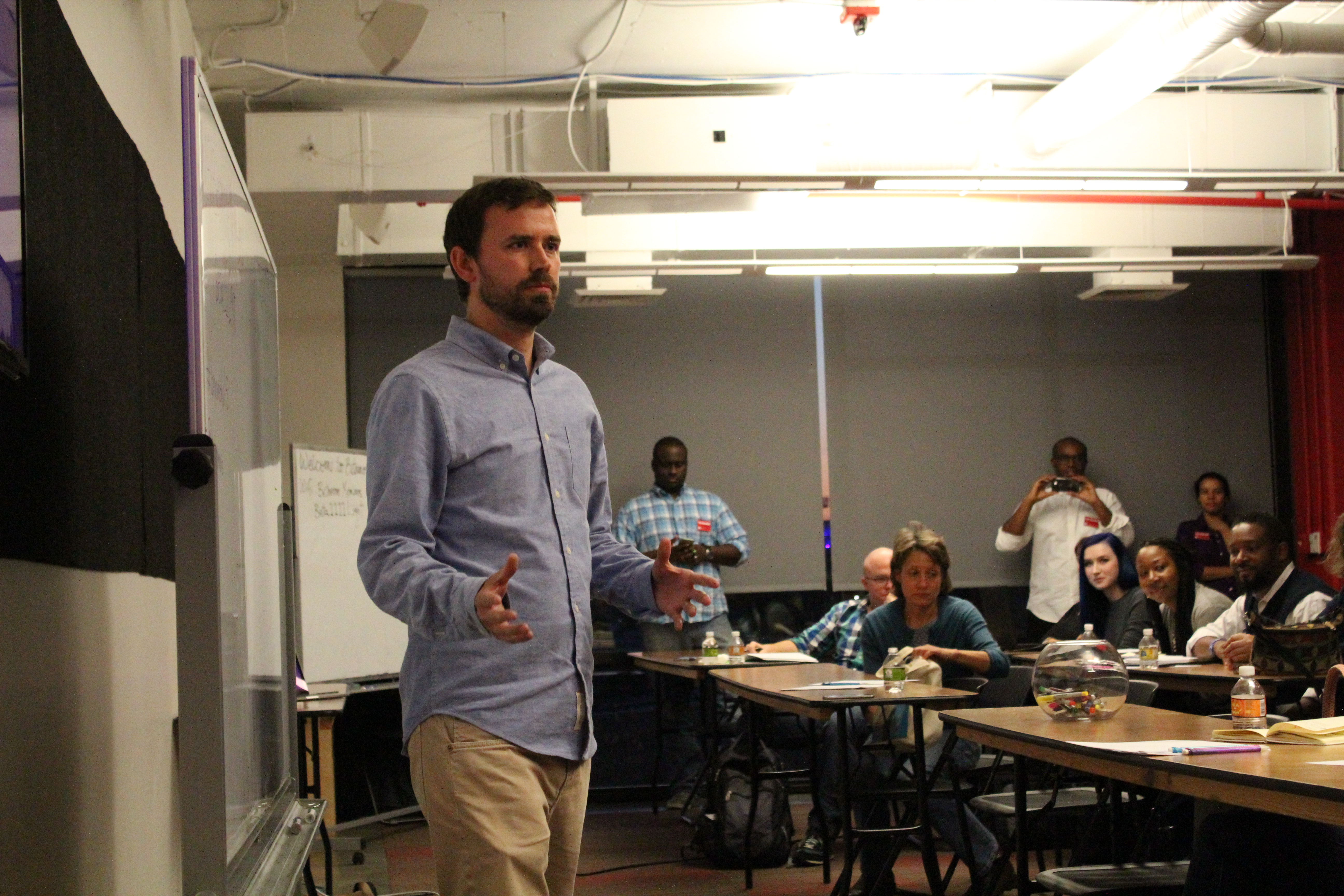
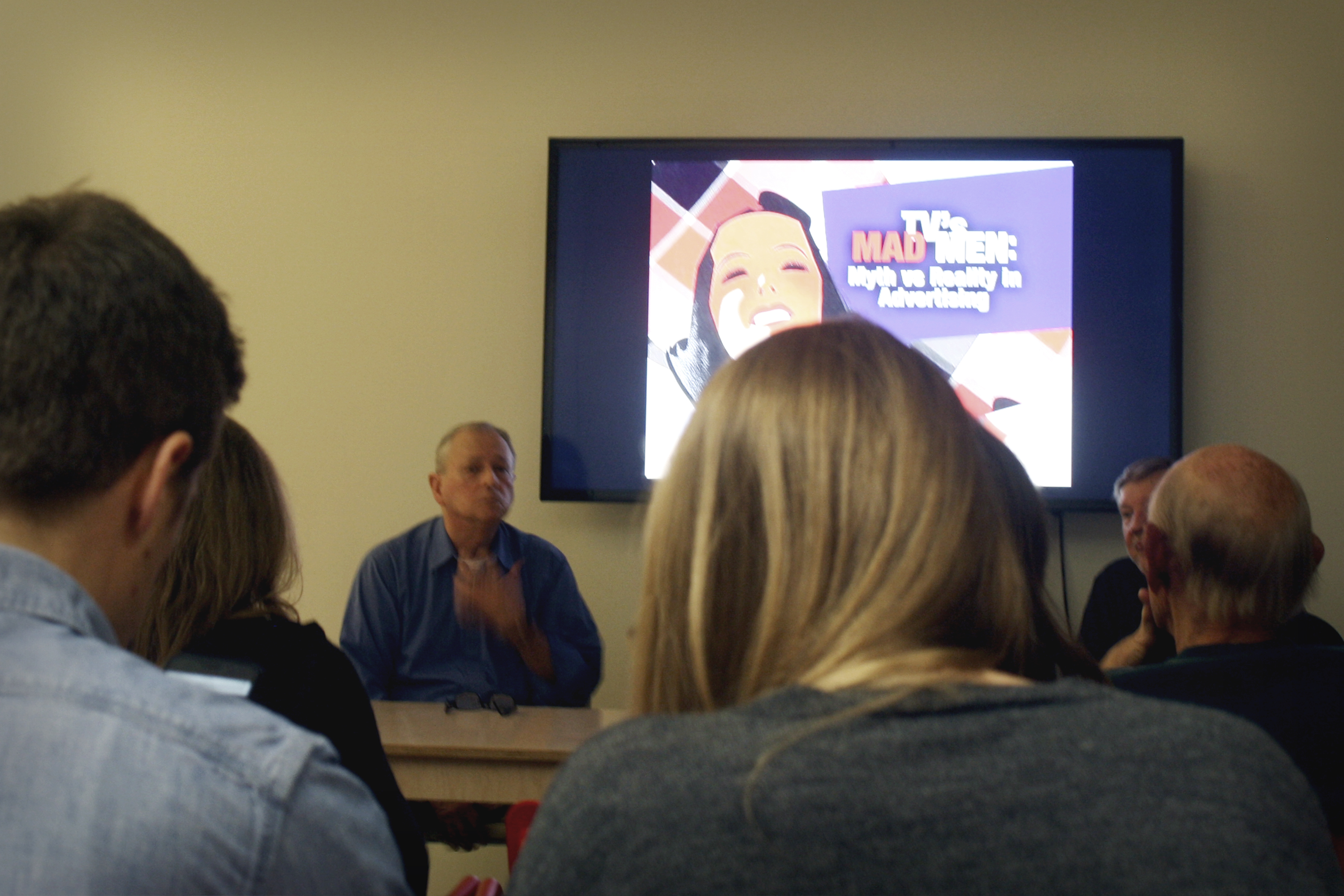
AIGA Baltimore is calling all designers looking to make in impact in our community! The nation and the world have been focused on Baltimore as we have confronted some of the major issues of our time. Last June we hosted an event focused on examining the issues facing Baltimore — designers came together, discussed the complex problems that affect our city, and used design thinking to concept solutions.

AIGA Baltimore has been working since then to determine the best course of action. After months of discussions, planning, and meetings internally and with city and community leaders; we have concluded that as an organization, our efforts can be most effective by assisting those who are already doing great work within the community. Therefore, in the coming months, we will be working in partnership with the Druid Heights Community Development Corporation and Neighborhood Design Center to develop the community branding for Druid Heights CDC. These branding efforts will include designing a new logo and branding system, templates for print collateral and social media, and a website review and redesign.

AIGA Baltimore will be working with Neighborhood Design Center to help with project management, and will be engaging members and leaders within the Druid Heights community during the process as well.

But we need YOU to do it!
AIGA Baltimore is looking for designers, creative and art directors, interactive and UX designers for this initiative. Apply by March 25th to get involved.

A link to the application is and details are below. Please contact socialdesign@baltimore.aiga.org with any questions.
Apply now!


About the Druid Heights Community Development Corporation

Druid Heights is one of Baltimore’s oldest neighborhoods with a rich historical background. The Druid Heights Community Development Corporation’s mission is to cause, encourage and promote community self-empowerment through the development of economic, educational, employment and affordable housing opportunities. They are one of the most active community centers in the city with a wide range of community resources and programs including peace patrols, environmental stewardship, senior programs, summer camps, youth initiatives, re-entry programs, community school initiatives, housing counseling, and real estate development.

The DHCDC has also been recognized for community revitalization and housing accomplishments such as the Commitment to Excellence Award by the Maryland Department of Housing and Community Development, the Community Advocate Award by the City of Baltimore and the Economic Empowerment Challenge Award by the NAACP, to name a few. The center was visited by members of the World Bank this past fall in recognition of their work within the community.


About the Neighborhood Design Center
Since 1968, the Neighborhood Design Center has provided pro-bono planning and design services to over 2,400 community initiatives that have helped communities build new playgrounds, reclaim vacant lots and abandoned buildings, revitalize commercial districts, create community master plans, and beautify their neighborhoods.


Expectations
Volunteers can expect to work 1-3 hours per week for the duration of the project and attend scheduled reviews.

Timeline
Dates are tentative and subject to change

  • Monday, March 14 — Applications open
  • Friday, March 25 — Applications due
  • Friday, April 1 — AIGA to contact volunteers
  • Tuesday, April 5 — Volunteer Introduction meeting with NDC (1 hour)
  • Tuesday, April 12 — Project Kickoff with Druid Heights (1.5-2 hours)
  • Tuesday, April 26 — Design check-in
  • Tuesday, May 3 — Design check-in
  • Tuesday, May 10 — Internal design review with NDC (1.5 hours)
  • Tuesday, May 31 — Stakeholder design review (1.5-2 hours). Meet with the same group as at the project kickoff, review designs. Determine next steps.

Apply now!

Navigating Success and Failure as a Design Entrepreneur: Advice from Alyson Beaton

Alyson Beaton is a successful designer and entrepreneur. For more than a decade, she’s designed and launched several of her own product lines, including Lille Huset, Grow Books Press, and Marketote. On Wednesday, October 21, Alyson joined us for a breakfast talk about her experiences as an entrepreneur and designer, and the processes of defining both success and failure.

20151021-AIGADW-Lecture-3130

As an entrepreneur, the first thing to do is to find your inspiration. Ask yourself what your goal is. Once you’ve defined your success, you’ll be able to evaluate the outcome. When you figure out what is and isn’t working, you’ll learn important lessons about your next steps. Failure is not necessarily something to be afraid of, as it can teach you when something needs to change, or when to just let go. It can, however, be hard to stay focused in the face of failure. But perseverance will pay off with opportunities not otherwise available. In Alyson’s case, she was able to meet her goals on Kickstarter, but the learning curve to get there was huge.

20151021-AIGADW-Lecture-3198

Success is more than just figuring out what not to do. Here are some tips from Alyson to help guide you to successfully designing and selling a product:

  1. Remember to pay yourself. Your time is valuable and should be budgeted for.
  2. Communicate to the intended customer through product packaging. A design that appeals to that person will ensure your message is received.
  3. Research trade shows as much as possible. This research will lead you to the right stores for your product and to important connections with people who can support you.
  4. Test the market for your product. Study the people who you intend to be the consumers to make sure your product fits their needs and desires.

Becoming a successful entrepreneur and designer is no small feat. Some measure of failure along the path is inevitable. As Alyson has learned, failure is not to be avoided, but welcomed as a learning opportunity. Learning from your mistakes and following the right steps will ultimately lead to the success you set out for.


Photos taken by Courtney Glancy

Mitchell Cole is the web sales manager at Service Photo Supply. Most of his free time is spent indulging in some sort of gaming – basking in the glow of a computer screen or the clattering of dice. Critical hit! Find him on Twitter at @mc_mittens.

Mental Models, Design Patterns, and the Norman Door: A Night of UX Design

Exactly what is user experience (UX) design? In a hands-on workshop lead by Phil Bolles, a DC-based designer and educator, that very question was asked to the crowd of 20+ attendees. Responses included “the easiest way to get from Point A to Point B” and references to the Norman Door, but ultimately, attendees agreed that the essence of UX is asking the questions, “Who is this for?” and “What are they trying to do?”

While the role of a UX designer is multidisciplinary, the ultimate goal is to be an advocate for the user. How one goes about this, with respect to web and mobile applications, was explored through rich discussions, activities, and real world examples.

One of those examples was an exercise in developing the mental model of a pizza tracker app. The goal of the mental model is not to illustrate how ordering a pizza via an app works, but how the user thinks that it works. Through this exercise, we were able to anticipate a user’s goals and tasks as they walk through the ordering process.

In the end, attendees were left with not only an excellent list of UX resources (see our list below), but also a deeper knowledge of design patterns, qualitative insight and mental models, and an understanding of how they all these things fit into the role of a UX designer.

22650413265_c949ba8e15_k
22029274863_b94fdf4aa3_k
22650398455_90c37519f2_k

What are your favorite UX resources? Share them with us on Twitter!

UX Resources:

DeDesign the Web
http://dedesigntheweb.com/
Test your knowledge of popular websites just by looking at the wireframes

The Design of Everyday Things by Don Norman
http://www.jnd.org/books/design-of-everyday-things-revised.html
Donald Norman’s book on the good–and bad–design theories behind everyday products

Designer Hangout CO
https://www.designerhangout.co/
Join 5800+ UXers from around the world on Slack to discuss user experience.

Apps

UX Companion
http://www.uxcompanion.com/

POP App (Prototyping on Paper)
https://popapp.in

Books

A Book Apart
http://abookapart.com/

Rosenfeld Media
http://rosenfeldmedia.com/

User Experience Team of One by Leah Boule
http://rosenfeldmedia.com/books/the-user-experience-team-of-one/

Podcasts

Accidental Tech Podcast
http://atp.fm/

The Big Web Show
http://5by5.tv/bigwebshow

Let’s Make Mistakes
http://www.muleradio.net/mistakes/

A Responsive Web Design Podcast
http://responsivewebdesign.com/podcast/

Other

A List Apart
http://alistapart.com/

Boxes and Arrows
http://boxesandarrows.com/

Daring Fireball
http://daringfireball.net/

Jesse James Garret’s visual vocabulary
http://www.jjg.net/ia/visvocab/

LukeW Ideation + Design
http://www.lukew.com/

Nielsen Norman Group
http://www.nngroup.com/


Shannon Crabill is a HTML Email Developer at T. Rowe Price. Outside of the Internet you can find her riding her motorcycle and binge-watching home improvement shows on HGTV. Tweet her at @shannon_crabill.

Posters, Narratives, and Linework: Recounting our Night with Daniel Danger and the National Poster Retrospecticus Exhibit

Posters, Narratives, and Linework: Recounting our Night with Daniel Danger and the National Poster Retrospecticus Exhibit

To kick off Baltimore Design Week 2015, we met at Stevenson University for a poster exhibit and art talk. The National Poster Retrospecticus (NPR) is a traveling poster show featuring over 400 pieces by over 125 artists from across the United States, with the purpose of celebrating and spreading appreciation of the made-by-hand poster movement. Curated by JP Boneyard, the exhibit included a wide range of styles. Minimal, intricate, flat, detailed, limited color…the variations showed attendees something new at every turn.

Art Talk and Opening Night for the National Poster Retrospecticus Exhibit

Daniel Danger, a New England-based illustrator and printmaker, and proprietor of Tiny Media Empire, lead the evening’s art talk. Asking first if we had anywhere to be anytime soon and warning us that he was about to “get weird with it,” Daniel walked us through his creative process, his work, and why he does what he does. A fan of “narratives stacked on narratives,” Daniel’s creations consist of fantasy settings mish-mashed together from various sources. Working with clayboard covered in black ink, Daniel painstakingly scrapes away the ink, creating the highlights in the piece. More than 200 hours of work goes into creating his large scale pieces.

Personal work ended up being key for Daniel during the tough points in his life. By creating work that had meaning just for him, he was able to deal with complex emotions and become a better illustrator in the meantime. Daniel gradually gained opportunities to sell his artwork. Work that he sarcastically described as “not at all personal” made its way onto posters commissioned for punk bands.

Art Talk and Opening Night for the National Poster Retrospecticus Exhibit

Closing his talk, Daniel was asked why he chose screenprinting as the final medium for his posters. Although he does not actively screenprint much anymore, Daniel described how much he loves the prepress process. Screenprinting, he said, is a very logical process. There either is, or isn’t ink. The intricate details of Daniel’s work can be recreated with a good printer, fine mesh screens, layering techniques and a lot of patience.

As far as subject matter—destroyed home towns, abandoned structures, memories of loved ones—no topic or life event is too dark to become the focus for his next piece. As Daniel so eloquently puts it, “everything is beautiful if you look at it the right way.”


Photography by Sophia Belitsos, a Baltimore native with a strong passion for photography—especially food, travel and photojournalism. View her work at sophiabelitsos.com.

Shannon Crabill is a HTML Email Developer at T. Rowe Price. Outside of the Internet you can find her riding her motorcycle and binge-watching home improvement shows on HGTV. Tweet her at @shannon_crabill.

Design & Dine: An Evening of Excellence

When we asked Baltimore designer Wesley Stuckey to come present his work at the Fork & Wrench while attendees noshed on items from a prix fixe menu, we didn’t know just how awesome the evening would be, but awesome it was. The cuisine was just as delectable to our taste buds as his presentation was to our creative eyes as Wesley showed us how he worked through several of his food-related design projects in the local area — like the branding for Dooby’s, Owl Bar, and Milk & Honey to name a few.

Take a look at the video, photos, and tweets from the evening, below:

AIGADW15 [Design and Dine] from AIGA Baltimore on Vimeo.


Check out more photos on our Flickr page, too.


Thanks again to all our attendees, our sponsors Exit 10Indigo Ink, and Fork & Wrench for a fantastic evening!  


Photo Credit: Jennifer Marin Jericho is an Industry Specialist for the School of Design and AIGA Chapter Advisor. Co-President Emeritus, AIGA Baltimore. Follow her on Twitter @hungry4design.

Video Credit: Leonard Brady is a University of Baltimore graduate who currently works as a video producer for Stevenson University’s marketing department. When Leo isn’t hiking trails in Maryland state parks, he enjoys taking photos. As a Baltimore City native, Leo is very involved in social justice and community organizing efforts in Baltimore.

Top 7 Takeaways from Baltimore Design Week 2015

Top 7 Takeaways from Baltimore Design Week 2015

This past October, AIGA Baltimore celebrated design by kicking off its 4th annual design week. With over a half dozen events between Oct 16th-23rd, it was one of our best registered and attended design weeks to date. For those who missed it or just want a recap of the week’s events to tide you over until Baltimore Design Week 2016, here is a list of our top seven takeaways from 2015.

  1. Failure isn’t the end of the world
    Alyson Beaton told us about her experiences with failure while developing her company, Lille Huset. Failure, as she says, teaches you when to let go, and when something needs to change.
  2. Personal projects—projects just for you—are important
    Not only do personal projects give you the opportunity to explore ideas or concepts outside of your day-to-day, but it can also be therapeutic. Daniel Danger spoke on how creating personal work helped him cope with complex emotions at the opening art talk for the National Poster Retrospecticus.21784967734_c759d5f1b9_o
  3. Inspiration can be anywhere. Even graveyards.
    While touring graveyards in Southwest England, Paul Barnes of Commercial Type was inspired by the worn, eroded tombstone lettering. This prompted him to create Dala Floda, an elegant stencil typeface that looks anything but military.showcase-dala-floda
  4. A-N-A-C-I-N
    Considered one of the oldest pain relief brands in the United States, Anacin made waves with their advertising strategy. Anacin television and radio ads were “designed to irritate” with their continually repeated unique selling proposition. One of the original television spots cost only $800 to create and generated $86 million in media buy revenue.Screen Shot 2015-12-21 at 5.47.55 PM
  5. Don Norman and the Norman Door
    In its simplest terms, a Norman Door is a door that at first glance does not quickly convey how it should be opened—pushed or pulled. Named after Donald Norman, it represents one of the key principles of user experience design: To empathize with the user.
  6. Mad Men was 90% accurate
    Thin ties aside, the 1960s marked the “age of the creative team”. Copywriters and art directors started working on advertising concepts together to share with the account executives, the true “Mad Men” of the era.SHAG: Mad Men: Myth vs Reality
  7. What do you do when your client hates the one concept you had to show them?
    Get back to the drawing board. Fast. Commercial Type experienced this exact moment of panic while showing lettering concepts to Puma for their sponsored teams in the Africa Cup of Nations. They scrambled to come up with a new concept, Crepello, which ended up being a winner for them and the client.
    crepello_specimen

Check back soon for more design week recaps. Who’s ready for Baltimore Design Week 2016?


Illustration by Niko Kwiatkowski

Shannon Crabill is a HTML Email Developer at T. Rowe Price. Outside of the Internet you can find her riding her motorcycle and binge-watching home improvement shows on HGTV. Tweet her at @shannon_crabill.

Unveiling a New Identity

The national AIGA headquarters recently launched an expanded AIGA identity, a direction that will allow each chapter to express their own personality while being able to unify under one distinct voice. Developed by Kiss Me I’m Polish, the new visual system strengthens the current AIGA brand while unifying chapter branding across the country.

In introducing brighter, bolder use of color, a new typographic sensibility, and encouraging the logo to play a more active and dynamic role in all of its applications, the AIGA brand remains consistently strong and recognizable as it moves forward, while reflecting all of the vibrancy and diversity of our chapters, members, programs and initiatives.

To give each chapter a unique identity, a pool of ten colors options and two typefaces were presented to all 70 AIGA chapters throughout the country. Each was tasked with choosing just one color and typeface to best represent their chapter.


FUN FACT: The last brand refresh was in 2008, and chapters had a whopping 24 colors to choose from.


Presented with a design problem, we did what any other group of designers would do: use design thinking to solve it. First, we polled members to uncover initial reactions to the typeface and color choices. Then, we formed a smaller branding committee and worked to identify Charm City’s strongest characteristics: robust, passionate, quirky, gritty.

With a foundation laid, we discussed typography. We had two typefaces to work with: GT Haptik and Serifa. The board had unanimously chosen GT Haptik Bold for it’s bold, bright personality and its quirky letterforms in our initial poll, and the members of the branding committee felt it was the right choice. GT Haptik provides just the right amount of visual balance when both the AIGA logo and chapter logotype would be used in tandem.

Finally, we looked at the given set of colors to represent our chapter: teal, aqua, pink, purple, lime, orange, red, blue, green, and cyan. One by one, we went through each option and discussed how each color connected to Baltimore’s characteristics. The blues and greens resonated with our connection to the harbor, and red has been used historically by our chapter. Orange and purple were in the running, of course, because they, too, reflect a certain quirkiness (but ultimately we felt Baltimore’s design style and spirit couldn’t be fully reflected by a color that was so heavily identified as a sports team color).

After rounds of debate, we eventually narrowed our options down to one final solution: Pink.

AIGA Baltimore logo The new AIGA Baltimore logo

Pink, the color of the flamingo hanging above Cafe Hon in Hampden. Pink, one of two colors found on the ubiquitous pens that proliferate our town whilst promoting a certain bail bonds company. Pink, a color that speaks to not only the quirky nature of our city, but also to the boldness of its residents.

We chose pink because it stands out. It isn’t apologetic for being different and it owns up to its convictions. And yet, as much as it’s bold, it’s also welcoming, bringing forth a positive brightness to our home.

We chose this brand direction because these characteristics embody both Baltimore and its creatives. We hope you feel the same warmth, passion and energy through all your interactions with AIGA Baltimore.

AIGA Baltimore's Brand (New) Identity Guide
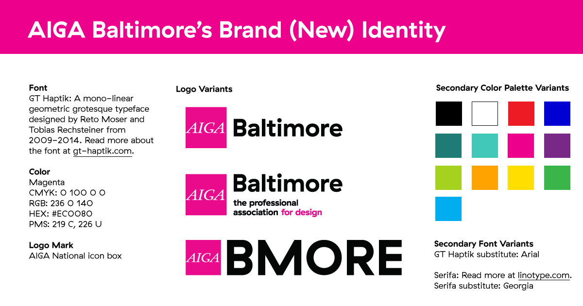
AIGA Baltimore’s Brand (New) Identity Guide

Rob Schilke is the Outreach Chair at AIGA Baltimore and graphic designer at T. Rowe Price. When he isn’t dreaming about his next snowboarding session, he can be found in his hammock plotting his next adventure. Tweet him @robschilke.


Image Credit: The featured image above, “410 Banner”, is a derivative of “Baltimore City” by Yianni Mathioudakis, used under CC BY-NC 2.0. “410 Banner” is licensed under CC BY by AIGA Baltimore.