Behind the Branding: How Design Month 2022 Came to Life

Each year for Baltimore Design Month (and previously Design Week), the AIGA Baltimore board selects a local partner to collaborate with in creating a brand that encompasses the theme for the year.

This year, we reached out to longtime community member, portfolio reviewer, designer and illustrator Emilee Beeson and the team at Mindgrub. Their enthusiasm and creativity made the process as smooth as a perfect bezier curve, and we couldn’t be happier with the results! So, to give you a peek behind the scenes, we asked Emilee to share more about the process.

timelapse of sketching design tools as characters

Q: Can you tell us a bit about yourself?
A: I have been a designer and illustrator in Baltimore for about 10 years. I am currently an Art Director at Mindgrub where I design mobile apps, websites, advertising, and everything in between.

I also have a passion for printmaking, art, and illustration. A lot of the work I do on my own time is themed around video games, tv, movies, and other pop culture. I am always inspired by the weird and wonderful things that come out of those mediums.

Q: What made you excited to be a part of Design Month 2022?
A: When I first got involved with AIGA Baltimore it was circa 2012. I was on the reviewee side of the Ink&Pixels table and I won the branding competition for the event. We now know that design competitions are problematic but at the time I was over the moon about seeing my design on a real poster (and the iTunes giftcard!). I’ve grown as a designer through this chapter so it’s special to design the branding for one of their keystone events 10 years later. This time, with the time and resource support from Mindgrub, Creative Director, Meagan Petri and our SVP of Strategy & Design, Ben Slavin!

Q: What was the inspiration and goal of this year’s Design Month branding?
A: There is a good chance other creatives are feeling a lot like I have these past few years. It’s been hard to find the energy to be creative and get back into the communities we had before the pandemic. I wanted this year’s branding to be bright, playful, and optimistic. One of our favorite buzz word phrases here at Mindgrub is “creating moments of delight.” While we usually use this phrase in relation to micro interactions I think looking a bezier pen in the eyes as he taps his little feet is delightful. Hopefully delightful enough to make people smile and remind them to come out to an event!

Q: How did you approach this event branding project and what was your design process?
A: I often start with the technical requirements as guardrails. In this case I knew that scalability and flexibility were key as this branding would be applied to many different sizes and spaces over the course of a couple months. I also wanted this year’s theme “designing life” to come through. The character illustrations checked all of those boxes and had great potential for motion design and event swag. Once they were finished everything came together really easily.

This sketch is what started it all but I decided touching eyeballs was a little too weird. You have to know when to dial it back.
pencil on paper sketch of a laptop and character with bulging eyeballs

Q: Can you describe your inspiration and any challenges you came across them while designing the branding?
A: I am always inspired by ephemera from the 80s. You can definitely see influence from 80’s puffy stickers in this branding. I am also really inspired by maximalist designs that feel a little ugly and aggressive. There is always that little voice that worries about criticism by committing to something so loud. But to me, being forgettable and underwhelming is a far worse fate.

wide image of the many design elements and deliverables included in the design month branding

Q: What are your typical process steps? Do they differ from the work you did for AIGA Baltimore?
A: Designing for other designers is always different than a typical client project. It’s a chance to be a little more out-of-the-box than what a normal client might allow. Presenting a wild idea and having everyone be on board with it doesn’t happen everyday!

Q: Could you explain an exciting Mindgrub project completely unrelated to AIGA?
A: We launched a mobile application for a major utility company called LG&E, KU and ODP. It’s always a good feeling when you start a project and everyone at the (virtual) table is an expert in their own right. Collaborating with designers, directors, scrum masters, product owners, and developers to create a massive tool that is actually useful to people is incredible. The app looks great and more importantly, works flawlessly.

Designing something flashy for a cool design event is easy. But playing a small role on a big team that is working together to make something beautiful and functional is something to really be proud of! Read the Case Study

Meet the Designers Behind the Ink & Pixels Branding 2022

Ink & Pixels is coming up at the end of April! Save the dates for the virtual panel, “From Portfolio to Offer: The Art of Getting Hired” on April 23rd and the in-person portfolio reviews on April 30th. This year, the branding for Ink & Pixels was designed by Jamie Wheeler of Jelly Creative Co. (@jellycreativeco) and Jess Langley of White Coffee Creative (@whitecoffeecreativeco).

Can you tell us about yourself? What’s your story?

Jamie — My go-to line is, “I’ve been getting paid to design for almost 15 years.” It started with a high school internship, a design degree from York College of PA, various design jobs, a few years teaching, and now I own Jelly Creative Co. A branding and design studio for the creatively ambitious. I also like lava lamps, Nutella, my dog Nova, reading fiction, and playing board games with my husband. When I’m working towards a deadline you’ll find 90’s hits or EDM blasting on my Spotify.

Jess — My story has been full of lessons and ups and downs. In college, I landed my first design-related job as a Store Artist at Whole Foods. I learned lettering, how to work with others, and built up my confidence. That led to my first internship turned design job after graduating with a BFA in Graphic Design from Towson University. After being laid off from there in June 2017, I decided I was done with the typical 9-5 culture and went out on my own. I started White Coffee Creative and haven’t looked back since! My services, style, branding, and who I like to work with have changed drastically since then but I’m so grateful for the journey. I started coaching creatives in 2020 and now am learning to balance the two businesses with ease. When I’m not working, you can find me sipping coffee (obviously, with extra cream and sugar), bingeing Netflix shows, hiking with my 2 pups and partner, or dreaming about having a cabin in the woods.

How did you meet and start working together?

Jess had been running her business for two years when I DM’d her on Instagram asking if we could meet for coffee and talk shop. We met up at Spoons for breakfast and just clicked! She was my first local design/business owner friend and a huge supporter as I went full-time with my company in 2019. Community is really important to us both so when I brought the idea of a group for local designers to Jess she was on board to help start the Facebook group, Baltimore Graphic Designers, which now has 300 members! We have worked on local branding projects together, drank lots of local coffee, sent countless voice messages, and continue to cheer each other on. After Ink & Pixels, we’re excited to see what design mischief we can get into next!

How did you approach this branding project and what was your design process?

We were inspired by the juxtaposition of ink (organic) and pixels (geometric). We started with basic shapes within the AIGA color palette, then using only these shapes we started creating icons that can be used in various ways. The final touch is the wavy lines that intersect with the shapes and icons to create movement and bring everything together.

Having a stark black background allows the colorful elements to be brought to life and grab your attention while scrolling on Instagram or walking by on campus.

The fonts are designed by our friend Alex of The Routine Creative, a Texas-based designer. The jackknife font just felt too perfect not to highlight!

Can you describe your inspiration and any challenges you came across them while designing the branding?

If we had been working solo, there may have been more challenges, but we were able to pass the files back and forth when one of us was feeling stuck creatively. We have worked on branding projects together so we hopped right back into a nice groove. When we say it was a fun project, we really mean it!

What’s your favorite part about designing branding?

Jamie — Like any large design project there are the peaks and valleys, I think the moments right after the valleys are my favorite. I think all designers have the thoughts of “this is never going to work, what am I doing” but it’s the “oh yeah, this is it!” that I’m always chasing.

Jess — I love pulling visual inspiration and using strategy and color psychology to tie in meaning. It’s always a fun challenge to create branding that visually captures the essence of a business while maintaining simplicity. So that beginning exciting energy and the finale of when it’s all done and ready to show the world are my favorite parts.

Was there an aha moment when you knew you wanted to be a designer?

Jamie — Why yes, yes there was. It was when I photoshopped Ashton Kutcher into my homecoming photo and posted it to my Myspace. Technically, that’s when I opened the world to design, but the moment I learned it was an actual career and a college major I knew that was the path I was taking.

Jess — Yes! In college, I dabbled in a few different majors—journalism, photography, general fine arts, and design. I vividly remember one of my college professors (shoutout to Carolyn Norton!) in an Intro to Design class telling me I was already a designer. Getting that recognition and encouragement made me feel ready to step into this direction as a designer full-heartedly, and I got accepted into the GD program at Towson that following semester!

In the long term, what do you hope to eventually accomplish as a designer? What is your biggest goal/dream as a creative?

Jamie — This question is making me realize how much I have accomplished as a designer already, which is really cool. My dream client at the moment would be to work with a performing arts company. Lately, I’ve been searching for ways to bring all my talents and interests together while also helping other designers and keepin’ it real. A huge dream of mine was to host a retreat for designers, which is happening this spring, so I’m too sure what’s next!

Jess — I’m really enjoying running my own studio. I love being a multi-faceted creative offering design, murals, AND coaching. I hope to continue to navigate balancing a variety of tasks, projects, and clients while continuing to reinvent myself and where I want to go next. My big dreamy goal right now is to speak on stage at a creative conference one day about intentionally finding that balance as a business owner while having the freedom to explore a variety of creative outlets.

Thank you to Jamie and Jess for sharing their stories! We cannot thank you both enough for creating the branding for this year’s Ink & Pixels. Make sure to follow them on their various social channels!

White Coffee Creative
Designer + Muralist
whitecoffeecreative.com | @whitecoffeecreativeco

The Colorful Jess
Mindset + Pricing Coach
thecolorfuljess.com | @thecolorfuljess

Jamie Wheeler
Owner + Creative Director
jellycreativeco.com | Instagram | Facebook

Meet the Designer: Paige Olsen | Ink & Pixels 2021

Have you seen the branding for this year’s Ink & Pixels on social media, our website, or the emails? The branding, patterns, and images were created by Stevenson University Alumna, Paige Olsen. We interviewed Paige recently to learn more about her process and her story.

Can you tell us about yourself? What’s your story?

I recently graduated with a degree in Visual Communication Design and am currently working as a Freelance Graphic Designer. In this role, I am designing promotional assets, visual identities, and graphic art according to client specifications.

In addition to my love for design, I have a love for fitness. I approach design similarly to how I approach fitness. Fitness requires a consistent effort to progress and a desire to persevere. I’m looking for an opportunity to take the next step in my Design career and am hoping to do so by merging both of my passions with a focus on graphic design in the fitness industry.

How did you approach this branding project and what was your design process? Can you describe your inspiration and any challenges you came across them while designing the branding?

My first step in approaching the branding project started by really understanding AIGA’s brand (goals and vision) and allowing the ideas to come to me. This general information led me to a better understanding of where the brand is vs. where they want to go. I continued my research by identifying the audience, as well as, reviewing past events/similar portfolio events in the area. Knowing what has previously been done allowed me to differentiate Ink and Pixels 2021 from what currently exists.

The number one strategy I used that inspired the brand’s identity was a Word Association list. I generated keywords associated with the main goals of the event, instead of pulling all of my inspiration from the title of the event, “Ink and Pixels”. The strategy led me to 4 main keywords that represent the event (Network, Continue (to learn), Connect, and Progress). I developed these keywords into icons to visually communicate the value of the event. By integrating these keywords directly, it is easy to understand what the event offers. The icons are also designed into an abstract pattern to reinforce this idea.

The main idea behind the visual identity is to show that even with different audiences (Students, Design Professionals, Speakers), they all have a common goal at Ink and Pixels (connecting, growing, and coming together). One challenge I faced along the way is the abstract pattern itself. The style I was attempting was new to me and needed to be designed heavily off of a grid. I overcame the obstacle by studying patterns that were also designed from a grid to understand how I can create my own.

What’s your favorite part about designing branding?

My favorite part about designing branding is turning my ideas into reality. I love the process of creating something impactful and memorable in the world that once wasn’t there.

Was there an aha moment when you knew you wanted to be a designer?

My journey as a designer is very different from what you would normally expect. I did not know anything about Graphic Design and wasn’t exposed to the idea until my senior year of High School when I enrolled in a Computer Graphics course. When growing up, I always had a love for art, but I never knew this would be the path I would take.

What led me to be a designer is that I felt as if it fit my personality. I am known for being driven and diligent. I enjoy challenging myself and in design, you need to constantly challenge yourself out of your comfort zone. Design is a challenge for me and that is what drew me to it. I have a willingness to always learn and progress. I believe consistent, disciplined action beats natural talent and that’s the approach I take in all aspects of my design work.

In the long term, what do you hope to eventually accomplish as a designer? What is your biggest goal/dream as a creative?

In the long term, I see myself further developing my skill set to create recognizable and noteworthy work at a reputable studio/company. I desire to evoke emotion and to bring the unexpected to the target audience of my designs. My end goal is to have a positive impact through the messaging of my designs while offering a high level of creativity.

Thank you, Paige Olsen, for sharing your story! We cannot thank you enough for creating the branding for this year’s Ink & Pixels. Make sure to give Paige a follow on her Behance portfolio page and on LinkedIn!

Design & Dine Recap: Debbie Millman’s Perspective on Social Media & Personal Branding

Thanks to Kelly Strine for writing this blog post!

The 8th annual AIGA Baltimore Design Week kicked off with a special Design & Dine with the legendary Debbie Millman on Friday, October 11, 2019, at Topside’s beautiful Garden Room. Founder and host of the Design Matters Podcast, Debbie has interviewed over 500 artists, designers, and industry experts. This special Design & Dine was no lecture. Instead, it was Debbie’s signature conversational interview style with 30 of Baltimore’s industry professionals. Had it been recorded, it could’ve been the next episode of Design Matters.

The casual discussion explored how we portray our lives on social media and in our own personal branding. Debbie has “very, very strong feelings about people as brands,” and why we sometimes hide the truth––or downright lie––in the social media versions of our lives.

Personal Branding

Debbie has studied the evolution of branding, and how we’ve grown with it, for the past 17 years. At its core, branding is about mark-making and building consensus around that mark. Through quality and consistency, shared views and opinions regarding products and services can be accomplished.

If we fast-forward through the history of corporate branding, we come to a more recent phenomenon: personal branding. Personal branding is the practice of marketing people and their careers as brands, with an intentional effort to influence public perception. Sound familiar in the design industry where everyone wants to position themselves a certain way in the marketplace?

Photography Credits: Bryan Burke

Humans are Messy

As Debbie so bluntly put it, “Humans are messy.” We have a lot of feelings. But brands don’t have that kind of depth. Sure, brands can evolve, but brands are rooted in consistency. If humans run the emotional gamut and can reinvent themselves, but brands are built on consistency, can personal brands be successful? Can consensus be built?

From a technology standpoint, we’re living in an ever-connected environment. We’re always just a tap, click, or voice command away from whatever we need. Yet we’re oddly disconnected in our interpersonal relationships. Why? Isn’t social media supposed to make us feel more connected?

Our Online Personas

In many cases, people use social media as a highlight reel. We share what we are proud of and the happy moments and hide what we are ashamed of. That’s natural, right? But if you’re only seeing the highlights of other people’s lives, it’s much easier to feel left-behind or alone in your own life. The things that we don’t share tend to be the things that build a better connection with others.

For those of us who maintain a personal brand, Debbie challenged us to consider how social media impacts our branding. If we hide certain aspects of our lives to position ourselves a particular way, we start to pull away from our authentic selves. We start to create an online persona who is our ideal selves, but ultimately this can lead us to feel even more disconnected from ourselves and others.

Photography Credits: Krystal Carpintieri

How do we combat the disconnect? Here are a few ideas:

  1. Digital minimalism: More and more people are disconnecting from social media to live their lives IRL (in real life). Taking a break from social media or ditching it altogether is one way to reconnect and build better relationships with others.
  2. Be authentic: Rather than showing only the highlights, show your authentic self—challenges and all. People connect with honesty. But the key is to help; not commiserate. If you’re going through a difficult time, chances are someone else is going through it too. Share resources or seek support, rather than just complain.
  3. Set an intention: Ask yourself, why am I posting this? Am I looking for self-validation? Sympathy? Is it a humble brag? Being honest about why you’re posting sends a clear message to your audience. Did you land your dream client after working your tail off on the pitch? Yeah, I’ll celebrate that win with you. But do I care about your “picky” client? Nah, I don’t need your negativity.
Photography Credits: Bryan Burke

Social Branding

As Debbie notes, branding is always evolving. The most recent anomaly is social branding, which is marketing for social change. Social branding projects, such as the Me Too Movement and Black Lives Matter, are designed to change a culture. So, whereas personal branding fails at the individual level due to the complexity of human emotions, social branding succeeds due to the social change people can rally around. Social branding builds consensus.

Continue the Conversation

Where do you stand on personal branding? Is your personal brand a true brand in that it builds consensus, or is it more of a brand identifier to set you apart in the marketplace? Do you tend to hide the truth on social media in hopes of creating an ideal online persona? Share your thoughts in the comments below, we want to hear from you!

About the Speaker:
Debbie Millman
Twitter & Instagram: @debbiemillman

Named “one of the most creative people in business” by Fast Company, and “one of the most influential designers working today” by Graphic Design USA, Debbie Millman is also an author, educator, curator and host of the podcast Design Matters.

Behind Design Week 2018’s Branding; A Discussion With idfive

AIGA Baltimore was thrilled when local Baltimore design studio idfive agreed to be our Branding Sponsor for Design Week 2018.

Since 2013, we have reached out to a local design agency to partner with us and bring Design Week alive visually. Past partners have included Fastspot, Orange Element, Gilah Press + Design, Eye Byte Solutions, and Exit10.

This year, we want to bring you behind the scenes with our Branding Sponsor, idfive, to learn more about their inspiration for this year’s branding for Design Week, their work outside of AIGA Baltimore, and what their company is all about!
design week baltimore

What was the inspiration for idfive’s Design Week Branding?

I wanted to take this creative opportunity to address what I think is the central issue in Baltimore – the “two Baltimores” – by attempting to build a visual system that would unify, represent, and complete the “feel” of Baltimore. I thought about the disparate ways our City has been represented visually – a sort of mishmash of the old (cobblestones and gas lamps), the new (modernist/brutalist architecture), and the forgotten (formstone, Waters-esque camp, The Wire).

I kept getting hung up on was the source of many of our current divisions – the 1937 Federal Home Owners’ Loan Corporation (HOLC) “redlining” map. So I suggested to our designer Heather that we re-use, re-purpose, and “break” shapes and forms from that tragically unjust document as a way to acknowledge our City’s past and represent its current divisions, while still looking with hope toward a more unified future.

The tagline was a natural extension of this visual theme, tied back to design.

What were the steps involved in creating the branding?

We divided a volunteer squad of six creative team members in to three teams of two (a copywriter and a designer), hashed out rough concepts separately, and came together under the guidance of Courtney Glancy to critique and tweak.

I can’t speak to the other teams’ processes, but for me and Heather, beers, dinner, and doodles on some cocktail napkins in Hampden were all it really took to come together on concepting. Heather and I have complementary strengths and work together well. I’m very analytically minded and always try to zoom out to process everything on the level of overarching themes and concepts, and she lives in the nitty-gritty of the execution phase where she’s amazing at expanding and exploring concepts within a consistent visual language.

aiga baltimore design week branding idfive

What was the inspiration for being a part of Design Week 2018?

Courtney asked us, “wanna do it?” And we said “hell yes!”

What was the goal of the Design Week branding?

Try to answer the questions:
“What is Baltimore design?”
“What should Baltimore design be?”
“How can we represent Baltimore in a way that feels like Baltimore?”

AIGA Baltimore Design Week 2018 logo by idfive

Could you explain an exciting idfive project completely unrelated to AIGA?

We’re currently redesigning the website for Maryland Food Bank, which distributes 37 million meals every year to people in Maryland. You can’t ask for a more inspiring client than that. As a copywriter, any time you find yourself shedding tears while you’re writing, you know you’re on the right track. Whoever’s reading this should donate.

What are your typical process steps? Do they differ from the work you did for AIGA?

Usually I start with a task list item, then go back and research the brand or the industry until I find an angle of entry, then organize my thoughts into buckets, and execute. I typically think slow and work fast. The process for AIGA was similar, but since the task wasn’t laid out with really any specificity, I also got to jumpstart my usual process with my own questions – “What do I want this task to be?” “What don’t I want this task to be?”

Your firm recently made a big move to the MICA campus. What’s your favorite part about the new location?

Anytime I need a boost or a break, I can walk through a gallery space and see something interesting, or pop into the library and flip through art books.

baltimore design agency idfive brands baltimore design week

How do you typically find your clients?

I let the new biz team handle that, and my focus is on doing high-quality work that makes their job easy.

What’s an ideal day at the office like?

A nice varied mix of tasks, some deep workflow where time has no meaning, some lightning round problem solving whack-a-mole, some positive client feedback when you check your email, some solid belly laughs with other team members, and that feeling at the end – when you fill out your timesheet – of “I just knocked this one out of the park.” And also idfive bought us pizza.

What is idfive’s mission? How did it come about?

Our whole thing is helping mission-driven brands do good better. So we do things like no-commission media campaigns, and website redesigns that are built to drive action AND help build more efficient governance structures. The whole setup is pure Andres, who is without a doubt the best boss I’ve ever had.

aiga baltimore design week

If you could describe your team and work philosophy in 5 words, what would they be?

How can I help? Oooohdonuts!

What’s your vision for Baltimore? For Maryland?

I’d like to see Baltimore, Maryland, and America transcend its entrenched divisions, build sustainably and fairly, and keep on being weird and wonderful.

idfive baltimore design agency logo png

Behind Design Week 2017’s Branding; A Discussion With Fastspot

AIGA Baltimore was thrilled when Fastspot agreed to be our Branding Sponsor for Design Week 2017. Their commitment to Baltimore was evident from the beginning, and with this Design Week being a resounding success, we couldn’t have of done it without them.

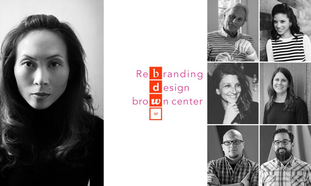
A critical aspect of communicating Design Week to our membership is a strong brand identity. Since 2013, we have reached out to a local design agency to partner with us and bring Design Week alive visually. Past partners have included Orange Element, Gilah Press + Design, Eye Byte Solutions, and Exit10.

Here we go behind the scenes with our Branding Sponsor, Fastspot, to learn more about their inspiration for this year’s branding for Design Week, their work outside of AIGA Baltimore, and what their company is all about!

What was the inspiration for Fastspot’s Design Week Branding?

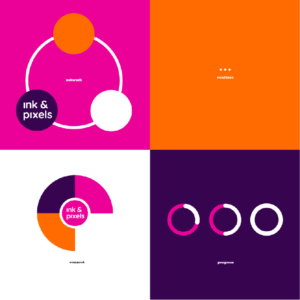
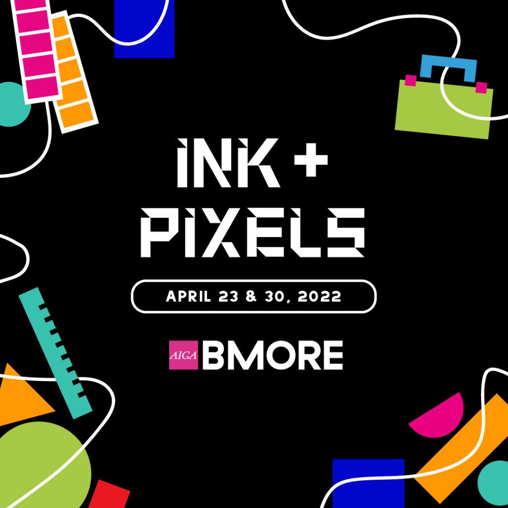
A branding project like this one is all about using design and aesthetic choices to bring the spirit of an organization to the surface. The Baltimore design community, which we’re honored to be a part of, is full of creative people exploring, innovating, and pushing in new directions. We wanted to reflect that in a way that was exciting and authentic, and would align well with AIGA’s existing materials. Our designers drew inspiration from the city itself, in abstracted shapes of iconic Baltimore buildings and variations on found letterforms. In the end, the Design Week brand captures the quirk and vibrancy that will be very familiar to AIGA’s audiences.

What were the steps involved in creating the branding?

We begin every project with a kick-off meeting that allows us to better understand the mindset and vision for the project. Time is spent together questioning, brainstorming, and setting a vision for the project, both from a creative and a scoping standpoint. From there, it’s a lot of iteration and collaboration. The “big reveal” moment might be dramatic, but it isn’t necessarily productive. We prioritize working closely with clients to discuss, challenge, and refine the work, so that we’re all in consensus around the finished product.

What was the inspiration for being a part of Design Week 2017?

Fastspot is Baltimore through and through—many of our team members are from Baltimore or have proudly adopted the city. So we jumped at the chance to give back to this community. It’s not unusual for us to work with clients to adapt an existing branding or design system for use in a new medium or for a specific initiative. It was a lot of fun doing so for AIGA.

What was the goal of the Design Week branding?

We wanted to create a design system that breaks down barriers (real and perceived).


Could you explain an exciting Fastspot project completely unrelated to AIGA?

The Ford’s Theatre website redesign was an exciting project and a great challenge.

Ford’s Theatre is a place where the past and present collide—they teach Lincoln’s legacy while preserving the historic theatre that shows new, contemporary performances. We loved immersing ourselves in the history and cultural impact of Ford’s Theatre. During the process we learned it was controversial for Lincoln enjoy theater! It was very uncommon at the time, and he was seen as a rebel for his attendance.

One of the interesting logistical goals of the project was to make online ticketing easier. We worked with the software applications TNEW and Tessitura to make them as user-friendly as possible, something we’re continuing to partner with Ford’s Theatre to refine. A website redesign doesn’t end at site launch, and some of our most successful clients are the ones who become partners that we continue to work with for many years.

What are your typical process steps? Do they differ from AIGA work?

Our process always start with research. We ask hard questions and we do a lot of listening as we seek to uncover the real motivations and challenges that each project contains. We want to understand the potential impact on the institution or organization, and the ways in which we can help create meaningful change. From there, we create foundational strategy before we move into design and (where needed) development. Throughout our process, we’re focused on innovation and collaboration. Great ideas can come from anywhere, at any time, and we’re always ready to pursue them. All of this was reflected in our work with AIGA.

How do you typically find your clients?

Fastspot finds most of our new clients through referrals. Great work and happy clients help bring in more happy clients!

BDW-logo


What’s an ideal day at the office like?

An ideal day at Fastspot is when our team members feel accomplished, whether it’s because of a design breakthrough, a successful presentation, progress on a hard problem, a well-received deliverable, helping a co-worker, etc. 

What is Fastspot’s mission? How did it come about?

“To build a successful company, with great people, who do awesome, creative work, together.” 

Fastspot’s mission partly comes out of our co-founder, Tracey Halvorsen’s background as a painter. She recognizes how important your physical space and who you surround yourself with is to doing your best work. She wanted to bring that sentiment into into the business world, where collaboration and creativity should also be encouraged and acknowledged.

If you could describe your team and work philosophy in 5 words, what would they be?

Challenging, supportive, smart, honest, and brave.

What’s your vision for Baltimore? For Maryland?

Our vision is to create more of a draw to this area, whether it’s Baltimore or Maryland as a whole. We want Maryland to be a place where creative, innovative people want to live and work. 

We like that Baltimore isn’t New York or Silicon Valley, there’s opportunity to have a really great life in Maryland. The lifestyle here emphasizes a work-life that balance, which makes it a place where people can truly thrive. 

We’d like to see more local initiatives to help kids get into creative and technology fields, and support for businesses that want to grow here. We hope the city and state can have the kind of leaders who look forward to new ways of leading and governing. We’re in a new time, and need progressive leadership.

5 Questions with Orange Element

Design agency selected as the official branding sponsor for Design Week 2016

AIGA Baltimore is excited to announce that Orange Element (OE) has agreed to be the official Design Week branding sponsor for this year’s fifth annual Baltimore Design Week. Held every third week of October, Baltimore Design Week is a week-long series of events geared towards educating and inspiring the design community.

One of the most important components of communicating Design Week to our membership (430+ and growing!) is a strong brand identity. Since 2013, we have reached out to a local design agency to partner with us and bring Design Week alive visually. Past partners have included Gilah Press + Design, Eye Byte Solutions, and Exit10.

AIGA Baltimore is thrilled for the partnership with OE this year, not only because they’re a group of uber-talented creative professionals, but also because their agency has made a really awesome commitment to focus on the Baltimore community and be proactive in helping make our city a better place. To learn more, we asked Aaron Moore, Creative Director and Principal of OE, five questions:

How did OE’s mission come about?

When we established our agency in 2003, we started in the beginning with a focus on developing strong partnerships. For us, earning trust has always been as important as the design work we do, and we take that to the broader community level by making a commitment to use design and branding to help our local communities, and organizations focused on making sure our city remains a great place to live, work and play.

How is OE currently involved?

We allocate an annual percentage of our revenue to support local and regional organizations focused on improving the quality of people and places. We’re currently honing our areas of focus and where we feel our mission most closely aligns with giving back, but we have supported organizations including Parks and People, The Creative Alliance, The Girl Scouts of Maryland, The Brick Companies, Thread, The Production Club of Baltimore, The American Advertising Federation, AIGA, The Foundery, the Industrial Arts Collective, and more.

We also support local organizations by choosing one or two each year to provide either pro-bono work or reduced pricing with the intention of moving their brands and missions forward. Philanthropy is one of our core beliefs and we continue to make it a priority, both as a team and as individuals.

Tell us about the coolest thing you did last year.

The Parks and People Foundation welcomed visitors to their new Auchentoroly Terrace in 2015. The new campus will welcome community families, educators, students and leaders focused on improving our City’s green spaces and the opportunities to make each an active addition for outdoor use.

Orange Element has been involved both personally and as a company to help advance the Foundation’s mission. We were thrilled to be included and involved on groundbreaking activities, as well as engaged with helping participate in environmental graphics—from the interior entrance signage to the donor wall. We are currently working on wayfinding and outdoor signage for campus visitors. It’s so cool to think about a new community campus that will help engage our youth and provide communities the opportunities to enjoy the city’s parks.

If you could describe the OE team and work philosophy in 5 words, what would they be?

Integrity, Civility, Precision, Curiosity and Creativity. Along with philanthropy, these round out our core beliefs at Orange Element.

What’s OE’s vision for the Baltimore creative community?

Baltimore has nearly 500 non-profits working towards their respective missions. Each organization, in some way, shares a collective desire to believe in our great city. At OE, we are constantly looking for opportunities to share these stories with hope that we can connect our creative thinkers to organizations that would benefit from new insight.

With so many organizations working towards this common goal, we challenge everyone to find time to give back. Whether it’s a commitment to a board, committee, volunteer effort or donation, please use your creativity to lend hand. And stay here, in Baltimore, because it IS the Greatest City in America.


Photo credit: John Davis Photography

We need YOU! Volunteer your time and talents to help our community

AIGA Baltimore is calling all designers looking to make in impact in our community! The nation and the world have been focused on Baltimore as we have confronted some of the major issues of our time. Last June we hosted an event focused on examining the issues facing Baltimore — designers came together, discussed the complex problems that affect our city, and used design thinking to concept solutions.

AIGA Baltimore has been working since then to determine the best course of action. After months of discussions, planning, and meetings internally and with city and community leaders; we have concluded that as an organization, our efforts can be most effective by assisting those who are already doing great work within the community. Therefore, in the coming months, we will be working in partnership with the Druid Heights Community Development Corporation and Neighborhood Design Center to develop the community branding for Druid Heights CDC. These branding efforts will include designing a new logo and branding system, templates for print collateral and social media, and a website review and redesign.

AIGA Baltimore will be working with Neighborhood Design Center to help with project management, and will be engaging members and leaders within the Druid Heights community during the process as well.

But we need YOU to do it!
AIGA Baltimore is looking for designers, creative and art directors, interactive and UX designers for this initiative. Apply by March 25th to get involved.

A link to the application is and details are below. Please contact socialdesign@baltimore.aiga.org with any questions.
Apply now!


About the Druid Heights Community Development Corporation

Druid Heights is one of Baltimore’s oldest neighborhoods with a rich historical background. The Druid Heights Community Development Corporation’s mission is to cause, encourage and promote community self-empowerment through the development of economic, educational, employment and affordable housing opportunities. They are one of the most active community centers in the city with a wide range of community resources and programs including peace patrols, environmental stewardship, senior programs, summer camps, youth initiatives, re-entry programs, community school initiatives, housing counseling, and real estate development.

The DHCDC has also been recognized for community revitalization and housing accomplishments such as the Commitment to Excellence Award by the Maryland Department of Housing and Community Development, the Community Advocate Award by the City of Baltimore and the Economic Empowerment Challenge Award by the NAACP, to name a few. The center was visited by members of the World Bank this past fall in recognition of their work within the community.


About the Neighborhood Design Center
Since 1968, the Neighborhood Design Center has provided pro-bono planning and design services to over 2,400 community initiatives that have helped communities build new playgrounds, reclaim vacant lots and abandoned buildings, revitalize commercial districts, create community master plans, and beautify their neighborhoods.


Expectations
Volunteers can expect to work 1-3 hours per week for the duration of the project and attend scheduled reviews.

Timeline
Dates are tentative and subject to change

  • Monday, March 14 — Applications open
  • Friday, March 25 — Applications due
  • Friday, April 1 — AIGA to contact volunteers
  • Tuesday, April 5 — Volunteer Introduction meeting with NDC (1 hour)
  • Tuesday, April 12 — Project Kickoff with Druid Heights (1.5-2 hours)
  • Tuesday, April 26 — Design check-in
  • Tuesday, May 3 — Design check-in
  • Tuesday, May 10 — Internal design review with NDC (1.5 hours)
  • Tuesday, May 31 — Stakeholder design review (1.5-2 hours). Meet with the same group as at the project kickoff, review designs. Determine next steps.

Apply now!

Design & Dine: An Evening of Excellence

When we asked Baltimore designer Wesley Stuckey to come present his work at the Fork & Wrench while attendees noshed on items from a prix fixe menu, we didn’t know just how awesome the evening would be, but awesome it was. The cuisine was just as delectable to our taste buds as his presentation was to our creative eyes as Wesley showed us how he worked through several of his food-related design projects in the local area — like the branding for Dooby’s, Owl Bar, and Milk & Honey to name a few.

Take a look at the video, photos, and tweets from the evening, below:

AIGADW15 [Design and Dine] from AIGA Baltimore on Vimeo.


Check out more photos on our Flickr page, too.


Thanks again to all our attendees, our sponsors Exit 10Indigo Ink, and Fork & Wrench for a fantastic evening!  


Photo Credit: Jennifer Marin Jericho is an Industry Specialist for the School of Design and AIGA Chapter Advisor. Co-President Emeritus, AIGA Baltimore. Follow her on Twitter @hungry4design.

Video Credit: Leonard Brady is a University of Baltimore graduate who currently works as a video producer for Stevenson University’s marketing department. When Leo isn’t hiking trails in Maryland state parks, he enjoys taking photos. As a Baltimore City native, Leo is very involved in social justice and community organizing efforts in Baltimore.

Unveiling a New Identity

The national AIGA headquarters recently launched an expanded AIGA identity, a direction that will allow each chapter to express their own personality while being able to unify under one distinct voice. Developed by Kiss Me I’m Polish, the new visual system strengthens the current AIGA brand while unifying chapter branding across the country.

In introducing brighter, bolder use of color, a new typographic sensibility, and encouraging the logo to play a more active and dynamic role in all of its applications, the AIGA brand remains consistently strong and recognizable as it moves forward, while reflecting all of the vibrancy and diversity of our chapters, members, programs and initiatives.

To give each chapter a unique identity, a pool of ten colors options and two typefaces were presented to all 70 AIGA chapters throughout the country. Each was tasked with choosing just one color and typeface to best represent their chapter.


FUN FACT: The last brand refresh was in 2008, and chapters had a whopping 24 colors to choose from.


Presented with a design problem, we did what any other group of designers would do: use design thinking to solve it. First, we polled members to uncover initial reactions to the typeface and color choices. Then, we formed a smaller branding committee and worked to identify Charm City’s strongest characteristics: robust, passionate, quirky, gritty.

With a foundation laid, we discussed typography. We had two typefaces to work with: GT Haptik and Serifa. The board had unanimously chosen GT Haptik Bold for it’s bold, bright personality and its quirky letterforms in our initial poll, and the members of the branding committee felt it was the right choice. GT Haptik provides just the right amount of visual balance when both the AIGA logo and chapter logotype would be used in tandem.

Finally, we looked at the given set of colors to represent our chapter: teal, aqua, pink, purple, lime, orange, red, blue, green, and cyan. One by one, we went through each option and discussed how each color connected to Baltimore’s characteristics. The blues and greens resonated with our connection to the harbor, and red has been used historically by our chapter. Orange and purple were in the running, of course, because they, too, reflect a certain quirkiness (but ultimately we felt Baltimore’s design style and spirit couldn’t be fully reflected by a color that was so heavily identified as a sports team color).

After rounds of debate, we eventually narrowed our options down to one final solution: Pink.

AIGA Baltimore logo The new AIGA Baltimore logo

Pink, the color of the flamingo hanging above Cafe Hon in Hampden. Pink, one of two colors found on the ubiquitous pens that proliferate our town whilst promoting a certain bail bonds company. Pink, a color that speaks to not only the quirky nature of our city, but also to the boldness of its residents.

We chose pink because it stands out. It isn’t apologetic for being different and it owns up to its convictions. And yet, as much as it’s bold, it’s also welcoming, bringing forth a positive brightness to our home.

We chose this brand direction because these characteristics embody both Baltimore and its creatives. We hope you feel the same warmth, passion and energy through all your interactions with AIGA Baltimore.

AIGA Baltimore's Brand (New) Identity GuideAIGA Baltimore’s Brand (New) Identity Guide

Rob Schilke is the Outreach Chair at AIGA Baltimore and graphic designer at T. Rowe Price. When he isn’t dreaming about his next snowboarding session, he can be found in his hammock plotting his next adventure. Tweet him @robschilke.


Image Credit: The featured image above, “410 Banner”, is a derivative of “Baltimore City” by Yianni Mathioudakis, used under CC BY-NC 2.0. “410 Banner” is licensed under CC BY by AIGA Baltimore.